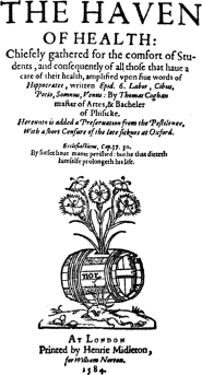
PREFACE.
 HERE are few phases of typography open to the
charge of being neglected. An unquestionable exception occurs, however,
in relation to Printers’ Marks. This subject is in many respects one of
the most interesting in connection with the early printers, who, using
devices at first purely as trade marks for the protection of their books
against the pirate, soon began to discern their ornamental value, and,
consequently, employed the best available artists to design them. Many
of these examples are of the greatest bibliographical and general
interest, as well as of considerable value in supplementing an important
class of illustrations to the printed books, and showing the origin of
several typical classes of Book-plates (Ex-Libris). The present Handbook
has been written with a view to supplying a readable but accurate
account of this neglected chapter in the history of art and
bibliography; and it appeals with equal force to the artist or
collector. Only one book on the subject, Berjeau’s “Early Dutch, German,
and English Printers’ Marks,” has appeared in this
viii
country, and this, besides being out of print and expensive, is
destitute of descriptive letterpress. The principle which determined the
selection of the illustrations is of a threefold character: first, the
importance of the printer; secondly, the artistic value or interest of
the Mark itself; and thirdly, the geographical importance of the city or
town in which the Mark first appeared.
Since the text of this book was printed, however, two additions have been made to the literature of its subject: Dr. Paul Kristeller’s “Die Italienischen Buchdrucker- und Verlegerzeichen, bis 1525,” a very handsome work, worthy to rank with the “Elsässische Büchermarken bis Anfang des 18. Jahrhunderts” of Herr Paul Heitz and Dr. Karl A. Barack (to whom I am indebted for much valuable information as well as for nearly thirty illustrations in the chapter on German Printers’ Marks); and Mr. Alfred Pollard’s “Early Illustrated Books,” an admirable volume which, however, only deals incidentally with the Printer’s Mark as a side issue in the history of the decoration and illustration of books in the fifteenth and sixteenth centuries. Mr. Pollard reproduces seven blocks from Dr. Kristeller’s monograph on the Devices of the Italian Printers. In reference to the statement on p. 116 of this volume that the Mark of Bade “is the earliest picture of a printing press,” Mr. Pollard refers to an unique copy of an edition of the “Danse Macabre” printed anonymously at Lyons in February, 1499, eight years earlier, which contains cuts of the shops of a printer and a bookseller.
ixThat this volume has considerably exceeded its intended limit must be my excuse for not including, with a very few exceptions, any modern examples from the Continent. Nearly every French printer and publisher of any note indulges in the luxury of a Mark of some sort, and an interesting volume might be written concerning modern continental examples. The practice of using a Printer’s Mark is an extremely commendable one, not merely as a relic of antiquity, but from an æsthetic point of view. Nearly every tradesman of importance in this country has some sort of trade mark; but most printers agree in regarding it as a wholly unnecessary superfluity. As the few exceptions indicated in the last chapter prove that the fashion has an artistic as well as a utilitarian side, I hope that it will again become more general as time goes on.
As regards my authorities: I have freely availed myself of nearly all the works named in the “Bibliography” at the end, besides such invaluable works as Brunet’s “Manual,” Mr. Quaritch’s Catalogues, and the monographs on the various printers, Plantin, Elzevir, Aldus, and the rest. From Messrs. Dickson and Edmonds’ “Annals of Scottish Printing” I have obtained not only some useful information regarding the Printer’s Mark in Scotland, but, through the courtesy of Messrs. Macmillan and Bowes of Cambridge, the loan of several blocks from the foregoing work, as well as that of John Siberch, the first Cambridge printer. I have also to thank M. Martinus Nijhoff, of the Hague, Herr Karl W. Hiersemann, of Leipzig, Herr J. H. x Ed. Heitz, Strassburg, Mr. Elliot Stock, Mr. Robert Hilton, Editor of the “British Printer,” and the Editor of the “American Bookmaker,” for the loan either of blocks or of original examples of Printers’ Marks; and Mr. C. T. Jacobi for several useful works on typography. Mr. G. P. Johnston, of Edinburgh, kindly lent me the reduced facsimile on p. 252, which arrived too late to be included in its proper place. The publishers whose Marks are included in the chapter on “Modern Examples” are also thanked for the courtesy and readiness with which they placed electros at my disposal.
The original idea of this book is due to my friend, Mr. Gleeson White, the general editor of the series in which it appears; but my thanks are especially due to Mr. G. R. Dennis for the great care with which he has gone through the whole work.
W. R.
86, Grosvenor Road, S.W.,
October, 1893.
CONTENTS.
| PAGE | |
| Preface | vii |
| List of Illustrations | xiii |
| Introduction | 1 |
|
Some General Aspects of the Printer’s Mark |
40 |
| The Printer’s Mark in England | 52 |
| Some French Printers’ Marks | 100 |
|
Printers’ Marks of Germany and Switzerland |
139 |
|
Some Dutch and Flemish Printers’ Marks |
178 |
|
Printers’ Marks in Italy and Spain |
209 |
| Some Modern Examples | 233 |
| Bibliography | 253 |
| Index | 255 |
LIST OF ILLUSTRATIONS.
| PAGE | |
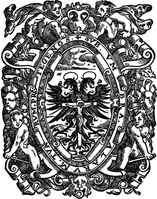
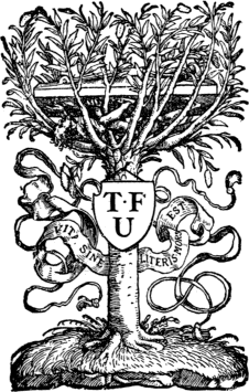
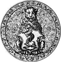
| Liechtenstein, Petrus. | Frontispiece |
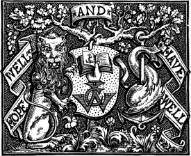
| Bell, George, and Sons. | Title-page |
| Andlau, G. U. Von | 1 |
| Couteau, Gillet | 4 |
| Du Pré, Galliot | 5 |
| Lecoq, Jehan | 7 |
| Petit and Kerver | 9 |
| Du Puys, Jacques | 11 |
| Pavier, T. | 12 |
| Janot, Denys | 15 |
| Faques, William | 16 |
| Steels, J. | 19 |
| Vérard, Antoine | 21 |
| Plate of thirty Marks used chiefly by the Italian Printers | 25 |
| Chaudière, Guillaume | 28 |
| Roffet, Jacques | 30 |
| Tournes, Jean de | 31 |
| Breuille, Mathurin | 33 |
| Snellaert, C. | 35 |
| Rastell, John | 37 |
| Leeu, Gerard | 39, 185 |
| Fust and Schoeffer | 40 |
| Froben, J. | 43 |
| Cratander’s Mark (attributed to Holbein) | 45 |
| Cox, T. | 46 |
| Dulssecker, Johann Reinhold | 47, 153, 154 |
| Beck, Reinhard | 50, 143, 144 |
| Goltz, Hubert | 51 |
| Lynne, Walter | 52 |
| Caxton, William | 55 |
| St. Albans Printer, The | 56 |
| De Worde, Wynkyn | 58 |
| Pynson, R. | 59, 60 |
| Notary, Julian | 61 |
| Fawkes, R. | 63 |
| Treveris, Peter | 64 |
| Scott, John | 65 |
| Copland, Robert | 66, 68 |
| Wyer, Robert | 69 |
| Hester, Andrew | 70 |
| Berthelet, Thomas | 71 |
| Byddell, John | 72 |
| Vautrollier, Thomas | 74 |
| Grafton, Richard | 75 |
| Middleton, William | 76 |
| Wolfe, John | 78 |
| Day, John | 79 |
| Arbuthnot, A. | 81 |
| Singleton, Hugh | 83 |
| Wight, John | 84 |
| Hall, Rowland | 85 |
| Bynneman, Henry | 86 |
| Woodcock, Thomas | 87 |
| Jaggard, William | 88 |
| Kingston, Felix | 89 |
| Creede, Thomas | 90 |
| Walthoe, John | 91 |
| Ware, R. | 92 |
| Scolar, John | 93 |
| Siberch, John | 95 |
| Myllar, Andro | 96 |
| Chepman, Walter | 97 |
| xiv Davidson, Thomas | 98 |
| Charteris, H. | 99 |
| Estienne, F. | 100 |
| Rembolt, B. | 102 |
| Vostre, Simon | 103 |
| Regnault, François | 104 |
| Regnault, Pierre | 105 |
| Marchant, Guy | 106 |
| De Marnef | 107 |
| Du Pré, J. | 108 |
| Le Rouge, Pierre | 109 |
| Le Noir, Philippe | 110 |
| Kerver, Thielman | 111 |
| Pigouchet, Philippe | 113 |
| Petit, Jehan | 114 |
| Bade, J. | 115 |
| Hardouyn, Gillet | 116 |
| Tory, Geoffrey | 117 |
| De Colines, Simon | 119 |
| Estienne, Robert | 120, 121 |
| Vidoue, P. | 124 |
| Cyaneus, Louis | 125 |
| Wéchel, André | 126 |
| Wéchel, Chrestien | 127 |
| Nivelle, Sébastien | 128 |
| Merlin, Desboys and Nivelle | 130 |
| Topie, M. | 131 |
| Treschel, J. | 132 |
| Dolet, E. | 133 |
| Hughes de la Porte and A. Vincent | 134 |
| Gryphe, Sébastien | 135 |
| Colomies, Jacques | 136 |
| Morin, M. | 137 |
| Le Chandelier, Pierre | 138 |
| Thanner, Jacobi | 139 |
| Grüninger, Johann | 140 |
| Schott, Martin | 141 |
| Knoblouch, Johann | 142 |
| Köpfel, Wolfgang | 145, 146 |
| Müller, Craft (Crato Mylius) | 147, 149 |
| Biener, Matthias (Apiarius) | 148 |
| Rihel, Theodosius; Rihel, Josias (und Deren Erben) | 150 |
| Zetzner, Lazarus | 151 |
| Berger, Thiebold | 151 |
| Scher, Conrad | 152 |
| Hauth, David | 152 |
| Anshelm, Thomas | 155 |
| Kobian, Valentin | 156 |
| Hoernen, A. Ther | 157 |
| Bumgart, Herman | 158 |
| Koelhoff, Johann | 160 |
| Cæsar, Nicholas | 161 |
| Soter, J. | 162 |
| Birckmann, Arnold | 163 |
| Oglin, Erhard | 164 |
| Pfortzheim, Jacobus de | 165 |
| Henricpetri | 166 |
| Endter’s, Wilhelm Moritz, Daughter | 167 |
| Weissenburger, J. | 168 |
| Lotter, Melchior | 169 |
| Schumann, V. | 170 |
| Baumgarten, Conrad | 171 |
| Feyrabend, J. | 172 |
| Guerbin, L. | 172 |
| Stadelberger, Jacob | 173 |
| Girard, Jehan | 174 |
| Rivery, J. | 174 |
| Froschover, C. | 175 |
| Brylinger, N. | 176 |
| Le Preux, F. | 177 |
| Veldener, J. | 178 |
| Johann of Westphalia | 179 |
| Martens, Theodoric | 180 |
| Mansion, Colard | 181 |
| The Brothers of Common Life | 182 |
| Paffraej, Albertus | 183 |
| Van der Meer, Jacob Jacobzoon | 186 |
| Van der Goes, Mathias | 187 |
| Van den Dorp, R. | 188 |
| Back, Godefroy | 188, 190 |
| Cæsaris, A. | 191 |
| Hillenius, Michael | 192 |
| Bellaert, J. | 193 |
| Henrici, H. | 194 |
| Destresius, Jodocus | 195 |
| xv Van der Noot, Thomas | 196 |
| Grapheus, J. | 197 |
| Van den Keere, Henri | 198 |
| Waesberghe, J. | 199 |
| Hamont, Michel de | 200 |
| Velpius, Rutger | 201 |
| Hovii, J. M. | 202 |
| Plantin, C. | 203, 204 |
| Elzevir Sage, The | 206 |
| Elzevir Sphere, The | 207 |
| Janssens, Guislain | 208 |
| Fritag, A. | 209 |
| Riessinger, Sixtus | 210 |
| Besicken, J. | 211 |
| Martens, Thierry | 211 |
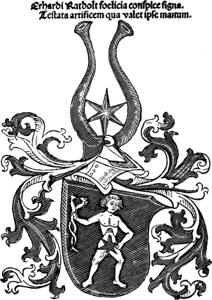
| Ratdolt, Erhardus | 212 |
| Scotto, Ottaviano | 214 |
| Sessa, Melchior | 216 |
| Meietos, P. and A. | 217 |
| Aldine Anchor, The First | 218 |
| Torresano, Andrea | 219 |
| Aldine Anchor, 1502–15 | 220 |
| „ „ 1546–54 | 221 |
| „ „ 1555–74 | 222 |
| „ „ 1575–81 | 223 |
| Giunta, P. | 224 |
| Giunta, L. | 225 |
| Giunta, F. de | 225 |
| Sabio, The Brothers | 226 |
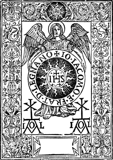
| Legnano, Gian Giacomo di | 227 |
| Rizzardi, Giammaria | 228 |
| Rosembach, Juan | 230 |
| Fernandex, V. | 231 |
| Kalliergos, Zacharias | 232 |
| Legnano, J. A. de | 232 |
| Vingle, J. de, of Picardy | 232 |
| Hugunt, M. | 232 |
| Longman and Co. | 233, 237 |
| Stationers’ Company, The | 233 |
| „ „ „ | 234 |
| Rivingtons, The | 235 |
| Clarendon Press, The | 238 |
| Pickering, William | 239 |
| Pickering, Basil Montagu | 239 |
| Chiswick Press | 240, 241 |
| Chatto and Windus | 243 |
| Nutt, David | 243 |
| Cassell and Co. | 243 |
| Macmillan and Co. | 243 |
| Unwin, T. Fisher | 243, 245 |
| Lawrence and Bullen | 243 |
| Kegan Paul and Co. | 243 |
| Clark, R. and R. | 244 |
| Constable, T. and A. | 246 |
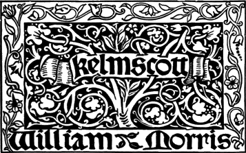
| Morris, William | 247, 248 |
| Appleton, D., and Co. | 250 |
| Cushing, J. S., and Co. | 250 |
| Harper Brothers | 250 |
| Lockwood, H., and Co. | 250 |
| Berwick and Smith | 251 |
| De Vinne, Theodore L., and Co. | 251 |
| Lippincott, J. B., Co. | 251 |
| Nijhoff, M. | 251 |
| Norton, William | 252 |
| Bell, George, and Sons | 261 |
PRINTERS’ MARKS.
INTRODUCTION.
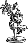
|
| G. U. VON ANDLAU. |
Shorn of all the romance and glamour which seem inevitably to surround every early phase of typographic art, a Printer’s Device may be described as nothing more or less than a trade mark. It is usually a sufficient proof that the book in which it occurs is the work of a particular craftsman. Its origin is essentially unromantic, and its employment, in the earlier stages of its history at all events, was merely an attempt to prevent the inevitable pirate from reaping where he had not sown. At one time a copy, or more correctly a forgery, of a Printer’s Mark could be detected with comparative ease, even if the body of the book had all the appearance of genuineness.
This self-protection was necessary on many grounds. First of all, the privileges of impression 2 which were granted by kings, princes, and supreme pontiffs, were usually obtained only by circuitous routes and after the expenditure of much time and money. Moreover, the counterfeit book was rarely either typographically or textually correct, and was more often than not abridged and mutilated almost beyond recognition, to the serious detriment of the printer whose name appeared on the title-page. Places as well as individualities suffered, for very many books were sold as printed in Venice, without having the least claim to that distinction. The Lyons printers were most unblushing sinners in this respect, and Renouard cites a Memorial drawn up by Aldus himself on the subject, and published at Venice in 1503.
But apart from the foregoing reasons, it must be remembered that many of the earliest monuments of typographic art appeared not only without the name of the printer but also without that of the locality in which they were printed. Although in such cases various extraneous circumstances have enabled bibliographers to “place” these books, the Mark of the printer has almost invariably been the chief aid in this direction. The Psalter of 1457 is the first book which has the name of the place where it was printed, besides that of the printers as well as the date of the year in which it was executed. But for a long time after that date books appeared without one or the other of these attributes, and sometimes without either, so that the importance of the Printer’s Mark holds good.
A very natural question now suggests itself, “Who invented these Marks?” Laire, “Index 3 Librorum” (Sæc. xv.), ii. 146, in speaking of a Greek Psalter says: “Habet signaturas, registrum ac custodes, sed non numerantur folia. Litteræ principales ligno incisæ sunt, sicut et in principio cujuslibet psalmi viticulæ quæ gallicé vignettes appellantur, quarum usum primus excogitavit Aldus.” The volume here described was printed about 1495, and the invention therefore has been very generally attributed to Aldus. That this is not so will be shown in the next chapter. We shall confine ourselves for the present to some of the various points which appear to be material to a proper understanding of the subject.
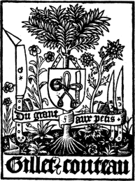
One of the most important and interesting phases in connection with Printers’ Marks is undoubtedly the motif of the pictorial embellishment. Both the precise origin and the object of many Marks are now lost to us, and many others are only explained after a thorough study of the life of the particular printer or the nature of the books which he generally printed or published. The majority, however, carry their own prima facie explanations. The number of “punning” devices is very large, and nearly every one has a character peculiarly its own. Their antiquity is proved by the fact that before the beginning of the fifteenth century, a picture of St. Anthony was boldly, not to say irreverently, used by Antoine Caillaut, Paris. A long series of punning devices occur in the books printed by or for the fifteenth century publishers, one of the most striking and successful is that of Michel le Noir, whose shield carries his initials, surmounted by the head of a 4 negress and sometimes supported by canting figures in full. This Mark, with variations, was also employed by Philippe and Guillaume le Noir, the work of the three men covering a period of nearly 100 years. The device of Gilles or Gillet Couteau, Paris, 1492, is apparently a double pun, first on his Christian name, the transition from which to œillet being easy and explaining the presence of a pink in flower, and secondly on his surname by the three open knives, in one of which the end of the blade is broken. It was almost inevitable that both Denis Roce or Ross, a Paris bookseller, 1490, and Germain Rose, of Lyons, 1538, should employ a rose in their marks, 5 and this they did, one of the latter’s examples having a dolphin twining around the stem. Jacques and Estienne Maillet, whose works at Lyons extended from the last eleven years of the fifteenth century to the middle of the sixteenth, give in the centre of their shield a picture of a mallet.
4
|
|
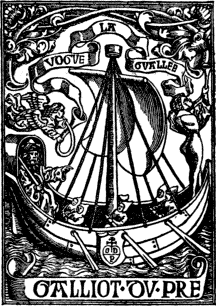
| GILLET COUTEAU. | GALLIOT DU PRÉ. |
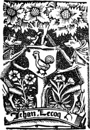
One of the boldest of the early sixteenth century examples is that employed by Galliot Du Pré, Paris, and in this we have a picture of a galley propelled with the aid of sails and oars, and with the motto “Vogue la gualee.” This device (with 6 several variations) was used by both father and son, and possesses an interest beyond the subject of Printers’ Marks, for it gives us a very clear idea of the different boats employed during the first three quarters of the sixteenth century. Another striking Mark of about the same time and covering as nearly as possible the same period, was that of the family De La Porte. The earlier example used in Paris about 1508 was a simple doorway; but the elder Hugues de la Porte, Lyons, and the successors of Aymon De La Porte of the same place, used several exceedingly bold designs in which Samson is represented carrying away the gates of Gaza, the motto on one door or gate being “libertatem meam,” and on the other “mecum porto.” The two printers of the same name, Jehan Lecoq, who were practising the art continuously during nearly the whole of the sixteenth century at Troyes, employed a Mark on the shield of which appears the figure of a cock; whilst an equally appropriate if much more ugly design, was employed by the eminent Lyons family of Sébastien Gryphe or Gryphius: he had at least eight “griffin” Marks, which differed slightly from one another. François Gryphe, who worked in Paris, had one Mark which was original to the extent of the griffin being supported by a tortoise. J. Du Moulin, Rouen, employed a little picture of a windmill on his Mark, as did Scotland’s first printer, Andro Myllar; but Jehan Petit, a prolific fifteenth century printer of Paris, confined his punning to the words “Petit à Petit,” as is seen in the reduced facsimile title, given on p. 9, of a 7 book printed by him for T. Kerver. Mathias Apiarius, Strassburg, used at least two Marks expressing the same idea, namely, a bear discovering a bee’s nest in the hollow of a tree—an obvious pun on his surname. The latter part of the sixteenth century is not nearly so fruitful in really good or striking devices. Guillaume Bichon, Paris, employed a realistic picture of a lap-dog (in allusion to his surname) chasing a hare, with the motto “Nunc fugiens, olim pugnabo”; and equally realistic in another way is the Mark of P. Chandelier, Caen, in which effective use is made of a candle-stick with seven holders, the motto being “Lucernis 8 fideliter ministro.” Antoine Tardif, Lyons, employed the Aldine anchor and dolphin, and also a motto, “Festina tarde,” which is identical in meaning, if not in the exact words, of that of Aldus. Guillaume De La Rivière, Arras, used a charmingly vivid little scene of a winding river, with the motto “Madenta flumine valles”; and it is not difficult to distinguish the appropriateness of the sprig of barley in the Mark of Hugues Barbon, Limoges. The Mark of Jacques Du Puys, Paris, was possibly suggested by the word puits (or well), and of which Puys is perhaps only a form: the picture at all events is a representation of Christ at the well. In the case of Adam Du Mont, Orange, the christian name, is “taken off” in a picture of Adam and Eve at the tree of forbidden fruit; and exactly the same idea occurs with equal appropriateness in the Mark of N. Eve, Paris, the sign of whose shop was Adam and Eve. Michel Jove naturally went to profane history for the subject of his Mark, and with a considerable amount of success.
7
|
| JEHAN LECOQ. |
Among the numerous other examples with mottoes derived from sacred history, special mention, as showing the connection between the sign of the shop and its incorporation in the Mark, may be made to the following printers of Paris: D. De La Noue, who not only had “Jesus” as the sign of his shop, but also as his Mark; J. Gueffier had the “Amateur Divin” as his sign, and an allegorical interpretation of the device, “Fert tacitus, vivit, vincit divinus amator,” as a Mark; Guillaume Julian, or Julien, had “Amitie” 10 as his sign, and a personification of this (Typus Amicitiæ) as his Mark, with the motto “Nil Deus hac nobis majus concessit in usus”; Abel L’Angelier (and his widow after his death) adopted the sacrifice of Abel as the subject of his Sign and Mark, with the motto “Sacrum pinque dabo nec macrum sacrificabo”; and the motto of both the first and the second Michel Sonnius was “Si Deus pro nobis, quis contra nos?”
PETIT AND KERVER.
Full text
center section
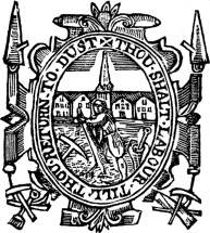
A few punning devices occur among the early English printers, but they are not always clever or pictorially successful. The earliest example is that of Richard Grafton, whose pretty device represents a tun with a grafted tree growing through it, the motto, “Suscipite insertum verbum,” being taken from the Epistle to St. James (i., verse 21). John Day’s device, with the motto “Arise! for it is day,” is generally supposed to be an allusion to the Reformation as well as a pun on his name; tradition has it, however, that Day was accustomed to awake his apprentices, when they had prolonged their slumbers beyond the usual hour, by the wholesome application of a scourge and the summons “Arise! for it is day.” We may also mention the devices of Hugh Singleton, a single tun; and of W. Middleton, a tun with the letter W at bottom and M in the centre of the tun; of T. Pavier, in which, appropriately enough, we have a pavior paving the streets of a town, and surrounded by the motto “Thou shalt labour till thou return to dust.” Thomas Woodcock employed a device of a cock on a stake, piled as for a Roman funeral, with the motto “Cantabo 12 Iehovæ quia benefecit”; Andrew Lawrence, a St. Andrew cross.
JACQUES DU PUYS.
Although not in any sense of a “punning” nature, the employment of a printing press as a Mark may conveniently be here referred to. It was first used in this manner, and in more than one form, by Josse Bade, or Badius, an eminent printer of the first thirty-five years of the sixteenth century, and to whom full reference will be found in the chapter on French Marks. A Flemish printer, Pierre César, Ghent, 1516, was apparently the next to employ this device; then came Jehan Baudouyn, Rennes, 1524; Eloy Gibier, Orleans, 1556; Jean Le Preux, Paris and Switzerland, 1561; Enguilbert (II.) De Marnef and the Bouchets brothers, Poitiers, 1567; and, later than all, L. Cloquemin, Lyons, 1579.
12
|
| T. PAVIER. |
Next to the section of “punning” devices, perhaps the most entertaining is that which deals with the question of mottoes. These are derived from an infinite variety of sources, not infrequently from the fertile brains of the printers themselves. Their application is not always clear, but they are nearly always indicative of the virility which characterized the old printers. It is neither desirable nor possible to exhaust this somewhat intricate phase of the subject, but it will be necessary to quote a few representative examples. Occasionally we get a snatch of verse, as in the case of Michel Le Noir, whose motto runs thus:
“C’est mon désir
De Dieu servir
Pour acquérir
Son doux plaisir.”
Also in the instance of another early printer, Gilles De Gourmont, who chants—
“Tost ou tard
Pres ou loing
A le Fort
Du feble besoing.”
Perhaps the greatest number of all are those in which the printer proclaims his faith to God and his loyalty to his king. One of the early Paris printers enjoins us—in verse—not only to honour the king and the court, but claims our salutations for the University; and almost precisely the same sentiment finds expression in the Mark of J. Alexandre, another early printer of Paris. Robinet or Robert Macé, Rouen, proclaims “Ung dieu, 14 ung roy, ung foy, ung loy,” and the same idea expressed in identical words is not uncommonly met with in Printers’ Marks. Of a more definitely religious nature are those, for example, of P. de Sartières, Bourges, “Tout se passe fors dieu”; of J. Lambert, “A espoir en dieu”; of Prigent Calvarin, “Deum time, pauperes sustine, finem respice”; and several from the Psalms, such as that of C. Nourry, called Le Prince, “Cor contritum et humiliatum deus non despicies”; of P. De Saincte-Lucie, also called Le Prince, “Oculi mei semper ad dominum”; and of J. Temporal (all three Lyons printers), “Tangit montes et fumigant,” in which the design is quite in keeping with the motto; in one case at least, S. Nivelle, one of the commandments is made use of, “Honora patrem tuum, et matrem tuam, ut sis longævus super terram.” Here, too, we may include the mottoes of B. Rigaud, “A foy entiere cœur volant”; S. De Colines, “Eripiam et glorificabo eum”; and of Benoist Bounyn, Lyons, “Labores manum tuarum quia manducabis beatus es et bene tibi erit.” Whilst as a few illustrations of a general character we may quote Geoffrey Tory’s exceedingly brief “Non plus,” which was contemporaneously used also by Olivier Mallard; J. Longis, “Nihil in charitate violentia”; Denys Janot, “Tout par amour, amour par tout, par tout amour, en tout bien”; the French rendering of a very old proverb in the mottoes of B. Aubri and D. Roce, “A l’aventure tout vient a point qui peut attendre”; J. Bignon, “Repos sans fin, sans fin repos”; the motto used conjointly by M. Fézandat and R. Granjon, “Ne 16 la mort, ne le venin”; and the motto of Etienne Dolet, “Scabra et impolita ad amussim dolo, atque perfolio.” Among the mottoes of early English printers, the most notable, partly for its dual source, and as one of our earliest examples, is that of William Faques; one sentence, “Melius est modicum justo super divitias peccatorum multas,” is taken from Psalm xxxvii. verse 16; and the second, “Melior est patiens viro forti, et qui dominat,” comes from Proverbs xvi., verse 32. The motto of Richard Grafton has already been quoted; that of John Reynes was “Redemptoris mundi arma”; and John Wolfe, “Vbique floret.”
DENYS JANOT.
16
![Melius est modicum iusto super divitias p[ecca]torum multas. / MELIOR EST PATIENS VIRO FORTI ET QVI DOMINAT / Guillam. Melius est modicum iusto super divitias p[ecca]torum multas. / MELIOR EST PATIENS VIRO FORTI ET QVI DOMINAT / Guillam.](images/pic16.png)
|
| WILLIAM FAQUES. |
The employment of mottoes in Greek and 17 Hebrew characters is a not unimportant feature in the earlier examples of Printers’ Marks, but it must suffice us here to indicate a few of the leading printers who used either one or the other, and sometimes both. B. Rembolt was one of the earliest to incorporate a Greek phrase; De Salenson, Ghent, had a Greco-Latin motto on an open bible, which is the pièce de resistance of a pretty Mark, a similar idea occurring in the totally different Marks of the brothers Treschel, Lyons; another Lyons firm of printers, the brothers Huguetan, employed a Greek motto, and a phrase, also in Greek characters, occurs in one of the Marks of Peter Vidoue. The more notable Marks which contain Hebrew characters, which generally signify Jehovah, are those of Joannes Knoblouchus, or Knoblouch, Strassburg, in which we have not only Hebrew, but upper and lower case Greek, and a Latin quotation—“Verum, quum latebris delituit diu, emergit”; and of Wolfius Cæphalæus, also of Strassburg; and here again we have the Mark environed by quotations in Greek, Latin, and Hebrew. In a few instances we have the unlucky letter of the Greek alphabet—theta—forming a Mark with considerable originality, as in that of Guillaume Morel, where this symbol of death is surrounded by two dragon serpents representing immortality. The theta was also employed by Etienne Prevosteau.
The subject of the sphere in Printers’ Marks might profitably occupy a good deal of space in discussing. It is generally considered to be not only the peculiar property of the Elzevirs, but that books 18 possessing it without having one or other of the real or assumed imprints of this celebrated family of printers are impudent frauds. But as a matter of fact, it was used by at least half-a-dozen printers many years before the Elzevirs started printing. For example, it was employed during the last decade of the fifteenth century by Gilles Hardouyn, and early in the sixteenth by Huguetan brothers at Lyons, by P. Sergent and L. Grandin at Paris, by J. Steels, or Steelsius of Antwerp, and P. Lichtenstein of Venice. In these instances, however, it is endowed, so to speak, with accessories. In the earliest Mark it plays only an incidental part, but in the Huguetan example it forms the device itself: it is held by a hand and is encircled by a ring on which the owner of the hand is evidently trying to balance a ball; there is a Greek motto. In a later and slightly different design of the same family, the motto is altered in position, and is in Latin: “Vniversitas rerum, vt Pvlis, in manv Iehovae.” Each of the two Paris examples is remarkable in its peculiar way. In Grandin’s two Marks the same allegorical idea prevails, viz., one person seizing a complete sphere from an angel out of the clouds, apparently to exchange it for the broken one held by a second person: in the cruder of the two examples of these there is a quotation from the 117th Psalm. In Sergent’s bold and vigorous Mark, the sphere, which incloses a figure of the crucified Christ, is fixed into the top of a dead trunk of a tree. It may also be mentioned that this device was frequently used by printers during the middle and latter part of the seventeenth 19 century in this country—it appears, for example, on several books printed by R. Bentley, London, during that period. The sphere as an Elzevir Mark will be referred to in the chapter dealing with Dutch examples.
J. STEELS.
An element which may be generically termed religious plays no unimportant part in this subject. It will not be necessary to enter deeply into the motives which induced so many of the old printers and booksellers to select either their devices or the illustrations of their Marks from biblical sources; and it must suffice to say that, if the object is frequently hidden to us to-day, the fact of the extent of 20 their employment cannot be controverted. The incident of the Brazen Serpent (Numbers xxi.) was a very popular subject. One of the earliest to use it was Conrad Neobar, Paris, 1538; it was adopted by Reginald Wolfe, who commenced printing in this country about 1543, and its possession was considered of sufficient importance to merit special mention among the goods bequeathed by his widow to her son Robert. It was also the Mark of Wolfe’s contemporaries, Martin Le Jeune, Paris, Jean Bien-Né, of the same city, and of Jean Crespin, Geneva, the last-named using it in several sizes, in which the foot of the cross is “continued” into an anchor. Apart from crosses in an infinite variety of forms, and to which reference will presently be made, by far the most popular form of religious devices consisted of what may, for convenience sake, be termed angelic. Pictorially they are nearly always failures, and often ludicrously so. The same indeed might be said of the work of most artists who have essayed the impossible in this direction. An extraordinary solemnity of countenance, a painful sameness and extreme ugliness, are the three dominant features of the angels of the Printers’ Mark. The subject offers but little scope for an artist’s ingenuity it is true, and it is only in a very few exceptions that a tolerable example presents itself. Their most frequent occurrence is in supporting a shield with the national emblem of France, and in at least one instance—that of André Bocard, Paris,—with the emblems of the city and the University of Paris. This idea, without the two latter emblems, occurs in 21 the devices of Jehan Trepperel, Anthoine Denidel, and J. Bouyer and G. Bouchet (who adopted it conjointly), who were printing or selling books in Paris during the last decade of the fifteenth century; whilst in the provinces in that period it was employed by Jacques Le Forestier, at Rouen; and by Jehan De Gourmont, Paris, J. Besson, Lyons, and J. Bouchet at Poitiers, early in the following century. The angels nearly always occur in couples, as in the case of Antoine Vérard, one of 22 the earliest printers to adopt this form; but a few exceptions may be mentioned where only one appears, namely, in the Mark of Estienne Baland, Lyons (1515), in which an angel is represented as confounding Balaam’s ass; and in that of Vincent Portunaris, of the same place and of about the same time, in which an angel figures holding an open book; in the four employed by G. Silvius, an Antwerp printer (1562), in three of which the figure is also holding a book; in the elaborate Mark of Philip Du Pré, Paris, 1595, and in the exceeding rough Mark of Jannot de Campis, of Lyons, 1505. Curiously enough, the subject of Christ on the cross was very rarely employed, an exception occurring in the case of Schäffeler, of Constance, or Bodensee, Bavaria, 1505. The same centre-piece, without the cross, was employed by Jehan Frellon, Paris, 1508, and evidently copied by Jehan Burges, the younger, at Rouen, 1521, whilst that of Guillaume Du Puy, Paris, 1504, has already been referred to. The Virgin Mary occurs occasionally, the more notable examples being the Marks of Guillaume Anabat, Paris, 1505–10, really a careful piece of work; and the elder G. Ryverd, Paris, 1516, and in each case with the infant Jesus. St. Christopher is a subject one sometimes meets with in Printers’ Marks: in that of Gervais Chevallon, Paris, 1538, it however plays a comparatively subordinate part, and its merits were only fully recognized by the Grosii, of Leipzig, who nearly always used it for about two centuries, 1525–1732; the example bearing the last date is by far one of the most 23 absurd of its kind—the cowled monk with a modern lantern lighting St. Christopher on his way through the river is a choice piece of incongruity. Another phase of the religious element capable of considerable expansion is that in relation to the part played in Marks by saints and priests generally. Sometimes these are found together with an effect not at all happy, notably the two Marks of Jehan Olivier, Paris, 1518, which, with Jesus Christ on one side, a Pope on the other, and an olive tree, are sufficiently crude to present an appearance which seems to-day almost blasphemous. The last of the several religious phases of Printers’ Marks to which we shall allude is at the same time the most elaborate and complicated. We refer to that of the Cross. The subject is sufficiently wide to occupy of itself a small volume, but even after the most careful investigation, there are many points which will for ever remain in the region of doubt and obscurity. Tradition is proverbially difficult to eradicate; and all the glamour which surrounds the history of the Cross, and which found expression in, among other popular books, the “Legenda Aurea,” maintained all its pristine force and attractiveness down to the end of the sixteenth century. The invention of printing and the gradual enlightenment of mankind did much in reducing these legends into their proper place; but the process was gradual, and whatever may have been their private opinions, the old printers found it discreet to fall into line with the established order of things. Indeed, the religious sentiment was perhaps never 24 so alive as at the time of the invention of printing, in proof of which some of the earliest and most magnificent typographical monuments may be cited,—the Gutenberg Bible, the Psalter of Fust and Schoeffer, for example. The accompanying plate will give the reader a faint idea of the extraordinary variety of crosses to be found on Printers’ Marks used chiefly by the Italian printers.
ANTOINE VÉRARD.
Full text
M. Paul Delalain has touched upon this exceedingly abstract phase of Printers’ Marks in the third fascicule of his “Inventaire des Marques d’Imprimeurs,” without, as he himself admits, arriving at any very definite conclusion. The cross, whether in its simplest form or with a complication of additional ornaments, has, as he points out, been at all times popular in connection with this subject. It appeared on the shield of Arnold Ther Hoernen, Cologne, 1477, at Stockholm in 1483, at Cracovia in 1510. That it did not fall entirely into desuetude until the end of the eighteenth century is a very striking proof of what M. Delalain calls “la persistance de la croix.” It has appeared in all forms and in almost every conceivable shape. Its presence may be taken as indicating a deference and a submission to, as well as a respect for, the Christian religion, and M. Delalain is of the opinion that the sign “eu pour origine l’affiliation à une confrérie religieuse.” Finally, in his introduction to Roth-Scholtz’s “Thesaurus Symbolarum ac Emblematum,” Spoerl asks, “Why are the initials of a printer or bookseller so often placed in a circle or in a heart-shaped border, and then surmounted by a cross? 26 Why at the extreme top of the cross is the lateral line formed into a sort of triangular four? Why, without this inexplicable sign, has the cross a number of cyphers, two, or even three, cross-bars? Why should the tail of the cypher 4 itself be traversed by one or sometimes two perpendicular bars which themselves would appear to form another cross of another kind? Why, among the ornamental accessories, do certain species of stars form several crosses, entangled or isolated? Why, at the base of the cross is the V duplicated?” All these are problems which it would be exceedingly difficult to solve with satisfaction. We do not propose offering any kind of explanation for these singular marks; but it will not be without interest to point out that among the more interesting examples are those used by Berthold Rembolt, André Bocard or Boucard, Georges Mittelhus, Jehan Alexandre, Jehan Lambert, Nicole De La Barre, and the brothers De Marnef, all printers or booksellers of Paris; of Guillaume Le Talleur, Richard Auzolt, of Rouen; of Jaques Huguetan, Mathieu Husz, François Fradin, Jacques Sacon or Sachon, and Jehan Du Pré, all of Lyons; of Jehan Grüninger, of Strassburg; of Lawrence Andrewe, and Andrew Hester, of London; the unknown printer of St. Albans; of Leeu, of Antwerp; of Jacob Abiegnus, of Leipzig; of Pedro Miguel, Barcelona; of Juan de Rosembach of Barcelona and other places; of the four “alemanes” of Seville, and hundreds of others that might be mentioned.
25|
1 |
2 |
3 |
4 |
5 |
 6 |
|
7 |
8 |
 9 |
 10 |
 11 |
 12 |
 13 |
14 |
15 |
16 |
17 |
18 |
|
19 |
20 |
 21 |
22 |
23 |
24 |
 25 |
26 |
27 |
28 |
29 |
30 |
|
1. Benedetto d’Effore. 2. Bonino de Boninis. 3. Bernardino de Misintis. 4. Bernardino Ricci. 5. Bernardino Stagnino. 6. Baptista de Tortis. 7. Bernardinus de Vitalibus. 8. Bartholomeus de Zanis.
11. Dominicus Roccociola or Richizolo. 12. William Schomberg. 13. Christopher de Canibus. 14. Hercules Nani. 15. Giovanni Antonio de Benedetti. |
16. Samuel de Tournes (Geneva). 17. The Somaschi. 18. Justinian de Ruberia. 19. J. Treschel (Lyons). 20. L. de Gerla, Gerlis or Gerula. 21. Laurentius Rubeus de Valentia. 22. Lazaro Suardo or da Suardis. 23. Matthew de Codeca or Capsaca. 24. Nicholas de Francfordia. 25. Dionysio Berrichelli. 26. Octavianus Scottus. 27. Peregrino de Pasqualibus. 28. Philip Pinzi or Pincius. 29. Caligula de Bacileriis. 30. J. Sacer. |
It is curious to note that, in spite of its great mediæval popularity, the subject of St. George and 27 the Dragon rarely enters into the subject of Printers’ Marks, and of the few examples which call for reference, those of Thomas Périer and Guillaume Bourgeat, of Paris and Tours respectively, are among the best both in design and execution. The idea was also adopted by Guillaume Auvray, of Paris; and by M. de Hamont, Brussels.
The personification of Time and Peace were both popular; and each has its successful examples. One of the earliest instances of the former is a pretty little mark, executed with a considerable amount of vigour, of Robert De Gourmont, Paris; a large and vigorous Mark—one of several—employed by Simon De Colines, Paris, in which it is interesting to note that the scythe is not invariably denticulated; two very crude but very distinct examples employed by Michel Hillenius or Hooghstrate, Antwerp, 1514; and two, one large and the other small, of Guillaume Chaudière, Paris, 1564; whilst Jean Temporal, of Lyons, 1550, used it as an evident play on his name. The emblem of Peace does not appear to have been much employed until well on into the sixteenth century; N. Boucher, 1544, used as his motto, “pacem victis;” Guillaume Julien, to whom reference has already been made; as likewise Michel Clopejau, of a few years later, who used the words “Typus amicitiæ” on his mark, with the further legend of “Quam sperata victoria pax certa melior;” these three lived in Paris, whilst by far the best decorative Mark in this connection was that adopted by Julien Angelier, a bookseller and printer of Blois, 1555, the centre of whose device, 28 besides the words “Signum pacis,” includes a dove bearing two olive branches. The fraternal device of two hands clasped may also be here alluded to: it is of special interest from the fact that it was employed by one of the earliest to 29 practice printing in Paris—Guy or Guyot Marchant, 1483, one of whose Marks gives us a view of two shoemakers working with musical notes representing So La (Sola), and “fides ficit” in gothic type. Thomas Richard, sixty years afterwards, elaborated on a portion of this idea, and his Mark shows two hands holding a crowned sceptre with two serpents entwined around it. Designs much superior to these were employed by Bertramus of Strassburg, at the latter part of the sixteenth century. Following the example of Marchant, musical notes have occasionally been employed by later printers. The rebus of this printer evidently suggested that of Jehan and Anthoine Lagache, father and son, Arras, in 1517, the first syllable of whose name, La, is indicated by a musical note, and is immediately followed by “gache.” Pierre Jacobi, Saint-Nicholas-de-la-Port, and Toulouse, 1503, adopted Marchant’s idea by giving “Sola fides ficit” with a musical start, so to speak; and a distinctly novel phase of the subject is employed by Jacobus Jucundus, Strassburg, 1531, in which a goose is represented as playing on a violin.
GUILLAUME CHAUDIÈRE.
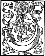
Printers’ marks in which the pictorial embellishments partake of a rustic nature, such as bits of landscape, seed-sowing, harvesting, and horns of plenty, are numerous, and in many cases exceedingly pretty. J. Roffet, Paris, 1549, employed the design of the seed-sower in several of his Marks; and of about a dozen different Marks used at one time or another by Jean De Tournes the first, Lyons, 1542, one of the most successful 30 is a clever one having for its central figure a sower; the same idea, in a very crude form, was contemporaneously employed also by De Laet, Antwerp. The Cornucopia, or horn of plenty, was a very favourite emblem, and it appears in a manifold variety of designs, sometimes with a Caduceus (the symbol of Mercury) which is held by two clasped hands, as in the case of T. Orwin, London, 1596, in a cartouche with the motto: “By wisdom peace, by peace 31 plenty;” four of the eight marks used by Chrestien Wéchel, Paris, 1522, differ from Orwin’s in being surmounted by a winged Pegasus; and André Wéchel, of the same city, 1535, employed one of the smaller devices of Chrestien, with variations and enlargements of the same; in the Mark of J. Chouet, Geneva, 1579, the caduceus 32 is replaced by a serpent, the body of which is formed into a figure 8; in that of Gislain Manilius, Ghent, the horns appear above two seated figures. In each of the foregoing examples two horns appear. Georg Ulricher von Andlau, Strassburg, 1529, used the cornucopia, and in one of his Marks the figure is surrounded by an elaborate array of fruit and vegetables; single horns appear also in the clever and elaborate marks of R. Fouet, Paris, 1597, whose design was a very slight deviation from that of J. De Bordeaux, Paris, 1567. The oak-tree, sheltering a reaper and with the motto “Satis Quercus,” was employed by George Cleray, Vannes, 1545; and the fruit of this tree—the acorn—by E. Schultis, Lyons, 1491. The thistle appears on the marks of Estienne Groulleau, Paris, 1547; the Rose on the more or less elaborate designs of Gilles Corrozet, Paris, 1538; a rose-tree in full flower occupies the centre of the beautiful mark of the first Mathieu Guillemot, Paris, 1585; a solitary Rose-flower was the simple and effective mark of Jean Dallier, Paris, 1545; and a flowering branch of the same tree is one of the items on the charming little Mark on the opposite page of Mathurin Breuille, Paris.
JACQUES ROFFET.
JEAN DE TOURNES.
|
| MATHURIN BREUILLE. |
In the category of what may be termed extinct animals, the Unicorn as a subject for illustrating Printers’ Marks enjoyed a long and extensive popularity. The most remarkable thing in connection with these designs of the Unicorn is perhaps their striking dissimilarity, and as nearly every one of the many artists who employed, for no obvious reasons, this animal in their Printer’s Marks had 33 his own idea of what a Unicorn ought to have been like, the result, viewed as a whole, is not by any means a happy one. Still, several of the examples possess a considerable amount of vigour and have a distinct decorative effectiveness. But apart from this its appearance in the Marks of the old printers is a very striking proof of the fact that the mediæval legends died hard. Curiously enough, the proverbial “lion and unicorn” do not often occur together. The family of printers with whose name the unicorn is almost as closely associated as the compass is with Plantin, is that of Kerver, for it has been employed in over a dozen different forms by one or other members from the end of the fifteenth century to the latter 34 part of the sixteenth. Sometimes there is only one Unicorn on the mark, at others there is a pair. Le Petit Laurens, Paris, was using it contemporaneously with the first Thielman Kerver, and possibly the one copied the other. Sénant, Vivian, Kées, and Pierre Gadoul, Chapelet, and Chavercher, were other Paris printers who used the same idea in their marks before the middle of the sixteenth century. It was long a favourite subject with the Rouen printers, one of the earliest in that city to use it being J. Richard, whose design is particularly original, inasmuch as the shield is supported on one side by a Unicorn, and on the other by a female, possibly intended to represent a saint, an idea which was apparently copied by Symon Vincent, Lyons; the Unicorn was also used in the marks of L. Martin and G. Boulle, both of Lyons; and also in the very rough but original design employed by H. Hesker, Antwerp, 1496; whilst for its quaint originality a special reference may be made to the Mark of François Huby, Paris, of the latter part of the sixteenth century, for in this a Unicorn is represented as chasing an old man. The origin of the Unicorn Mark is essentially Dutch. The editions of the Printer, “à la licorne,” Deft, 1488–94, are well known to students of early printing. The earliest book in which this mark is found is the “Dȳalogus der Creaturen” (“Dialogus Creaturarum”) issued at that city in November, 1488. Henri Eckert de Hombergh and Chr. Snellaert, both of Delf, used a Unicorn in their Marks during the latter years of the fifteenth century.
35C. SNELLAERT.
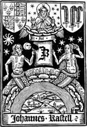
Among other possible and impossible monsters and subjects of profane history, the Griffin, the Mermaid, the Phœnix, Arion and Hermes has each had its Mark or Marks. In the case of the first named, which, according to Sir Thomas Browne, 36 in his “Vulgar Errors,” is emblematical of watchfulness, courage, perseverance, and rapidity of execution, it is not surprising that the Gryphius family, from the evident pun on their surname, should have considered it as in their particular preserves. As may be imagined, it does not make a pretty device, although under the circumstances its employment is perhaps permissible. Sebastien Gryphius, Lyons, and his brother François, Paris, who were of German parentage, employed the Griffin in about a dozen variations during the first half of the sixteenth century. The Griffin, however, was utilized by Poncet Le Preux, Paris, some years before the Gryphius family came into notoriety, and it was employed contemporaneously with this by B. Aubri, Paris. The Mermaid makes a prettier picture than the Griffin, but its appearance on Printers’ Marks is an equally fantastic vagary of the imagination. In one of the earliest Marks on which it occurs, that of C. Fradin, Lyons, 1505, the shield is supported on one side by a Mermaid, and on the other by a fully-armed knight; half a century after, B. Macé, Caen, had a very clever little Mark in which the Mermaid is not only in her proper element, but holding an anchor in one hand, and combing her hair with the other. During the second quarter of the sixteenth century, the idea was, with variations, used by G. Le Bret, Paris, and J. De Junte, Lyons, as well as by John Rastell, London, 1528, whose shop was at the sign of the Mermaid.
|
| JOHN RASTELL. |
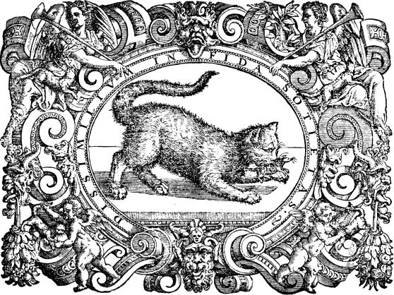
To summarize a few of the less popular designs, it will suffice to give a short list of the vignettes 37 or marks used by the old printers of Paris (except where otherwise stated), alphabetically arranged according to subjects: Abraham, Pacard; an anchor, Christopher Rapheleng, Leyden, Chouet and Pierre Aubert, Geneva; two anchors crosswise, Thierry Martens, Antwerp, and Nicholas le Rich; one or more angels, Legnano, Milan; Henaud and Abel L’Angelier, and Dominic Farri, Venice; Arion, Oporinus or Herlist, Brylinger, Louis le Roi, and Pernet, Basle, and Chouet, Geneva; a Basilisk and the four elements, Rogny; Bellerophon, the brothers Arnoul and Charles Angeliers; Guillaume Eustace, and Perier, and Bonel, Venice; a Bull with the sign Taurus and the Zodiac, 38 Nicholas Bevilacqua, Turin; a Cat with a mouse in her mouth, Melchior Sessa and Pietro Nicolini, de Sabio, Venice; two Doves, Jacques Quesnel; an Eagle, Balthazar Bellers, Antwerp, Bladius, Rome, G. Rouille or Roville, Lyons, and the same design—with the motto “Renovabitur ut aquilæ juventus mea”—occurs in the books published in the early years of the seventeenth century by Nicolini, Rabani, Renneri and Co., Venice; the personification of Fortune, Bertier, J. Denis (an elaborate and clever design in which a youth is represented climbing the tree of Fortune), and Adrian le Roy and Robert Ballard, Berde and Rigaud, Lyons, and Giovanni and Andrea Zennaro, Venice; a Fountain, M. Vascosan, the second Frederic Morel (with a Greek motto importing that the fountain of wisdom flows in books), and Cratander, Basle; a Heart, Sebastian Huré and his son-in-law Corbon; Hercules, with the motto, “Virtus non territa monstris,” Vitré, Le Maire, Leyden; a Lion rampant, Arry; a lion rampant crowned on a red ground, Gunther Zainer; a lion led by the hand, Jacques Creigher; a lion supporting a column, Mylius, Strassburg, and a lion with a hour glass, Henric Petri, Basle; a Magpie, Jean Benat or Bienne; this bird also occurs among Robert Estienne’s Marks, and the same subject, with a serpent twining round a branch was used (according to Horne), by Frederic Morel; Mercury, alone or with other classic deities, David Douceur, Biaggio, Lyons; Jean Rossy, Bologne; Verdust, Antwerp, and Hervagius, Basle; a Pelican, N. De Guinguant, S. Nivelle, Girault and De 39 Marnef, C. and F. Franceschini, Venice; Mamarelli, Ferrara; F. Heger, Leyden; E. Barricat, Lyons; and Martin Nuyts and his successor who carried on business under the same name, Antwerp; a Phœnix, Michael Joli, Wyon, Douay; Leffen, Leyden; Martinelli, Rome; and Giolito, Venice; a Salamander, Zenaro, Venice; St. Crespin and Senneton, Lyons; Duversin and Rossi, Rome; a Stork, Nivelle and Cramoisy; St. George and the Dragon, Michel de Hamont, Brussels; a Swan, Blanchet; whilst a swan and a soldier formed the Mark of Peter de Cæsaris and John Stoll, two German printers who were among the earliest to practise the art in Paris.
GERARD LEEU.
SOME GENERAL ASPECTS OF THE
PRINTER’S MARK.

|
| FUST AND SCHOEFFER. |
From what has already been stated, it will be seen that the Printer’s Mark plays a by no means unimportant part in the early history of illustration,—whether the phase be serious or grotesque, sublime or ridiculous, we find here manifold examples, crude as well as clever. Although it cannot be said with truth that the Mark as an institution reached, like typography itself, its highest degree of perfection at its inception, some of the earlier examples, nevertheless, are also some of the most perfect. The evolution from the small monogram, generally in white on a black ground, to an elaborate picture occupying from a quarter to a whole page, was much less gradual than is generally supposed. The unambitious marks of the first printers were clearly adopted in consonance with the traders’ or merchants’ marks which began to be so generally 41 employed during the latter part of the fifteenth century.
The very natural question, Which was the first Printer’s Mark? admits of an easy answer. It was employed for the first time in the form of the coupled shield of Fust and Schoeffer, in the colophon of the famous Psalter printed by these two men at Mainz in 1457. This book is remarkable as being the costliest ever sold (a perfect copy is valued at 5,000 guineas by Mr. Quaritch): it is the third book printed, and the first having a date, and probably only a dozen copies were struck off for the use of the Benedictine Monastery of St. James at Mainz. It is, however, quite as remarkable for the extraordinary beauty of its initial letters, printed in red and blue ink, the letters being of one colour and the ornamental portion of the other. The Mark of Fust and Schoeffer, it may be mentioned, consists of two printer’s rules in saltaire, on two shields, hanging from a stump, the two rules on the right shield forming an angle of 45°: the adoption of a compositor’s setting-rule was very appropriate. It was nearly twenty years before the introduction of woodcuts into books became general, Gunther Zainer beginning it at Augsburg in 1471–1475. The inception of this movement was naturally followed by a general improvement, or at all events elaboration, of the Printer’s Mark, which, moreover, now began to be printed in colours, as is seen in the Fust and Schoeffer mark in red which appears beneath the colophon of Turrecremata’s Commentary on the Psalms printed by Schoeffer in 1474. Reverting 42 for a moment to the Psalter which has been very properly described as “the grandest book ever produced by Typography,” a very curious fact not at all generally known may be here pointed out. Although the few existing examples with two dates are of the same edition, there are several very curious variations which are well worthy of notice. It will be only necessary, however, in this place to refer to the fact that the beautiful example in the Imperial Library at Vienna—which, from its spotless purity, Heineken calls the “exemplaire vierge”—differs from the others in being without the shield of Fust and Schoeffer, a fact which points to the probability of this copy having been the first struck off.
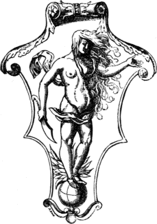
By the end of the fifteenth century the Printer’s Mark had assumed or was rapidly assuming an importance of which its original introducers had very little conception. Indeed, as early as 1539, a law, according to Dupont, in his “Histoire de l’Imprimerie,” was passed by which these marks or arms of printers and booksellers were protected. Unfortunately the designs were very rarely signed, and it is now impossible to name with any degree of certainty either the artist or engraver, both offices probably in the majority of cases being performed by one man. There is no doubt whatever that Hans Holbein designed some of the very graceful borders and title-pages of Froben, at Basle, during the first quarter of the sixteenth century, and in doing this he included the graceful Caduceus which this famous printer employed. It does not necessarily follow that he was the original 44 designer, although he was in intimate association with Froben when the latter first used this device. The distinctive Mark of Cratander, or Cartander, which appears in the edition of Plutarch’s “Opuscula,” Basel, 1530, has also been confidently attributed to the same artist: if there is any foundation for this statement Holbein was guilty of plagiarism, for this Mark is a very slight modification on one used by the same printer in 1519, and not only so dated but having the artist’s initials, I. F. Those who have the opportunity of examining the “Noctes Atticæ” of Aulus Gellius, printed by Cratander in 1519, will come upon several highly interesting features in connection with this Mark, which is emblematical of Fortune: the elaborately engraved title-page contains an almost exact miniature of the same idea on either side, and it is repeated in a larger form in the border which surrounds the first chapter. The Mark occurs in its full size on the last page of all. The title-page, borders and Mark are all by the same artist, I. F. In the earlier example the woman’s hair completely hides her face, whilst in that of eleven years later it is as seen on the opposite page, and the whole design is more carefully finished. Dürer had dealt with the same subject. In reference to Froben, however, it should be pointed out that his Marks, of which there were several, show considerable variation in their attendant accessories, and that Holbein could not possibly have had anything to do with the majority of them.
J. FROBEN.
Full text
|
| CRATANDER’S MARK. (Attributed to Holbein.) |
|
| T. COX. |
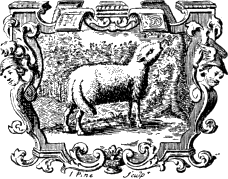
To attempt to identify the designers of even a selection of the best Printers’ Marks would be but 45 to embark on a wild sea of conjecture. The initials of the engravers, which occur much more frequently than those of the artists, are of very little assistance to the identification of the latter. Many of them possess a vigour and an originality which would at once stamp their designers as men of more than ordinary ability. For picturesqueness, and for the care and attention paid to the minutest details, it may be doubted if either 46 B. Picart in France, or J. Pine in this country, has ever been excelled. The examples of the former come perhaps more in the category of vignettes than of Printers’ Marks, although the charming little pictures on the title-pages of Stosch’s “Pierres Antiques Gravées,” 1724, the “Impostures Innocentes,” 1734, and the edition of Cicero’s “Epistolæ,” printed at the Hague by Isaac Vaillant, 1725,—to mention only three of many—may be conveniently regarded as Printers’ Marks. So far as we know, Pine only executed one example,—representing a Lamb within a cleverly designed cartouche—and this appears on the title-page of Dale’s Translation of Freind’s “Emmenologia,” printed for T. Cox, “at the Lamb under the Royal Exchange,” 1729: in its way it is unquestionably the most perfect Mark that has ever been employed in this country. Any rule differentiating the Printer’s Mark proper from a 47 vignette is not likely to give general satisfaction; for a writer on the subject of vignettes will unfailingly appropriate many that are Marks, and vice versa. The present writer has found it a fairly safe rule, to accept as a Mark a pictorial embellishment (on a title-page) to which is appended a motto or quotation. The temptation to persuade oneself that several of these vignettes are Printers’ Marks needs a good deal of resisting, especially when such an exquisite example as that of Daniel Bartholomæus and Son, of Ulm, is in question. The same holds good with several of the dozen used by J. Reinhold Dulssecker, Strassburg, about 48 the latter part of the seventeenth and earlier part of the eighteenth century; and very many others that might be named.
J. R. DULSSECKER.
It is interesting to note that the Printer’s Mark preceded the introduction of the title-page by nearly twenty years, and that the first ornamental title known appeared in the “Calendar” of Regiomontanus, printed at Venice by Pictor, Loeslein and Ratdolt in 1476, in folio. Neither the simple nor the ornate title-page secured an immediate or general popularity, and not for many years was it regarded as an essential feature of a printed volume. Its history is intimately associated with that of the Printer’s Mark, and the progress of the one synchronizes up to a certain point with that of the other. In beauty of design and engraving, the Printer’s Mark, like the Title-page, attained its highest point of artistic excellence in the early part of the sixteenth century. This perhaps is not altogether surprising when it is remembered that during the first twenty years of that period we have title-pages from the hands of Dürer, Holbein, Wechtlin, Urse Graff, Schauffelein and Cranach. In his excellent work entitled “Last Words on the History of the Title-Page,” Mr. A. W. Pollard observes “From 1550 onwards we find beauty in nooks and corners. Here and there over some special book an artist will have laboured, and not in vain; but save for such stray miracles, as decade succeeds decade, good work becomes rarer and rarer, and at last we learn to look only for carelessness, ill-taste, and caricature, and of these are seldom disappointed.” These remarks 49 apply with equal force to the Printer’s Mark, although some exceptionally beautiful examples appeared after that period.
The position allotted to the Printer’s Mark may not be of very great importance, but it offers some points of interest. It appeared first in the colophon, in which the printer usually seized the opportunity not only of thanking God that he had finished his task, but of indulging in a little puff either of his own part of the transaction or of the work itself. The appearance of the Mark in the colophon therefore was a natural corollary of the printer’s vanity. It soon outgrew its place of confinement; and when a pictorial effect was attempted it became promoted, as it were, to the title-page. In this position it was nearly always of a primary character, so to speak, but sometimes, as in the case of Reinhard Beck, it was almost lost in the maze of decorative borders. But it is found in various parts of the printed book: in some cases, among which are the Arabic works issued by Erpenius of Leyden, we find the Mark at what we regard as the beginning of the book, but which in reality is its end. Sometimes the Mark occupies the first and last leaves of a book, as was often the case with the more important works issued by Froben, by the brothers Huguetan and others. These two Marks at the extreme portions of a book either differed from one another or not, according to the fancy or convenience of the printer. The Mark also appeared sometimes at the end of the index, or at the end of the preliminary matter, such as list of contents or address of the author, 51 and its position was generally determined by several circumstances.
REINHARD BECK.
Now and then we have what may be described as a double Mark; that is, of printer and bookseller, the one keeping a sharp look out to see that the other did not have more than his fair share of credit. This is the case with several books printed by Jehan Petit for Thielman Kerver, Paris, of which an example is given in the previous chapter; Wynkyn de Worde used Caxton’s initials for a time on his Mark, but the only motive which could have prompted this was an affectionate regard for his master. Some of the books which Jannot De Campis printed at Lyons for Symon Vincent contained not only the printer’s, but two examples of the bookseller’s Mark.
HUBERT GOLTZ.
THE PRINTER’S MARK IN
ENGLAND.
|
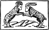
| WALTER LYNNE. |
The consideration of the Printer’s Mark as an institution in this country is characterized by extreme simplicity, both as to its origin and to its design. From an entry in one of the Bagford volumes (Harleian MSS. 5910) in the British Museum, we learn that “rebuses or name devices were brought into England after Edward III. had conquered France: they were used by those who had no arms, and if their names ended in Ton, as Hatton, Boulton, Luton, Grafton, Middleton, Seton, Norton, their signs or devices would be a Hat and a tun, a Boult and a tun, a Lute and a tun, etc., which had no reference to their names, for all names ending in Ton signifieth town, from whence they took their names.” Even in England, therefore, the merchant’s trade device was the direct source of the Printer’s Mark, which it antedated by over a century. It will be convenient, 53 first of all, to explain that the first printing-press in England was that of William Caxton at Westminster, whose first book was issued from this place November 18, 1477; the second was that of Theodoricus de Rood, at Oxford, the first book dated December 17, 1478; the third was that of the unknown printer at St. Albans, 1480, and the fourth was that of John Lettou, in the city of London, 1480, the last-named being soon joined by William de Machlinia, who afterwards carried on the business alone. The earliest phases of wood-engraving employed at one or other of these four distinct houses were either initial letters or borders around the page. At Caxton’s press, as the late Henry Bradshaw has pointed out in a paper read before the Cambridge Antiquarian Society, February 25, 1867, simple initials are found in the Indulgences of 1480 and 1481; at the Oxford press an elaborate border of four pieces, representing birds and flowers, is found in some copies of the two books printed there in October, 1481, and July, 1482. Of illustrations in the text, we find a series of diagrams and a series of eleven cuts illustrating the text of the first edition of “The Mirror of the World,” 1481; a series of sixteen cuts to the second edition of “The Game of Chesse Moralised,” 1483; and two works of the following year, “The Fables of Esop” and the first edition of “The Golden Legend,” each contains not only a large cut for the frontispiece, but in the case of the former, a series of 185 cuts, and, in the latter, two series of eighteen large and fifty-two small cuts. At the Oxford press only two books 54 are known with woodcut illustrations, in neither case cut for the work; at the St. Albans press the only known illustrations in the text are the coats-of-arms found in the “Book of Hawking, Hunting and Coat-Armours,” 1486; at the press of Lettou and W. de Machlinia there is no trace of illustrations.

|
| THE ST. ALBANS PRINTER. |
These few introductory facts, condensed from Mr. Bradshaw’s paper above mentioned, have a distinct interest to us as leading up to the employment of the Printer’s Mark. It is certainly curious that at Caxton’s press the very familiar device was only first used about Christmas, 1489, in the second folio edition of the Sarum “Ordinale.” At first this bold and effective mark was used, as in the “Ordinale,” the “Dictes of the Philosophers,” and in the “History of Reynaud the Fox,” at or close to the beginning of the volume. In Caxton’s subsequent books it is always found at the end. At the St. Albans press the device with “Sanctus Albanus” is found in two of the eight books printed there, “The English Chronicle,” 1483, where it is printed in red, and in “The Book of Hawking,” etc., 1486; it is formed of a globe and double cross, there being in the centre a shield with a St. Andrew’s cross.
So far as regards Caxton’s device, it is easier to name the books in which it appeared than to explain its exact meaning. The late William Blades accepts the common interpretation of “W. C. 74.” Some bibliographers argue that the date refers to the introduction of printing in England, and quote the colophon of the first edition of the 56 “Chess” book in support of this theory. But the date of this work refers to the translation and not to the printing, which was executed at Bruges, probably in 1476. Caxton did not settle at Westminster until late in that year, and possibly not until 1477. In all probability the date, supposing it to be such, and assuming that it is an abbreviation of 1474, refers to some landmark in our printer’s career. Professor J. P. A. Madden, in his “Lettres d’un Bibliophile,” expresses it as his 57 opinion that the two small letters outside the “W. 74 C” are an abbreviation of the words “Sancta Colonia,” an indication that a notable event in the life of Caxton occurred in 1474 at Cologne. Ames, Herbert, and others have copied a device which Caxton never used: it is much smaller than the genuine one (which, in other respects, it closely resembles) which we reproduce from Berjeau. The opinion that the interlacement is a trade mark is, Mr. Blades points out in his exhaustive “Life,” much strengthened by the discovery of its original use. In 1487, Caxton, wishing to print a Sarum Missal, and not having the types proper for the purpose, sent to Paris, where the book was printed for him by G. Maynyal, who in the colophon states distinctly that he printed it at the expense of William Caxton of London. When the printed sheets reached Westminster, Caxton, wishing to make it quite plain that he was the publisher, engraved his design and printed it on the last page, which happened to be blank. Mr. Blades gives 1487 as the year in which this Missal (of which only one copy is known) was printed, but Mr. Bradshaw puts it at 1489. The former enumerates twelve books printed by Caxton in which his device occurs—all ranging from the aforesaid Missal to the year 1491, the date of his death.
WILLIAM CAXTON.
|
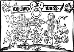
| WYNKYN DE WORDE. |
Wynkyn de Worde, a native of Lorraine, who was with Caxton at Bruges or Cologne, carried on the business of his master at Westminster until 1499, when he removed to the sign of the Golden Sun, Fleet Street, London. He had nine Marks, 58 the earliest of which is often described as one of Caxton’s, from the genuine example of which, as we have already stated, it differs in being smaller, with a different border, and in having a flourish inserted above and below the letters. The second is an elongated variation of No. 1, with the name Wynkyn de Worde on a narrow white space beneath the device. The next four devices are more or less elaborations upon that of which we give a reproduction; the seventh is the Sagittarius device in black with white characters: between the sagittarii is seen the sun and flaming stars, and below the initials “W C” in Roman letters, with the name Wynkyn de Worde at the foot; the eighth is a picturesque Mark copied from one belonging to Froben, with the omission of part of the background; it consists of a semicircular arch, supported by short-wreathed pillars, with foliated capitals, plinths and bases: on the top of each is a 59 boy habited like a soldier, with a spear and shield bending forwards; a large cartouche German shield is supported by three boys. The ninth Mark of this printer was a large and handsome one, being a royal and heraldic device which Wynkyn de Worde used as a frontispiece to the Acts of Parliament, in the form of an upright parallelogram which encloses a species of arched panel or doorway, formed of three lines, imitating clustered columns and Gothic mouldings, and two large square shields, that on the left charged with three fleurs-de-lys for France, and the other bearing France and England quarterly, each of which is surmounted by a crown. For a very minute description of these Marks, and their variations, the reader is referred to Johnson’s “Typographia,” and Bigmore and Wyman’s “Bibliography of 60 Printing,” the former of whom enumerates 410 books which issued from this press.
59
|
|
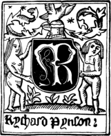
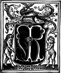
| R. PYNSON. | R. PYNSON. |
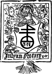
Among the 200 odd books which Richard Pynson printed between 1493 and 1527, we find six Marks (besides variants), of which five are very similar, and of these we give two examples, the smaller being one of the earliest, in which it will be noticed that the drawing is much inferior to the larger example; the sixth Mark is a singular one, consisting of a large upright parallelogram surrounded by a single stout line, within which are the scroll, supporters, shield and cypher, crest, helmet and mantling, and the Virgin and St. Catherine, and in many other particulars differing from the other five examples. Robert Redman, who, after quarrelling with 61 Richard Pynson, and apparently succeeding him in business, employed a device almost identical with that which Pynson most frequently used, and to which therefore we need not further refer. In chronological sequence the next English printer who employed a device is Julian Notary, who was printing books for about twenty years subsequent to 1498, first at Westminster, then near Temple Bar, and finally in St. Paul’s Churchyard. He had two devices (of which there are a very few variations), of which we give the more important. The other has only one stout black line, and not two, and it has also the Latinized form of the name—Julianus Notarius. About two dozen different works of this printer are known to bibliographers. In connection 62 with Notary, we may here conveniently refer to an interesting, but admittedly inconclusive article which appears in The Library, i., pp. 102–5, by Mr. E. Gordon Duff, in which that able bibliographer publishes the discovery of two books which would point to the existence of an unrecorded English printer of the fifteenth century. One of these has the title of “Questiones Alberti de modis significandi,” and the other, of which only a fragment is known to exist, is a Sarum “Horæ,” which is dated 1497. In the colophons of neither does the name of the printer transpire, but his Mark is given in both—in the former book in black, and in the latter in red. This mark is identical with Notary’s, with this important exception, that, whereas in Notary’s device his name occurs in the lower half of the device, in these the lower half is occupied by the initials I. H., and the upper half by the initials I N B, the I N being in the form of a monogram, and not distinct. In 1498 this same block was used on the title-page of the Sarum “Missal,” printed by Notary, who altered it to suit his own requirements. We cannot follow Mr. Gordon Duff in his conjectures as to the probability of who this unknown printer may have been, but the matter is one of great bibliographical interest. William Faques, who was the King’s Printer, and who is known to have issued seven books between 1499 and 1508, had only one Mark, which is totally different from those of any of his predecessors, as may be seen from the example given on page 16, where will also be found references to the sources of the scriptural quotations on the white and black triangles.
63The extreme rarity of this printer’s books will be best understood when it is stated that there are only two examples in the British Museum; one of these is a “Psalter,” 1504. With W. Faques we exhaust the fifteenth century printers who employed marks to distinguish the productions of their presses.
61
|
|
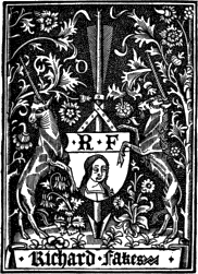
| JULIAN NOTARY. | R. FAWKES. |
Notwithstanding the similarity in their surnames it is not at all certain that Richard Fawkes (1509–1530), who also appears as Faukes, Fakes, and Faques, was related to the last-mentioned printer. His books are now of excessive rarity. The unicorn (regardant on either side of the device) appears for the first time in an English mark. Henry Pepwell 64 (1505–1539), of the Holy Trinity in St. Paul’s Churchyard, was a bookseller rather than a printer, and all his earlier books were printed in Paris; his Mark, in which occurs the heraldic device representing the Trinity, was suggested by the sign of his shop. The most important example of the thirty books which issued from the little-known press of Peter Treveris, who was apparently putting forth books from 1514 to 1535, is “The Grete herball whiche geveth parfyt knowlege and und[er]standing of all maner of herbes,” etc., 1526, a finely printed folio (“at the signe of the Wodows”), of which a second edition appeared in 1529. The earlier edition contains, on the recto of the sixth 65 leaf, a full-page woodcut of the human skeleton, with anatomical explanations, whilst the last leaf contains a full-page woodcut of the printer’s Mark, with the imprint at the foot. Herbert supposes that the sign of the “Wodows,” mentioned by Treveris in the colophon, might possibly be put for wode hommes or wild men, and alludes to the supporters used in the device. Treveris printed for several booksellers, notably John Reyves, of St. Paul’s Churchyard, and for Lawrence Andrewe, of Fleet Street. In this printer’s Mark, and in fact nearly every other sixteenth century example, there is a very evident French influence, whilst many of the examples are the most transparent imitations of Marks used by foreign printers. Of the three used 66 by John Scott or Skot, who was printing books from about 1521 to 1537, two were mere copies of the Marks used by Denis Roce of Paris. We give an illustration of one example; the second is of the same design, but with a very rich stellated background, and the motto, “A l’aventure, tout vient a point qui peut attendre.” His own device was an exceedingly simple long strip, with the letters Iohn Skot in antique Roman characters. An example of the last mark will be found in “The Golden Letanye in Englysshe,” printed by Skot in “Fauster Land, in Saynt Leonardes parysshe”; but examples of this press are excessively rare, only one, “Thystory of Jacob and his XII Sones,” fourteen leaves, in 67 verse, and printed about 1525, being in the British Museum, and another tract, “The Rosary,” 1537, being in the Althorp Library now transferred to Manchester.
64
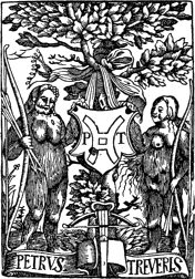
|
65
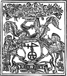
|
| PETER TREVERIS. | JOHN SCOTT. |
Robert Copland, who was a beneficiaire and pupil of Wynkyn de Worde, was a translator as well as a printer and stationer, and his shop was at the sign of the Rose Garland in Fleet Street. Although he carried on business from 1515 to about 1548, only a few of his books are now known, none of which appear to be in the British Museum. The majority were purely ephemeral. The most interesting phase of this printer’s career occurs in connection with one or two books printed by Wynkyn de Worde, notably “The Assembly of Foules,” 1530, at the end of which is “Lenvoy of Robert Copland boke prynter,” one of the three verses running thus:
“Layde upon shelfe, in leues all torne
With Letters, dymme, almost defaced cleane
Thy hyllynge rote, with wormes all to worne
Thou lay, that pyte it was to sene
Bounde with olde quayres, for ages all hoorse and grene
Thy mater endormed, for lacke of thy presence
But nowe arte losed, go shewe forth thy sentence.”
66
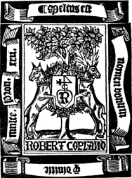
|
| ROBERT COPLAND. Full text |
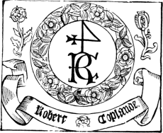
|
| ROBERT COPLAND. |
The three Marks of Copland make allusion to the roses which appeared as a sign to his shop. The most elaborate design is an upright parallelogram within which appears a flourishing tree springing out of the earth, and supporting a shield suspended from its branches by a belt and surrounded by a wreath of roses; on the left-hand side is a hind regardant collared with a ducal 68 coronet standing as a supporter, and on the right is a hart in a similar position and with the same decorations; there are four scrolls surrounding the centre-piece, on the top one is “Melius est,” on the right-hand one “nomen bonum,” on the bottom one “q diuitie,” and on the left-hand one “multe. Prou. xxii,” i.e. “A good name is better than much riches.” The second device, of which we also give an example, is self-explanatory, and is perhaps the more original. It has also an additional interest from the fact that it was used by William Copland, 1549–1561, who was probably a son of Robert, and who simply altered the mark to the extent of substituting his own Christian name for that of Robert in the scroll at the bottom of the device. Over sixty books by this printer are described by bibliographers, and many of them are in the British Museum. Robert Wyer, whose shop was at the 69 sign of St. John the Evangelist, in St. Martin’s parish, in the rents of the Bishop of Norwich, near Charing Cross, was another printer whose works were more remarkable for their number than for their typographic excellence. His earliest dated work is the “Expositiones Terminarum Legum Anglorum,” 1527, and his latest “A Dyalogue Defensyue for Women,” 1542, but as to nearly sixty others of his works no date is attached, he may have commenced earlier than the first date and continued after the second. The marks of Wyer consisted of two or three representations of St. John the Divine writing, attended by an eagle holding the inkhorn; he is seated on a rock in the middle 70 of the sea intended to represent the Isle of Patmos. Laurens, or Lawrence, Andrewe, by Ames stated to be a native of Calais, printed a few books during the third decade of the sixteenth century, and resided near the eastern end of Fleet Street at the sign of the Golden Cross. His Mark consisted of a shield which is contained within a very rudely cut parallelogram; the escutcheon is supported by a wreath beneath an ornamental arch, and between two curved pillars designed in the early Italian style, with a background formed of coarse horizontal lines. Three of his books are in the British Museum. The Museum possesses only one book with the imprint of Andrew Hester, who was a bookseller of the “White Horse,” St. Paul’s 71 Church Yard, and this is an edition of Coverdale’s Bible, “newly oversene and correcte,” which appears to have been printed for him by Froschover, of Zurich, 1550. Among English Marks of the period, Hester’s possesses the merit of being original.
69
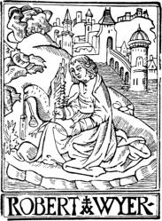
|
70
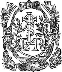
|
| ROBERT WYER. | ANDREW HESTER. |
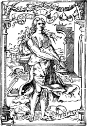
|
| THOMAS BERTHELET. |
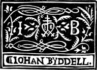
|
| JOHN BYDDELL. |
One of the most prolific of the printers of the first half of the sixteenth century was Thomas Berthelet, who succeeded Pynson in the office of King’s Printer, at a salary of £4 yearly, and who (or his immediate successors, for he died at the end of 1555) issued books from 1528 to 1568, of which nearly 150 are known to bibliographers, sixty being in the British Museum. His shop was 72 at the sign of the “Lucretia Romana,” a charming engraving—the most carefully executed of its kind used in this country up to that time—of which, with his own name on a scroll, he used as a Mark. Several of his books were printed in Paris. He issued a large number of works in classical literature, and among the more notable of his publications were Chaloner’s translation of Erasmus’s “Praise of Folly,” 1549, Gower’s “De Confessione Amantis,” and the “Institution of a Christen Man,” with a woodcut border to the title by Holbein. John Byddell, otherwise Salisbury, 1533–44, was another printer whose Mark was derived from the sign of the shop in which he carried on business, namely, “Our Lady of Pity,” next Fleet Bridge, but he afterwards removed to the Sun near the Conduit, which was probably the old residence of Wynkyn de Worde, for whom he was an executor. The Lady of Pity is personified as an angel with outstretched wings, 73 holding two elegant horns or torches, the left of which is pouring out a kind of stream terminating in drops, and is marked on the side with the word “Gratia”; that on the right contains fire and is lettered “Charitas”: the lower ends of these horns are rested by the angel upon two rude heater shields, on the left of which is inscribed “Johan Byddell, Printer,” and on the other is a mark which includes the printer’s initials; round the head of the figure are the words, “Virtus beatos efficit.” This is merely a copy of one of the Marks used by J. Sacon, a Lyonese printer, 1498–1522. Byddell’s books were distinctly in keeping with the seriousness of his sign, and among others we find such titles as “News out of Hell,” 1536, “Olde God and the Newe,” 1534, “Common Places of Scripture,” 1538, etc., besides two “Primers.” Thomas Vautrollier, who printed books at Edinburgh and London from about 1566 to 1605, had four Marks, in all of which an anchor is suspended from the clouds, and two leafy boughs twined, with the motto “Anchora Spei,” and with a framework which is identical with that of Guarinus, of Basle. Vautrollier was a native of France; nearly all his books were in Latin. In 1584 he printed an edition of Giordano Bruno’s “Spaccio de la Bestia Trionfante,” with a dedication to Sir Philip Sidney, and for which he had to flee the country, for the imprint, “Stampato in Parigi,” was an obvious and unsuccessful attempt to hoodwink the authorities. In the following year he printed at Edinburgh “A Declaration of the Kings Majesties intention and meaning toward 74 the lait Actis of Parliament.” J. Norton, 1593–1610, also used the same Mark.
THOMAS VAUTROLLIER.
Richard Grafton, 1537–72, who was a scholar and an author, is one of the best known of the sixteenth 75 century printers, and, although he issued a large number of books, confined himself to a single Mark, which was a rebus or pun upon his name. Grafton was for several years in partnership with Edward Whitchurche, and also with John Butler. The most important works accomplished by the two first named were the first issue of the Great or Cromwell’s Bible, 1539, and Coverdale’s version of the New Testament, 1538–9, in Latin and English; the latter being partly printed in Paris by Regnault, and completed in London: as nearly the entire impression was burnt by order of the Inquisition, it is of great rarity and value. Grafton, who was printer to Edward VI. both before and after his accession to the throne, issued a 76 magnificent edition of Halle’s “Chronicle,” 1548, and an “Abridgement of the Chronicles” by himself in 1562, which in ten years reached a fourth edition. Grafton found printing a much more hazardous calling than the grocery business to which he had been brought up, for he was constantly in difficulties, which on one occasion nearly cost him his life. The idea which found expression in Grafton’s Mark naturally suggested itself to William Middleton, or Myddleton, 1525–47, who succeeded to the business of Robert Redman, and issued books from the sign of the “George next to St. Dunstan’s Church in Fleet Street.” He had two devices, of which we give the larger and more important: in the smaller the shield is supported 77 on either side by an angel. About forty of William Middleton’s books have been described, one of the most notable being John Heywood’s “Four P’s, a very merry Enterlude of a Palmer, a Pardoner, a Poticary, and a Pedler.” Reginald or Reynold Wolfe, 1542–73, was the King’s Printer and a learned antiquary. Wolfe was probably of foreign extraction, for there were several early sixteenth century printers of the same surname in France, Germany, and Switzerland. His printing-office was in St. Paul’s Churchyard, at the sign of the Brazen Serpent, which emblem he used as a device, a subject which, as we have already seen, was frequently employed for a similar purpose abroad. Wolfe’s other device, of which there are two sizes, consisted of an elegant cartouche German shield, on which is represented a fruit-tree and two boys, one of whom is drawing down the fruit with a stick, whilst the other is taking it up off the ground. Over sixty books have been catalogued as the work of Reginald Wolfe. John Wolfe, originally a fishmonger, started printing about 1560, and from that year until 1601 we have an almost continuous stream of his books, on a very great variety of subjects. Like several others of the early printers, he was in constant warfare with the authorities, whose rules and restrictions of the press were a source of ever-recurring annoyances. He appears to have had as much difficulty in managing his “authors” as with the Stationers’ Company, for he is referred to more than once in very uncomplimentary terms in the Martin Marprelate tracts of the period. The Mark here 78 reproduced from Berjeau represents a fleur-de-lys seedling supported by two savages, with the motto “Ubique Floret.” John Day, 1546–84, is undoubtedly one of the best known and most prolific of the sixteenth century printers, nearly 300 books having him as their foster-father. He appears to have started in business at the sign of the Resurrection, a little above Holborn Conduit, but removed in or about 1549 to Aldersgate Street; he had several shops in various parts of the town, where his literary wares might be disposed 79 of, and he is remarkable in being the first English printer who used Saxon characters, whilst he brought those of the Greek and Italic to perfection. It is not possible to give in this place even a brief summary of Day’s career, and it must suffice us to mention that Archbishop Parker was among his patrons, and that the more important books which appeared from his press included Fox’s “Acts and Monuments,” 1563, and the “Psalmes in Metre with Music,” 1571 (for the printing of which he received a patent dated June 2, 1568). His best known device, of which we give an example, has a double meaning; first it is a pun on his name, and secondly an allusion to the dawn of the Protestant religion. He used another Mark, which is a large upright parallelogram, within the lines of which is a very elegant Greek sarcophagus bearing a skeleton lying on a mat. At the head of the corpse are two figures standing and looking down at it, of which the outer one is in 80 the dress of a rich citizen, having his left hand on his sword, and the other, who is pointing to the body, is dressed like a doctor or a schoolmaster: from his mouth issues a scroll rising upwards in eight folds, on four of which are engraven in small Roman capitals, “Etsi Mors in dies accelerat,” and the remainder of the sentence, “Post Fvnera virtus vivet tamen,” appears in similar letters on another scroll, which is elegantly twined round the branches of a holly placed behind the sepulchre, to indicate by a tree that blooms at Christmas the evergreen nature of virtue; the sarcophagus, figures, and tree stand by the side of a river, with some distant vessels, on the left hand of which are rocky shores, with cities, etc., and in the upper corner of the left is the sun breaking out of the clouds; the initials I D appear on the lower left hand. This Mark is exceedingly rare; it occurs on the last leaf of J. Norton’s translation of the Latin “Catechism,” 1570, and also at the end of Churton’s “Cosmographical Glass.” There are several variations of the Mark which we reproduce on p. 79. William Seres, who was for some time anterior to 1550 in partnership with Day (and at other times with Anthony Scoloker, Richard Kele, and William Hill), printed over 100 books, in many of which his monogram serves the purpose of a Mark.
75
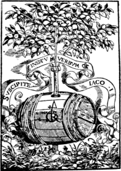
|
76
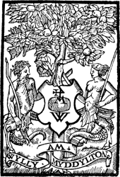
|
| RICHARD GRAFTON. | WILLIAM MIDDLETON. |
JOHN WOLFE.
79
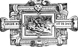
|
| JOHN DAY. |
Like so many other of the early printers, Richard Jugge, 1548–77, whose shop was at the sign of the Bible at the north door of St. Paul’s, was a University man, having studied at King’s College, Cambridge. “He had a license from Government to print 82 the New Testament in English, dated January, 1550; and no printer ever equalled him in the richness of the initial letters and general disposition of the text which are displayed therein.” On the accession of Elizabeth to the throne, he printed the proclamation, November 17, 1558. About seventy books are catalogued as coming from his press. His elegant Mark consists of a massive architectural panel, adorned with wreaths of fruit, and bearing in the centre an oval within which is a pelican feeding her young, surrounded by the mottoes, “Love kepyth the Lawe, obeyeth the Kynge, and is good to the commen welthe,” and “Pro Rege Lege et Grege.” On the left of the oval stands a female figure having a serpent twined round her right arm, with the word “Prudentia” underneath, whilst the second female figure, with a balance and a sword, is called “Justicia”; in the bottom centre in a small cartouche panel is the name R. Jugge in the form of a monogram. This Mark was also used by J. Windet and by Alexander Arbuthnot, of Edinburgh, of which we give the example of the last named. Hugh Singleton, 1548–82, appears to have earned as much notoriety among his contemporaries for his “rather loose” principles as for the books which he printed. He was often in conflict with the authorities, and very narrowly escaped severe punishment for printing one of Stubbs’ outbursts, for which the author and Page the publisher had their right hands cut off with a butcher’s knife and a mallet in 1581; Singleton was pardoned. His Mark, of which there are variations, is sufficiently 83 self-explanatory, although it may be mentioned that for a time he dwelt at the Golden Tun in Creed Lane. Walter Lynne, 1547–50, who was a scholar and an author, had a shop at “Sommer’s Key near Billingsgate” and printed about twenty sermons and other religious tracts in octavo, employed the device given as an initial to the present chapter. John Wyghte, or Wight, resembled Singleton somewhat in his facility for running his head against established customs, and was on one occasion fined for keeping his shop open on St. Luke’s Day, and on another for selling pirated books. His shop was at the sign of the Rose, St. Paul’s Churchyard, and his books—beginning with an edition of the Bible—range from the year 1551 to 1596. His device was a portrait of himself, which varies considerably both in size and in other respects. Perhaps the most curious and interesting work which he published was 84 “A Booke of the arte and manner how to plant and graffe all sortes of trees,” 1586, translated from the French by Leonard Mascall, and dedicated to Sir John Paulet.
A. ARBUTHNOT.
Full text
83
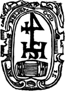
|
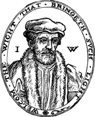
|
| HUGH SINGLETON. | JOHN WIGHT. |
The employment of the Geneva arms as a Printer’s Mark is confined, in this country, to Rowland Hall, who, at the death of Edward VI., accompanied several refugees to Geneva, where he printed the Psalms, Bible, and other works of a more or less religious character; his books range from 1559 to 1563, and about two dozen are known to bibliographers, and half of this number are in the British Museum. His Mark has a double interest; first, from his residence in Geneva, and secondly from the fact that the sign of his shop, “The Half Eagle and Key,” was a still further 85 acknowledgment of the protection which he enjoyed in Geneva. This was not his only Mark, but it is the only one to which we need refer. The name of Richard Tottell, 1553–97, is much better remembered in connection with the epoch-making little book, “Songes and Sonettes,” 1557, the first miscellany of English verse, than either of the other seventy or eighty publications which bear his imprint. His shop was in Fleet Street at the sign of the Hand and Star, the same idea serving him as a Mark: the hand and star in a circle, with a scroll on either side having the words “cum privilegio,” the whole being placed under an arch supported by columns ornamented in the Etruscan style. One of the most curious of the large number of books which came from the press of Henry Bynneman, 1567–87, is “The Mariners boke, containing godly and necessary 86 orders and prayers, to be observed in every ship, both for mariners and all other whatsoever they be that shall travaile on the sea, for their voyage,” 1575; a still more curious production of his press has the following title, “Of ghostes and spirites walkyng by night, and strange noyes, crackes and sundry fore warnynges, which commonly happen before the death of men, great slaughters, and alterations of kyngdomes,” 1572. Bynneman had served with Reynold Wolfe, and when he started in business on his own account met with much encouragement from Archbishop Parker, who allowed him to have a shop or shed at the north-west door of St. Paul’s. He appears to have had two Marks, one of which was derived from the sign of his shop, “The Mermaid,” with the motto, “Omnia tempus habent,” and the other (here reproduced) of a doe passant, and the motto, “Cerva charissima et gratissimus hinnulus pro.” Thomas Woodcock, 1576–94, who dwelt at the sign of the Black Bear, in St. Paul’s Churchyard, 87 was a bookseller rather than a printer; his Mark is an evident double pun on his surname.
85
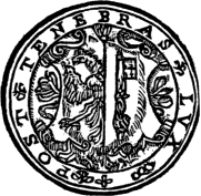
|
86
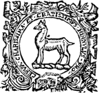
|
| ROWLAND HALL. | HENRY BYNNEMAN. |
THOMAS WOODCOCK.
During the last years of the sixteenth century, and the first three decades of the seventeenth, there were two Jaggards among the London printers; by far the better known is Isaac, who, with Edward Blount, issued the first folio edition of Shakespeare’s plays; he seems to have had no Mark, but William, 1595–1624, used the rather striking device (page 88), which is thus described: Serpent biting his tail, coiled twice round the wrist of a hand issuing from the clouds and holding a wand from which springs two laurel 88 branches, and which is surmounted by a portcullis (the Westminster Arms); in the last coil of the serpent the word “Prudentia.” Equally distinct is the mark of Felix Kingston, or Kyngston, who printed a very large number of books from 1597 to 1640; in this device we have the sun shining on the Parnassus, and a laurel tree between the two conical hills, with a sunflower and a pansy on either side.
WILLIAM JAGGARD.
The Mark of William Norton, 1570–93, whose shop was at the King’s Arms, St. Paul’s Churchyard, was in a double sense a pun on his name, consisting as it did of a representation of a Sweet-William growing through a tun inscribed with the 89 letters “NOR”; and something of the same kind may be said of that employed by Richard Harrison, 1552–62, whose Mark is described by Camden as “an Hare by a sheafe of Rye in the Sun, for Harrison.” In this connection we may also here refer to the Mark employed by Gerard (or Gerald) Dewes, 1562–87, whose shop was at the sign of the Swan in St. Paul’s Churchyard; this is described by Camden thus: “and if you require more [i.e. in reference to the prevailing taste for picture-writing such as the designs of Norton and Dewes] I refer you to the witty inventions of some Londoners; but that for Garret 90 Dewes is most remarkable, two in a garret casting Dewes at dice.” In the same category also may be included the Mark of Christopher and Robert Barker, the Queen’s Printers, who used a design of a man barking timber, with the couplet
“A Barker if you will,
In name but not in skill.”
From these and many other instances which might be cited, it will be seen that by the end of the sixteenth century the Printer’s Mark in England had declined into a very childish and feeble play upon the names of the printers, and the subject therefore need not be further pursued.
FELIX KINGSTON.
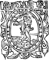
|
| THOMAS CREEDE. |

|
| JOHN WALTHOE. |
|
| R. WARE. |
The natural result, moreover, of this decline was, in the following century, followed by what practically amounts to extinction; and the few exceptions to which we shall refer, and which are to some extent 91 selected at random, prove the truth of that theory. Thomas Creede, 1588–1618, whose shop was at the sign of the Catherine Wheel, near the Old Swan in Thames Street, was one of the prolific printers of the period, and his most common Mark is a personification of Truth, with a hand issuing from the clouds striking on her back with a rod, and encircled with the motto, “Veritas virescit vulnere.” Among the numerous books which he printed was Henry Butte’s “Digets Dry Dinner,” 1599, for William Wood, a bookseller whose shop was at the sign of Time, St. Paul’s Churchyard, and whose Mark was an almost exact copy of one employed by Conrad Bade, a sixteenth century printer of Paris and Geneva (who had apparently adopted his from that of Knoblouch of Strassburg, which we give on another page): it represents a winged figure of Time helping a naked woman out of what appears to be a cave, with the motto, “Tempore patet occulata veritas”; this Mark follows the introductory matter in the above-named work. Making a leap of over half a century, 92 we come across another ambitious Mark, which in the present instance served the additional purpose of a frontispiece; it was employed by John Allen of the Rising Sun, St. Paul’s Churchyard, and is dated 1656; it is rather a fine device of the sun rising behind the hills, with a cathedral on the left-hand side, and the inscription “Ipswiche” and a coat-of-arms, apparently of that city. Although not exactly a printer’s or publisher’s Mark, the charming little plate, engraved by Clark, which John Walthoe, Jr., inserted on the title-page of “The Hive: a collection of the most celebrated Songs,” 1724, is sufficiently near it to be worth reproducing here. T. Cox, a bookseller of “The Lamb,” under the Royal Exchange, Cornhill, was fortunate enough to have a Mark (see page 46), in which John Pine is seen at his best: Cox was not only an eminent bookseller, but was also an exchange-broker. Of 93 much less delicate workmanship, but appropriate nevertheless, is the Mark which we find on the title-pages of the books printed for R. Ware, at the Bible and Sun in Warwick Lane, one of whose books, Dr. Warren’s “Impartial Churchman,” 1728, contains at the end of the first chapter 94 another Mark, an exceedingly rough sketch of a printing-office, with the motto, “vitam mortuis reddo.” On books intended more or less for particular schools, the Printer’s Mark usually takes the shape of the arms of the schools themselves, as in the case of Westminster and Eton; and the same may be said of books printed at Oxford and Cambridge, in the former case a very fine view of the Sheldonian Theatre usually appearing on the title-page of books printed there. John Scolar is an interesting figure among the very early printers of Oxford, and from 1518 he was the official printer of the University; in one of the books he issued there is cited an edict of the Chancellor, under his official seal, enjoining that for a period of seven years to come, no person should venture to print that work, or even to sell copies of it elsewhere printed within Oxford and its precincts, under pain of forfeiting the copies, and paying a fine of five pounds sterling, and other penalties. Scolar’s Mark is one of the very few in which a book appears. John Siberch, the first Cambridge printer, apparently had two Marks, one of which—the Royal Arms, which was the sign of the house he occupied—appears on four of the eight books printed by him at Cambridge in or about 1521; of the second we give a facsimile from his first book, Galen, “De Temperamentis.” The Mark of the majority of eighteenth century booksellers and printers consisted of a monogram formed either with their initials or names. During a portion of his career Jacob Tonson used a bust of what purported to 95 be Shakespeare, partly from the fact that for many years the copyright of the great dramatist’s works belonged to him and partly because one of his shops had for its sign, “The Shakespeare’s Head.”
JOHN SCOLAR.
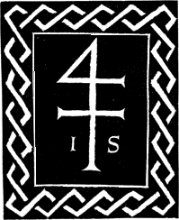
|
| JOHN SIBERCH. |
The earliest Printers’ Marks of Scottish printers are not of the first importance, but they are sufficiently interesting to merit notice. Walter Chepman and Andro Myllar were granted a patent for the erection of a printing-press at Edinburgh on September 15, 1507, the former finding the money and the latter the knowledge. Each had his distinctive Mark, both of which are of French origin—a theory which is easily proved so far as Myllar’s is concerned from the fact that it displays two small shields at the top corners, each charged 96 with the fleur-de-lys. Myllar’s device, in which we see a windmill with a miller ascending the outside ladder, carrying a sack of grain on his back, is an obvious pun on his name, and was, perhaps, 97 suggested by the Mark of Jehan Moulin, Paris. Chepman’s is a very close copy of that of Pigouchet, Paris, the male and female figures being carefully copied even to the small crosses on their knees; the initials W C are elegantly interlaced. Thomas 98 Davidson is a very interesting figure in the early history of Scottish typography; he appears to have been the first king’s printer of his country, and one of his earliest works is “Ad Serenissimum Scotorum Regem Jacobum Quintum de suscepto Regni 99 Regimine a diis feliciter ominato Strena,” circa 1525; about ten years later came a translation of the “Chronicles of Scotland,” compiled by Boece, and “translatit be maister Johne Bellenden;” Davidson’s Mark is of the same character as Chepman’s, but is, if possible, even more roughly drawn and engraved; whilst Bassandyne copied the device of Crespin of Geneva, with the initials T. B. instead I. C. Arbuthnot’s device of the Pelican, which he used in two sizes, and the Marks of Thomas Vautrollier, have been already referred to. Coming down to the last twenty years of the sixteenth century, we find the few books of Henry Charteris of considerable and varied interest, and his Mark, if by no means carefully drawn and engraved, has at all events the merit of being fairly original.
ANDRO MYLLAR.
WALTER CHEPMAN.
THOMAS DAVIDSON.
H. CHARTERIS.
SOME FRENCH PRINTERS’ MARKS.
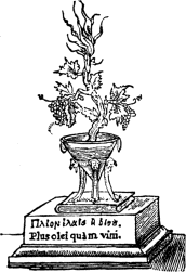
|
| F. ESTIENNE. Full text |
It is rather a curious fact, all things considered, that the introduction of the printing-press into Paris should have only antedated its appearance in this country by four years; such however is the case. It was at the commencement of the year 1470, the tenth of the reign of Louis XI., that Ulrich Gering, Martin Krantz, and Michel Friburger commenced printing in one of the rooms of the College Sorbonne. They had learnt their art at Mayence, and at the dispersal of the office of Fust and Schoeffer had settled down at Basel. They were induced to take up their residence at the Sorbonne by Jean Heinlin and Guillaume Fichet, two distinguished professors of that place. The 101 first book printed at Paris was the “Letters” of Gasparin of Bergamo, 1470, which contains the following quatrain at the end of the work:
“Primos ecce libros quos hæc industria finxit
Francorum in terris ædibus atque tuis;
Michael, Udalrichus, Martinusque magister
Hos impresserunt, ac facient alios.”
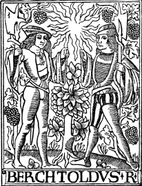
|
| B. REMBOLT. |
By the end of 1472 the three companions had issued thirty works, apparently without indulging in the luxury of a Mark, but their patrons separating they had to leave the Sorbonne. Their new quarters were at the sign of the “Soleil d’Or” in the Rue St. Jacques—the Paternoster Row of Paris. Here they remained until 1477, when Gering was the sole proprietor. He was joined in 1480 by George Mainyal, and in 1494 by Bertholt Rembolt, and died in August, 1510. Within thirty years of the introduction of printing into Paris, there were nearly ninety printers, who issued nearly 800 works between 1470 and 1500. Rembolt, who succeeded Gering and preserved the sign of his office, was one of the earliest, if not the first to adopt a Mark, of which indeed he used four more or less distinct examples. We reproduce one of the rarest; his best known is a highly decorative picture, and has a shield (carrying a cross with the initials B. R. in the lower half of the circle which envelopes the foot of the cross) suspended from a vine tree and supported by two lions. Of this Mark there are at least two sizes; another of his Marks consisted of an enlarged form of the cross to which we have referred.
102After Rembolt, the interest of the Printer’s Mark in France diverges into a number of directions. The most prolific printer was, perhaps, Antoine Vérard, who, dying in 1530, issued books continuously for about forty-five years: he was also a calligrapher, an illuminator, and a bookseller; his Books of Hours led the way for the beautiful productions of Simon Vostre, whilst his chief “line” consisted of romances, of which there are over a hundred printed on vellum and ornamented with beautiful miniatures. He had two Marks, one of which, consisting simply of the two letters A. V., is accompanied by the lines:
103“Pour proquer la grand’ miséricorde,
A tous pescheurs faire grâce et pardon,
Antoine Vérard humblement te recorde.”
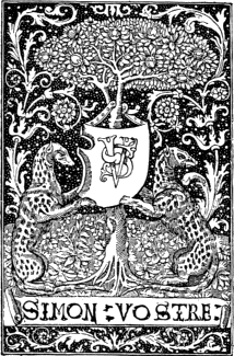
|
| SIMON VOSTRE. |
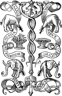
|
| PIERRE REGNAULT. |
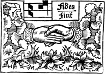
|
| GUY MARCHANT. |
Of the second we give an example on p. 21. Among his publications may be mentioned “L’Art de bien Mourir,” 1492, which Gilles Couteau and J. Menard printed for him, whilst the punning Mark of the former is reproduced in our first chapter (p. 4). François Regnault, who printed a large number of books during the first half of the 105 sixteenth century, had six Marks, chiefly variations on the one here given. He usually placed at the bottom of his books: “Parissis, ex officinâ honesti viri Francissi Regnault”; the accompanying reduced facsimile of one of his title-pages indicates the prominent position allotted at this early period to the printer’s Mark. A very remarkable and elaborate Mark of this family of printers was that of Pierre Regnault, who was putting forth books during nearly the whole of the 106 first half of the sixteenth century. The Marchant family existed in Paris as printers for over 300 years (1481–1789). The first of the line, Guy, or Guyot, who printed books for Jehan Petit, Geoffrey De Marnef, and others, had as Mark four variations of the chant gaillard represented by two notes, sol, la, with one faith represented by two hands joined, in allusion to the words, “Sola fides sufficit,” taken from the hymn, “Pange lingua.” Beneath his Mark he placed the figures of Saints Crispin and Crispinian, patrons of the leather-dressers who prepared the leather for the binder, in which capacity Marchant acted on several occasions for Francis I. As was the case with his contemporaries, Marchant’s earliest books possessed no mark, and one of the first of the publications in which it appeared was the “Compost et Calendrier des Bergiers,” 1496. The De Marnef family also make a big show in the annals of French typography, particularly in the way of Marks, the various members using, between 1481 and 1554, 107 nearly thirty examples, including duplicates, several of which were designed by Geoffrey Tory. Nearly all these Marks had the subject of the Pelican feeding her young as a centre piece. Jerome, however, used a Griffin among his several other examples, of which the two finest of the whole series are those numbered 746 and 812 in Silvestre, and are the work of Jean Cousin at his best. The founder of the family, Geoffrey, used the accompanying device in two sizes. The Janot family, of which the founder, Denys, was the most celebrated, were issuing books in Paris from the end of the fifteenth to the middle of the eighteenth 108 century, and the more noticeable of their Marks contained the device: “Amor Dei omnia vincit—amour partout, tout par amour, partout amour, en tout bien” (see p. 15). The Macé family, which makes a good show with eleven Marks, was also a long-lived one of over 200 years, many of the members residing at Caen, Rennes, and Rouen, besides Paris. The same may be said to some extent of the Dupré or Du Pré family, 1486–1775; the two first, Jean or Jehan and Galliot, were the most celebrated. Of the dozen Marks employed by this family, the most original, it being the evident pun on his name, has a Galiote, at the head of the 109 mast of which is the motto, “Vogue la Guallee,” or sometimes “Vogue la Gualee” (see p. 5). Jehan Du Pré the Lyons printer, used the accompanying Mark formed of his initials. The first as well as the most noted member of the Le Rouge family of printers was Pierre, who resided at Chablis, Troyes, and Paris, and who was the first to take the title of “Libraire-Imprimeur du Roi,” ceded to him by Charles VIII., and used in “La Mer des Histoires,” 1488. Appropriately enough, Michel Le Noir, whose motto we have already quoted, may be here referred to. He issued a large number of books, the most notable, perhaps, being “Le 110 Roman de la Rose,” 1513. He was succeeded by his son Philippe in 1514, one of whose most noticeable publications was “Le Blazon des Hérétiques” (a satirical piece attributed to Pierre Gringoire), the figure or effigy at the head is signed with the monogram of G. Tory. The five Marks of father and son differed only in minor details, and the above example of Philippe will sufficiently indicate the character of the others. Philippe Pigouchet, who was an engraver as well as a bookseller and printer, contented himself apparently with one Mark. He is distinguished for the extreme care 111 with which he turned out his books, particularly the Books of Hours which he undertook to produce in partnership with Simon Vostre; some of his works are freely copied by the publishers of to-day, and might with advantage be even more generally utilized than they are, for they possess all the attributes of beautiful books. Thielman Kerver, a German, was another printer who worked for Simon Vostre, one of his most important productions being a “Breviarium ad usum Ecclesiæ Parisiensis,” 1500, in red and black. His shop was on the Pont St. Michel, at the sign of the Unicorn, which, as will be seen, he adopted as his Mark, 112 and of which there are two, which differ from one another only in minor details. Of Simon Vostre himself, a whole book might be compiled. From about 1488 to 1528 he devoted himself exclusively to the publishing of books, and employed all the best printers: it was by his energy combined with Pigouchet’s technical skill that the two produced, in April, 1488, the “Heures à l’Usaige de Rome,” an octavo finely decorated with ornaments and figures; the experiment was a complete success. It is generally assumed that the engraving was done in relief on metal, as the line in it is very fine, the background stippled, and the borders without scratches: wood could not have resisted the force of the impression, the reliefs would have been crushed, the borders rubbed and badly adjusted. The artistic connection of Pigouchet and Vostre lasted for eighteen years, and with them book production in France may be said to have attained its highest point. By the year 1520 Vostre had published more than 300 editions of the “Hours” for the use of different cities; he had two Marks, of which we give the larger example on p. 103.
FRANÇOIS REGNAULT.
Full text
Text
close-up
107
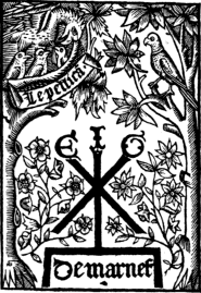
|
108
|
| DE MARNEF. | J. DU PRÉ. |
109
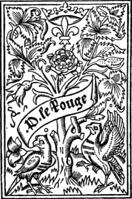
|
110
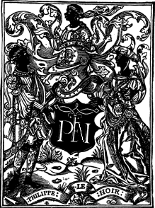
|
| PIERRE LE ROUGE. | PHILIPPE LE NOIR. |
111
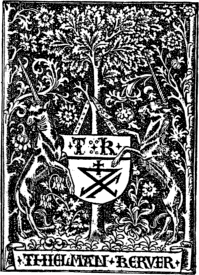
|
| THIELMAN KERVER. |
In many respects Jean or Jehan Petit is one of the most remarkable of the early French printers, whilst from the time he started to the final extinction of his descendants as printers covers a space of 336 years—a record which is probably unrivalled in the history of typography. Jehan Petit kept fifteen presses fully employed, and found a great deal of work for fifteen others. The family as a whole makes a good show with 114 their marks, in which the founder is more extravagant than any of the others, having used, at one time or another, at least half-a-dozen more or less different examples. In addition to reproducing 115 one of the finest, we give, on p. 9, also a reduced facsimile of a title-page of a book, the joint venture of Petit and Kerver; the combination of the two names on one title-page is distinctly novel and curious. He was on several occasions associated with others in producing a book, his connection with Josse Bade extending from 1501 to 1536. Of Bade or Badius it will be necessary to give a few particulars. He was born at Asche, near Brussels, and was a scholar and a poet as well as a printer. About 1495–7 he was engaged as a corrector of the press for Treschel and De Vingle at Lyons. He left about 1500 for Paris, where he started a press in 1502, which he called “Prelum 116 Ascensianum.” In reference to this term, “the Ascension Press,” the word “prelum” was applied to the ancient wine presses, after which, in fact, the earliest printing presses were modelled. His Mark, which he first used in 1507, is the earliest picture of a printing-press. Thirteen years after, he adopted another device with the same subject, but differing in many important particulars. In the second, the composing-stick used by the figure in the act of setting type is changed from the right 117 to the left hand; the press shows improved mechanical construction, indicating greater solidity and strength. In the latter example also the figure sitting at the case on the right side of the engraving is intended to represent a woman, instead of a man as in the earlier illustration. Contemporary with both Petit and Bade, Gilles or Gillet Hardouyn, 1491–1521, was both a printer and a bookseller, and used two Marks, of which we give the more striking. Germain Hardouyn, possibly a son of the preceding, confined himself more particularly to selling books during the first forty years of the sixteenth century.
PHILIPPE PIGOUCHET.
JEHAN PETIT.
115
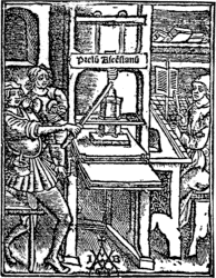
|
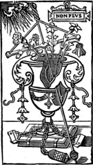
|
| J. BADE. | GEOFFREY TORY. |
116
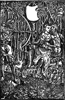
|
| GILLET HARDOUYN. |
Geoffrey Tory resembled many others of the early printers in being also a scholar; but he was 118 also an artist and an engraver, taking up and carrying on the great work inaugurated by Vostre and Vérard. He was born at Bourges in 1480, and one of his earliest works, which was published by Petit and printed by Gilles De Gourmont, was an edition of the “Geography” of Pomponius Mela, 1507, and between this time and his death he produced a number of Books of Hours, the decoration of which can only be described as marvellous. One of the most beautiful is undoubtedly the “Heures de la Vierge,” executed for Simon De Colines. What interests us most, however, is the Mark which he adopted when he entered into business as a printer and bookseller; it is perhaps the most elegant that had been up to that time designed. This Mark of the broken pitcher, with the motto “Non plus,” first appeared at the end of a Latin poem issued in 1524, is regarded as a memento of the death of his little daughter in 1522, and is thus explained: the broken pitcher symbolizes her career cut short; the book with clasps her literary studies; the little winged figure her soul; and the motto “Non plus,” “Je ne tiens plus à rien.” He gives his own interpretation of this Mark, however, in that curious medley of poetry and philosophy which he called “Champfleury,” 1529. It may be mentioned that on some of the bindings of his quarto volumes the broken pitcher is transversed by the wimble or toret—an obvious pun on his name.
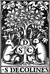
|
| SIMON DE COLINES. |
The Estienne or Etienne family is probably the most important and interesting of the sixteenth century printers of Paris. Silvestre reproduces 119 twenty Marks which one or other of the Estiennes employed, and a description of these might very well form a distinct chapter. But a condensed review of the family as a whole must suffice. Henry, the first of the name and chief of the family, was born at Paris about 1470; he started in 1502 a printing and bookselling business in the Rue du Clos-Bruneau, near the Ecoles de Droit; he adopted the device, “Plus olei quam vini”; and twenty-eight works are catalogued as having been printed by him. He died in 1521, leaving a widow and three children—François, Robert, and 120 Charles. François I. continued the profession in company with Simon De Colines, who had been associated with his father, and who married the widow of Henry: his Mark is given as an initial to this chapter. Robert I., the second son of Henry, was born in 1503, and is probably more generally known as a Greek, Latin, and Hebrew scholar than as a printer. For several years he, like his brother, was associated with De Colines; he married Pétronille, daughter of Badius “Ascensius,” and was a Protestant; in 1526 he established a printing-press in the Rue St. Jean-de-Beauvois at the sign of the Olive. His editions of the Greek and Latin classics were enriched with useful notes, 121 and promises of reward were offered to those who pointed out mistakes. He used the types of his father and De Colines until about 1532, when he obtained a more elegant fount with which he printed his beautiful Latin Bible. In 1552 he retired to Geneva, when he printed, with his brother-in-law, the New Testament in French. He established here another printing-press, and issued a number of good books, which usually carried the motto: “Oliva Roberti Stephani.” His Marks are at least ten in number, of which seven are variations of the Olive device, and three 122 (in as many sizes) of the serpent on a rod intertwined with a branch of a climbing plant. With the exception of François the other members of the family used the Olive mark, sometimes however altering the motto, and adding in some instances an overhead decoration of a hand issuing from the clouds and holding a sickle or reaping hook. He died in 1559. The third son of the founder, Charles, after receiving his diplomas as a doctor of medicine, travelled in Germany and Italy, returning to Paris in 1553, and started in business as a printer. Among the ninety-two works which he printed, special mention may be made of the “Dictionarium historicum ac poeticum, omnia gentium, hominum, locorum,” etc., Paris, 1553, reprinted at Geneva in 1556, at Oxford in 1671, and London, 1686. He possessed the opposite attributes of being the best printer and of having the worst temper of the family, and he alienated himself from all his friends and relations; he was confined in the Chatelet in Paris, and died there after two years in 1564. Henry II., son of Robert I., was born in Paris in 1528; after leaving college he travelled on the continent and visited England. He returned to Paris in 1552, when his father was leaving for Geneva. In 1554 he started a printing-press; in 1566 he published a translation of Herodotus by Valla, revised and corrected, defending, in the preface, the Father of History against the reproach of credulity. Charles, brother of Robert I., established a printing-press in 1551, and died crippled with debts in 1564. Robert II., second son of Robert I., was born in 1530, and, 123 refusing to adopt the new religion, was disinherited by his father; he started a printing-press on his own account when his father retired to Geneva, and issued forty-eight books, some of which possessed the mark of the Olive; he was the royal printer in 1561, and died in 1575. François II., third son of Robert I., printed in Geneva from about 1562 to 1582. Robert III., elder son of Robert II., died in 1629. Paul, son of Henry II., was born in 1566, and, after a brilliant scholastic career, travelled on the continent, and started a printing-press at Geneva in 1599, where he issued twenty-six editions of the classics which were particularly notable for their correctness and notes. He died in 1627, and his son Antoine, born 1594, established himself at twenty-six years of age as a printer in Paris, reverted to Roman Catholicism, was appointed printer to the king and to the clergy, dying at the Hotel Dieu in 1674. The number of editions which this celebrated family, starting in 1502 and finishing in 1673, issued, reaches the very large number of 1590, thus classified: theology, 239; jurisprudence, 79; science and arts, 152; belles lettres, 823; and history, 297. Of the eleven members of this family, one died in exile, five in misery, one in a debtor’s prison, and two in the hospital—“Lecteur, que vous faut-il de plus?”
120
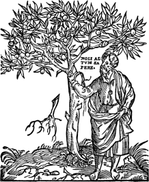
|
121

|
| R. ESTIENNE. | ROBERT ESTIENNE. |
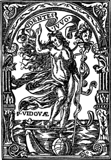
|
| P. VIDOUE. |
Although in France, as elsewhere, we have to look to the printers of the fifteenth century for originality and decorative beauty, some exceedingly interesting Marks occur in the sixteenth, and are well worth studying. We have only space for 124 the enumeration of a few of the more important. Of these, Pierre Vidoue comes well in the first rank. He was one of the most distinguished of the early Parisian Greek typographers, besides being a person of learning and eminence, and was issuing books up to the year 1544; his edition of Aristophanes, 1582, published by Gilles De Gourmont, is described as “a singularly curious impression,” whilst ten years later he printed Guillaume Postel’s “Linguarum XII. characteribus differentium Alphabetum,” which is described by La Caille as 125 the “first book printed in oriental character,” a statement, however, which is incorrect so far as relates to the Hebrew. He had at least three Marks, all more or less similar, in one of which, however, the motto “ardentes juvo,” is supplemented by “par sit fortuna labori.” Of the six Roffets who were printing or publishing books in Paris during the sixteenth century, the most notable is perhaps Pierre, whose name frequently occurs in the bookbinding accounts of Francis I.; of their seven Marks, nearly all more or less of the same “rustic” character, the most decorative is that of Jacques (see p. 30). In their separate ways, the Marks of Mathurin Breuille, 1562–83 (p. 33), and Louis Cyaneus, 1529–46, each possesses a pleasing originality, the latter of which is inscribed with the motto “Tecum Habita.” The two Wéchels, André and Chrestien, were among the most eminent of the sixteenth century Parisian 126 printers, and between them employed over a dozen marks. All those of André were variations of one type, namely, two hands holding a caduceus between two horns of plenty surmounted by Pegasus. This had also been used by Chrestien, of whose other Mark a reproduction is here given, and of which there were several variations. Regnault Chaudière’s shop was in the Rue St. Jacques, at the sign of “L’homme Sauvage,” which he adopted for his Mark: this he appears to have changed for one emblematical of Time when he took his son into partnership, and which, Maittaire thinks, he may have borrowed of Simon De Colines, whose daughter (and only child) he married. We give the largest of the examples used by Guillaume Chaudière, 1564–98 on p. 28. Sébastien Nivelle, who was working during the latter half of the sixteenth century until the third year of the seventeenth century, is a very interesting 127 figure in the typographical annals of Paris. He was, at the time of his death at the age of eighty years, the doyen of the trade. His books were, for the most part, beautifully printed. His shop was in the Rue St. Jacques at the sign of the Two Storks, which he adopted for his exceedingly beautiful Mark, the four medallions representing scenes of filial piety. His daughter was the mother of Sébastien Cramoisy, “typographus regius,” who inherited the establishment of his grandfather. 129 Of the somewhat crudely drawn Mark—an evident pun on his surname—used in or about 1504, by Guillaume Du Puys, the sign of the shop being the Samaritan, a much more decorative example was used, in various sizes, by Jacques Du Puys (p. 11), who was a bookseller, 1549–91, rather than a printer. Equally fine in another way is the tripartite example, given on page 130, used by Guillaume Merlin in partnership with Guillaume Desboys and Sébastien Nivelle, in 1559, and also with the latter in 1571. The Mark is the interpretation of the four lines:
“Veniet tempus meissionis.
Non oderis laboriosa opera.
Homo nascitur ad laborem,
Vade, piger, ad formicam.”
125
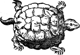
|
126
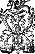
|
| LOUIS CYANEUS. | ANDRÉ WÉCHEL. |
On the opposite page we reproduce the Mark Nivelle used for the books which he produced alone.
SÉBASTIEN NIVELLE.
127
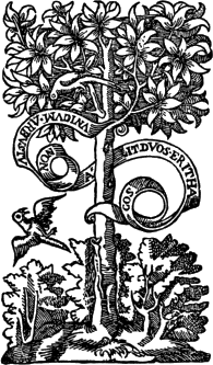
|
| CHRESTIEN WÉCHEL. |
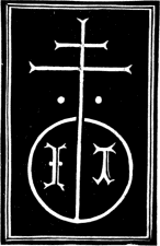
|
| J. TRESCHEL. |
After Paris, the next most important town in France, so far as printers and their Marks are concerned, is Lyons. The first book printed in this city is presumed to be “Cardinalis Lotharii Tractatus quinque,” “Lugduni, Bartholomæus Buyerius,” 1473 (in quarto). The same printer also published the first French translation of the Bible, by Julian Macho and Pierre Ferget, which was executed between 1473 and 1474, from which date the art of printing in Lyons increased by leaps and bounds. Panzer notices over 250 works executed (by nearly forty printers) here during the quarter of a century which followed. The most notable among these is perhaps Josse Bade, to 131 whom we have already referred. The former of the two “honestes homes Michelet topie de pymont: & Iaques heremberck dalemaigne,” possessed a Mark which may be regarded as one of the earliest, if not actually the first, employed at Lyons. Topie and Heremberk printed the first edition of the “Chronique Scandaleuse,” about 1488, and Breydenbach’s “Voyage à Jerusalem,” of about the same period—the latter of which contains the first examples of copper-plate engraving in France, the panorama of Venice alone being sixty-four inches in length. Contemporary with 132 these, Johannes or Jehan Treschel deserves notice not only as an eminent printer, but also as the father-in-law of one still more eminent—Bade. Treschel’s illustrated edition of Terence, 1493, is described as forming “the most striking and artistic work of illustration produced by the early French school.” The most generally known of all the Lyonese printers is Etienne Dolet, who, born at Orleans in 1509, distinguished himself not only as a printer, but as a Latin scholar, a poet, and an orator; he was burnt as an atheist in August, 1546. Dolet, as Mr. Chancellor Christie tells us in his exhaustive monograph, adopted a Mark and motto which are to be found in all or nearly all the productions of his press. The Mark and the motto are equally allusive: the former is an axe of the 133 kind known as doloire, held in a hand which is issuing out of a cloud. Below is a portion of a trunk of a tree; it is usually surrounded by the motto, “Scabra et impolita ad amussim dolo atque perfolia”; it is often also surrounded by an ornamental woodcut border, as in the accompanying illustration; and in some cases the words “scabra dolo” are printed on the axe.
MERLIN, DESBOYS AND NIVELLE.
131
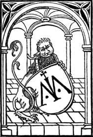
|
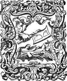
|
| M. TOPIE. | E. DOLET. |
Two contemporary Lyonese firms of printers, the De Tournes and De la Portes, appear to have rivalled one another in the number of their Marks. Jean De Tournes, 1542–50, himself had no less than eleven Marks, several of which are exceedingly 134 graceful, one of the largest and best of which represents a sower, and serves as an excellent pendant to the reaper of Jacques Roffet, both of which appear in our first chapter. The seven or eight members of the De la Porte family used at least half a score Marks between them. The family, beginning with Aymé De la Porte in the last decade of the fifteenth century, and ending with Sibylle De la Porte, were in business first as printers, then as booksellers, for just a century; and the punning device apparently originated, not 135 with the first member of the family, but with Jehan, who started a business in Paris about 1508, and in his Mark the shield bears a castellated doorway; the picture of the biblical Samson carrying off the gates was apparently first used by Hugues De la Porte, who was a bookseller at Lyons from 1530; this was superseded for the more pictorial and considerably smaller example, here given, when he entered into partnership with Antoine Vincent about 1559. Although the Du Prés were Parisian printers, Jehan of that family issued several books at Lyons during the last few years of the fifteenth century, and one of his three Marks is given on p. 108. 136 Sébastien Gryphe, or Gryphius, who printed and published a large number of works during the second quarter of the sixteenth century, was also extravagant in the way of Marks, of which there are at least eight, all, however, of one common type—the Griffin, sometimes quite without any sort of decorative attributes or motto, and sometimes as in the example here given.
HUGUES DE LA PORTE AND A. VINCENT.
135
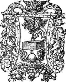
|
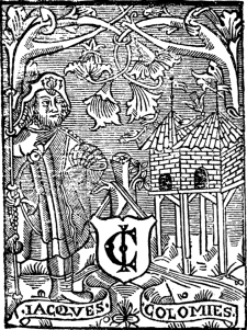
|
| SÉBASTIEN GRYPHE. | JACQUES COLOMIES. |
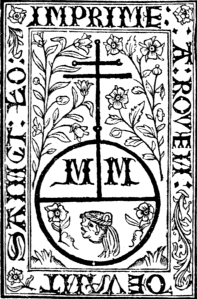
|
| M. MORIN. |
So far as regards the French cities and towns, we have only space to refer briefly to a few of the more important. After Paris and Lyons, Toulouse was one of the earliest places in France in which 137 a printing-press was set up. Although not the first, Jacques Colomies was one of the first, as he was one of the most prolific of the early printers of Toulouse, working from 1530 to 1572. Printing was established at Caen in 1480; but Pierre Chandelier, whose punning Mark we give, did not start work until eighty years after its first introduction. A punning device (p. 7), also is that of Jehan Lecoq, who was printing at Troyes from about 1509 to 1530. The only Rouen printer to whom we shall refer is Martin Morin, who appears to have been at work here as a printer from about 138 1484 to 1518, and of his Marks we give one example; another is formed of a large initial M, decorated with a variety of grotesque heads, with the surname Morin on the two central strokes of the letter.
PIERRE LE CHANDELIER.
PRINTERS’ MARKS OF GERMANY
AND SWITZERLAND.
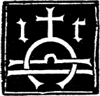
|
| JACOBI THANNER. |
Although the early history of the Printer’s Mark in Germany is neither extensive in variety nor startling in surprises, there are still very many features of general interest. And if the Printer’s Mark, as we have already seen, had its origin in Mainz, its development is certainly due to the Strassburg craftsmen. As no other city in Germany can show such a varied collection of beautiful Marks, examples of the Strasburg printers will preponderate in this chapter. It is now generally accepted that the art of printing was carried on in Strassburg (Argentina, Argent-oratum), either in 1459 or 1460, by Johan Mentelin, who appears to have continued in the business until 1476; and about six years after he had started, Heinrich Eggestein commenced, and continued until about 1478. Accepting the arrangement of Herr Paul 140 Heitz and Dr. Karl August Barack in their very elaborate “Elsässische Büchermarken bis Anfang des 18. Jahrhunderts,” the first Strasburg printer to use a Mark was Johann Grüninger, who, after working at Basel for a year or two, took up his residence in Strassburg at the end of 1482. One of his first Marks appeared in Brant’s “Narrenschiff,” 1494, and of this our example is an elaboration. By the year 1525 he employed no less than five distinct examples, the last of which, in Ptolemæus, “Geographicæ Enarrationes,” 1525, differs completely from all the others, the single letter G occupying the centre of the masonic compass and rule. Grüninger, it may be noted, was the printer of “Cosmographie Introductio,” 1509; the second 141 edition of the famous book in which the name America was proposed and used for the first time. He is further noted for the number of misprints which occur in the books issued by him. The last book which bears his imprint is apparently “Geberi philosophi ac alchimistæ maximi, de Alchimia, libri tres,” March, 1529. Martin Schott’s distinct device is found in at least three books of the date 1498, including Matheolus’ “Ars memorativa,” and was used by him until 1517. It was also used by his son, Johann Schott, about 1541, the same printer using seven or eight other Marks, all more or less distinct, at different periods. The first book bearing Martin Schott’s name is dated 1491, and he continued printing until 1499; while his son was in business from 1500 to 1545. Equally distinct is the accompanying example—one of 142 several—used by Johann Knoblouch, which is found in the majority of the books printed by him from about 1521 to 1526, notably several works by Erasmus (e.g. “Moriæ Encomium,” 1522, and the “Novum Testamentum,” 1523). The father started in 1497, and was succeeded by his son, who continued the business until 1558. The Mark, it may be mentioned, is a somewhat atrocious pun on the owner’s name, which is the German for “garlic,” with the seed pods of which the figure 144 emblematically representing Ignorance ascending from darkness into light is encircled; this Mark is generally surrounded by mottoes in Greek, Hebrew, and Latin.
140
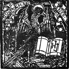
|
141
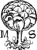
|
| JOHANN GRÜNINGER. | MARTIN SCHOTT. |
JOHANN KNOBLOUCH.
REINHARD BECK.
REINHARD BECK.
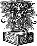
|
| WOLFGANG KÖPFEL. |
Although Reinhard, or Renatus, Beck was only in business for about eleven years, 1511–1522, he had several Marks, which differed chiefly in their extraneous ornament, as will be seen from the accompanying examples. Two books, sine nota, which Mr. Quaritch assigns to Beck’s press, 146 of the date 1490, are remarkable for the large number of woodcuts which they contain, relating principally to plants, animals, gardening operations, rural architecture, so that the Mark of “ein wilder Mann” is so far in keeping with the nature of his publications. Fourteen or fifteen Marks, several of which are only variations of one type, have been identified as having been used by Wolfgang Köpfel (whose surname sometimes appears in its Greek translation of Cephalæus) between 1522 and 1554: the most remarkable, of which we give a reproduction, appears to have been used very rarely, notably in “Zehn Sermones” of Luther, 1523; a much commoner type is the smaller example, which appeared in various books issued between 1526–1554. Georg Ullricher von Andlau, 1529–36, confined himself to one type (see p. 1), that of the Cornucopia or Horn of 148 Plenty, of which there are seven variants. The more elaborate of the two Marks of Matthias Biener, or Apiarius, 1533–36, appears in Oecolampadius’ “Commentarius” on the Prophet Ezekiel, 1534, and is an evident pun on the printer’s surname. Several of the dozen Marks used by Craft 150 Müller, or Crato Mylius, 1536–62, are exceedingly bold and picturesque, although, with the exception of the Ceres, they are all variants of the leonine type: the Ceres was apparently used only in his first book, “Auslegung oder Postilla des heil. Zmaragdi,” 1536.
WOLFGANG KÖPFEL.
CRAFT MÜLLER (CRATO MYLIUS).
MATTHIAS BIENER (APIARIUS).
Full text
CRAFT MÜLLER.
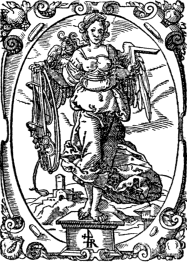
|
| THEODOSIUS RIHEL, JOSIAS RIHEL (UND DEREN ERBEN). |
Wendelin Rihel was the founder of one of the longest-lived dynasties of Strassburg printers, who were issuing books from 1535 to 1639; their eighteen Marks have all the same subject, a winged figure of Sophrosyne, holding in one hand a rule, and in the other a bridle and halter. Of Thiebold Berger, who appears to have been in business 152 from 1551–1584, very little is known, either of his books or his personality; his Mark is, however, pretty, and unique, so far as Strassburg is concerned. Lazarus Zetzner and his successors, whose works date from 1586 to 1648, and whose Marks number nearly thirty, all variants of the example here given: it is a bust of Minerva supported on a short square pedestal, on which is inscribed the words “Scientia immutabilis.” This family printed a large number of works, from a Lutheran Bible to Aretini’s “Historiæ Florentinæ.” As an example of a rare and distinct Mark we give one of two employed by Conrad Scher, 1603–31, which was subsequently used by Johannes Reppius, also of Strassburg. Curiosity is the only feature of the solitary example of David Hauth, 1635.
151
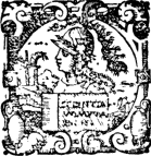
|
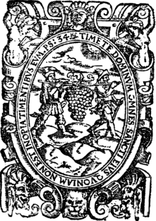
|
| LAZARUS ZETZNER. | |
| THIEBOLD BERGER. |
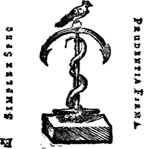
|

|
| CONRAD SCHER. | DAVID HAUTH. |
J. R. DULSSECKER.A
But of all the Strassburg printers, there can be no doubt that, from a strictly pictorial point of view, the Marks of Johann Reinhold Dulssecker, 1696–1737, are by far the most beautiful. Indeed, in many respects they are the most charming examples to be found among the devices of any time or country. In some instances they partake much more of the character of a vignette than a tradesman’s mark. His earliest device is composed of his monogram; and his first decorative Mark is the very beautiful little picture of an English 154 garden, in the central pathway of which occurs his initials. This Mark appears to have been used in only one book, “M. Fabii Quinctiliani Declamationes ... ex recensione Ulrici Obrechti,” 1698. A type of Mark very frequently used by him occurs in Schilter’s “Scriptores Rerum Germanicarum,” 1702, with his motto of “Dominus providebit,” and of this Mark we give an excessively rare variant on p. 47. He had eleven Marks, his list includes books of all kinds, in Latin, German, and French.
JOHANN REINHOLD DULSSECKER.
Of the other Alsatian printers we have only 155 room to refer to two examples. Thomas Anshelm (or Anshelmi Badensis) is perhaps the most eminent of the early Hagenau printers, his books dating from 1488 to 1522, the earliest of which, however, were not printed at this place. His Marks all carry the initials T A B, the Hebrew letters in the accompanying example representing the name Jehovah; in his most elegant Mark the same word is supported on a scroll by a cherub, whilst another cherub is supporting a second scroll on which is inscribed the word Jesus in Greek characters. The style and workmanship of this woodcut suggest the hand of Hans Schaufelein, and it is worth noting that in 1516 Anshelm produced “Doctrina Vita et Passio Jesu Christi,” 156 some of the illustrations of which were by Schaufelein. Anshelm issued a large number of books, including the works of Pliny, Melancthon, Erasmus, Cicero, etc. Valentin Kobian, 1532–42, inserted an exceedingly original and striking Mark in the edition of Erasmus’ “Heroicum Carmen,” 1536, the Peacock with one foot on a Cock and the other on a crouching Lion being highly effective.
VALENTIN KOBIAN.
Full text
155
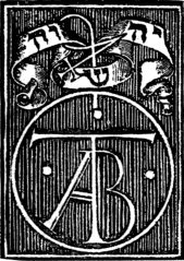
|
|
| THOMAS ANSHELM. Full text |
A. THER HOERNEN. Full text Text close-up |
Printing had not established itself at Cologne until four years later than at Strassburg. Ulric Zell, at the dispersal of the Mainz printers, settled himself in this city, where he was printing from about 1463 to nearly the end of the fifteenth century. He was clearly not an innovator, for he never printed a book in German, and did not adopt any of the improvements of his confrères who had settled themselves in Italy; he “rigidly adhered to the severe style of Schoeffer, printing all his books from three sizes of a rude face of a 159 round gothic type.” It is not to him therefore that we can look for anything in the way of Printers’ Marks, the earliest Cologne printer to adopt which was apparently Arnold Ther Hoernen, whose colophons, of which we give an example, were often printed in red. His Mark is a triangle of which the two upright sides are prolonged with a crosslet; in the centre a star, and on either side the gothic letters T H, the whole being on a very small shield hanging from a broken stump. Herman Bumgart, one of whose books bears the subscription “Gedruckt in Coelne up den Alden Mart tzo dem wilden manne,” and who was in Cologne at the latter end of the fifteenth century, has a special interest to us from the probability that he was in some way connected with the early Scottish printers.
HERMAN BUMGART.
Once started, the idea of the Mark was quickly taken up. Johann Koelhoff, 1470–1500, the first printer to use printed signatures (in his edition of Nyder, “Preceptorium divinæ legis,” 1472), came out with a large but roughly drawn example, the arms of Cologne, consisting of a knight’s helmet, with peacock feathers, crest, and elaborate mantles, surmounting a shield with the three crowns in chief, the rest of the escutcheon blank, and rabbits in the foreground. Koelhoff (who describes himself “de Lubeck”) was the printer of the “Cologne Chronicle,” 1499, and of an edition of “Bartholomæus de Proprietatibus Rerum,” 1481. Several interesting Cologne Marks of the first years of the sixteenth century may be noted. For instance, Eucharius Cervicornus, 1517–36, used a caduceus on an 161 ornamented shield, and printed among other books what is believed to be the earliest edition of Maximilianus Transylvanus’ “De Moluccis Insulis,” 1523, in which the discoveries of Ferdinand Magellan and the earliest circumnavigation of the globe were announced. Like Koelhoff, Nicolas Cæsar, or Kaiser, who was established as a printer at Cologne in 1518, used the Cologne arms as a Mark, which is sufficiently distinct from the earlier example to be quoted here. Johann Soter, 1518–36, is another exceedingly interesting personality in the early history of Cologne printing. We give 162 the more elaborate of the two marks used by him and reproduced by Berjeau: the shield contains the Rosicrucian triple triangle on the threshold of a Renaissance door. During the latter end of his career at Cologne, Soter had also an establishment at Solingen, where he printed “several works of a description which rendered too hazardous their publication in the former city.” Arnold Birckmann and his successors, 1562–92, used the accompanying Mark of a hen under a tree. After Günther Zainer, 1468–77, who introduced printing into Augsburg, the most notable typographer of this city is perhaps Erhart Ratdolt, to whom reference is made in the chapter on Italian Marks. We 163 give the rather striking Mark—a white fleur-de-lis on black ground springing from a globe—of Erhart Oglin, Augsburg, 1505–16, one of whose productions, by Conrad Reitter, 1508, is remarkable as having a series of Death-Dance pictures; Hans Holbein was eight years of age when it appeared, and was then living in his native town of Augsburg.
JOHANN KOELHOFF.
161
|
162
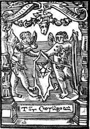
|
| NICHOLAS CÆSAR. | J. SOTER. Full text |
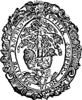
|
| ARNOLD BIRCKMANN. |
For typographical purposes Switzerland may be regarded as an integral portion of Germany, and it was to Basle that Berthold Rodt of Hanau, one of Fust’sworkmen, is assumed to have brought the art about the year 1467. One of the first Basle printers to adopt a Mark was Jacobus De Pfortzheim, 1488–1518, who used two very distinct examples, of which we give the more spirited, the left shield carrying the arms of the city in which he was working. It appears for the first time in 164 “Grammatica P. Francisci nigri A. Veneti sacerdoti oratoris,” etc., 1500. The second Mark is emblematical of the Swiss warrior. The most eminent of the Basle printers was however Johann Froben, 1490–1527, who numbered among his “readers” such men as Wolfgang Lachner, Heiland, Musculus, Oecolampadius, and Erasmus. Very few, if any, German works were printed by him; the first edition of the New Testament in Greek was printed by him in 1516, Erasmus being the editor. Froben’s device (to which lengthy reference 166 has already been made, and into a discussion of the extremely numerous variants of which we need not enter here) led Erasmus to think that his learned friend did indeed unite the wisdom of the serpent to the simplicity of the dove (see p. 43). Two other early Basle printers, Michael Furter, 1490–1517, and Nicholas Lamparter, 1505–19, used Marks one shield of each of which carried the arms of Basle. Henricpetri was a celebrated printer of Basle, 1523–78, and had a Mark of quite a unique character, representing Thor’s hammer, held by a 167 hand issuing from the clouds, striking fire on the rock, while a head, symbolizing wind, blows upon it. To yet another distinguished Basle printer, Cratander, reference is made, and his Mark given, in the second chapter.
ERHARD OGLIN.B
JACOBUS DE PFORTZHEIM.
HENRICPETRI.
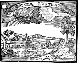
|
| WILHELM MORITZ ENDTER’S DAUGHTER. |
The most famous, as he was one of the earliest, if not actually the first, printers of Nuremberg, or Nürnberg, Anthony Koberger, does not appear to have used a Mark. Indeed, the Printers’ Marks of Nürnberg generally do not make anything like so good a show as those of Cologne and other large German cities. The earliest Mark of all is probably that of Wilhelm Moritz Endter’s daughter, which represents a rocky landscape, with a town in the background lighted by the sun. Endter’s books, it may be mentioned, are excessively rare. A much better known printer of this place is Johann Weissenburger, 169 who started here in 1503, and continued until 1513, when he removed to Landshut, and remained there until 1531. He used the accompanying Mark at both places,—the precise signification of the letters H H on one side of the globe is not known. Mr. Quaritch describes a book of 170 Jacobus Locher, published by this printer in 1506, which is remarkable as containing a number of woodcuts “which, in their style and spirit, draw the book into close connexion with the ‘Ship of Fools.’”
J. WEISSENBURGER.
MELCHIOR LOTTER.
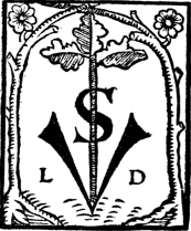
|
| V. SCHUMANN. |
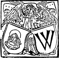
|
| CONRAD BAUMGARTEN. |
Several of the Marks of the early printers of Leipzig, into which printing was introduced in 1480, are of great interest and possess quite a character of their own. One of the earliest, for example, is that of Melchior Lotter, who issued a large number of books from 1491 to 1536. The word “Lotter” is equivalent to “vagabond” in English, and the Mark herewith consists of an emblem of a mendicant in a half-suppliant posture. Melchior Lotter junior was printing at Wittenberg from 1520 to 1524, where he printed anonymously the first edition of Luther’s Bible, with illustrations by Lucas Cranach, 171 1522, which an enthusiastic bibliopole has described as “one of the great works of the world.” Valentin Schumann, 1502–34 (and probably much later), is another eminent Leipzig printer, being the first to attempt printing in Hebrew characters in a Hebrew grammar, 1520. The initials L D on his Mark are taken to signify “Lipsiensis Demander” or Damander, a rude Latinization of Schumann which he sometimes used. Sufficiently quaint also is the Mark of Jacobus Thanner, 1501–21, which forms the initial to the present chapter. By 1500 printing had reached to Olmütz, where Conrad Baumgarten was issuing until 1502 works chiefly levelled against the Church of Rome; from 1503 to 1505 the same printer had established 172 himself in Breslau, which he again changed for Frankfort-am-Oder, 1507–14, removing again in the latter year to Leipzig. The W on one of the shields of his Mark is the initial of Wratislau, the Polish name of Breslau, and the female saint on the other shows the arms of the town. It appears to be uncertain whether printing was introduced into Frankfort-am-Main in 1511 or 1530; but the only Mark which we need quote is that of Johann Feyrabendt, whose chief interest to posterity lies in the fact that he printed Jost Ammon’s “Künstliche wohlgerissene neu Figuren von allerley Jagtkunst,” 1592: his Mark is emblematical of Fame, winged, blowing a German horn, and enclosed in a cartouche. Andreas Wechel was printing at Frankfort from 1573 to 1581, his Mark being the well-known one of the Pegasus. Although Jacob Stadelberger, Heidelberg, was not by any means an eminent printer, his Mark is well 173 worthy of note: it consists of three shields, the right of which bears the arms of Bavaria, the left a lion rampant, the arms of Heidelberg, and that of the middle is supposed to represent the arms of Zurich.
172
|
|
| J. FEYRABEND. | L. GUERBIN. |
JACOB STADELBERGER.
Adam Steinschawer is said to be the printer of the first book issued at Geneva, in 1479; soon after him came Guerbin, 1482, whose Mark we give after Bouchot. From about 1537 to 1554 Jehan Girard, or Gerard, was busy printing books here; the Mark 174 herewith comes from one of Calvin’s books, 1545, the Latin motto being anglicized thus: “I came not to send peace, but a sword,” a very proper motto indeed for such an author. Girard used three other Marks of this type. The position of Geneva in literature is French rather than German, and this also holds good with regard to its typographical annals. The accompanying Mark of Jean Rivery, Geneva, 1556–64, is distinct of its kind, and is the smaller of the two examples used by this printer; in the larger one, the same motto appears, but in roman type, not italic; there are also only two trees, both nearly leafless; the hand holding an axe occurs in both examples. Many French printers, for various reasons, and at different times, “retired” to Geneva, as, for example, the Estiennes; the Marks of several Franco-Genevan printers therefore will be found dealt with in the previous 175 chapter. Although printing appears to have been introduced into Zurich in 1508, books executed at this place prior to 1523 are excessively rare. Christopherus Froschover, 1523–48, was by far the most eminent and prolific of the early Zurich printers; to him has been attributed the production of the first English Bible. His Mark is a punning one, Frosch being German for “frog;” it is emblematical of a gigantic frog ridden by a child under 176 a tree, the “larger growth” being surrounded by several of the normal size. Of other Swiss printers whose Marks we reproduce, but to whom we can make no further reference, are Nicolas Brylinger, Basle, 1536–65 (the accompanying example is taken from the title-page of “Pantalonis Henrici, Prosopographiæ Heroum atque illustrium Virorum totius Germaniæ,” 1565, a folio of three volumes, full of fancifully drawn portraits, the same portrait being often used for several men), and F. Le Preux, of Lausanne, Morges, and Berne.
174
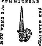
|
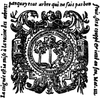
|
| JEHAN GIRARD. | J. RIVERY. Full text |
C. FROSCHOVER.
N. BRYLINGER.
177F. LE PREUX.
SOME DUTCH AND FLEMISH
PRINTERS’ MARKS.
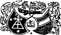
|
| J. VELDENER. |
The introduction of the art of printing into the Low Countries, and the rival claim of Coster and Gutenberg, have proved a highly fruitful source of literary quarrels and disputations. It is not worth our while to enter, even briefly, into the merits of the arguments either for or against; and it will suffice for our present purpose to regard Johann Veldener, 1473–7, as the first printer. He was probably a pupil of Ulric Zell, and, like many others of the early Netherland printers, he does not appear to have remained long at one place. For example, he was at Louvain from 1473–7, at Utrecht 1478–81, and at Culemberg, 1482–4. His only Mark appears to be that given herewith, in which his name in an abbreviated form occurs between the 179 two shields, on the right one of which appears the arms of Louvain. His most notable publications were two quarto editions of the “Speculum” in the Dutch language, one of which contained 116 and the other 128 illustrations, “printed from the woodcuts that had been previously used in the four notable editions; to make these broad woodcuts, which had been designed for pages in folio, Veldener cut away the architectural framework surrounding each illustration and then sawed each block in two pieces.” He received from the University the honorary title of Master of Printing, an honour which was also conferred on his more distinguished contemporary, Johann of Westphalia, 1474–96, for whom in fact is claimed the priority of the introduction of printing into Louvain. The first of the large number of books produced by the latter is by Petrus de Crescentiis, “Incipit liber ruraliū cōmodorū,” 1474, its colophon being printed in red. The accompanying exceedingly curious “souscription,” with portrait of the printer, is given from Lambinet’s “Recherches.” 180 Thierry Martens, or Mertens, or Martin d’Alost (Theodoricus Martinus), may be regarded either as an early printer of Louvain, Antwerp, or Alost, for it is stated that he had presses working simultaneously at the three places; but Alost has the first claims, and it is said that he was printing here in 1473, although as a matter of fact he was only twenty years of age at this period. He was a distinguished scholar, and the friend of Barland 181 and Erasmus, the latter making the following reference to the accompanying Mark, “l’ancre sacrée,” in the epitaph he wrote as a memorial of his friend:
“Hic Theodoricus jaceo, prognatus Alosto:
Ars erat impressis scripta referre typis.
Fratribus, uxori, soboli, notisque superstes,
Octavam vegetus præterii decadem.
Anchora sacra manet, gratæ notissima pubi:
Christe! precor nunc sis anchora sacra mihi.”
JOHANN OF WESTPHALIA.
Full text
THEODORIC MARTENS.
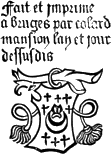
|
| COLARD MANSION. |
Colard Mansion, 1474–84, the first printer who worked at Bruges, for an exhaustive account of whose connection with William Caxton the reader is referred to Mr. Blades’s monograph, used several Marks, printed in red and black, and similar to the example here given.
In many respects the “Clercs ou Frères de la vie Commune” (Fratres vitæ communis), who were printing at Brussels from 1476 to 1487, form one of the most interesting features in the 183 early history of printing in the Low Countries. The types which they used resemble very much those of Arnold Ther Hoernen, Cologne; and the only book, “diligentia impresse in famosa civitate Bruxellen,” to which they put their name, is entitled “Legendæ Sanctorum Henrici Imperatoris et Kunegundis Imperatricis,” etc., 1484, and this is their only illustrated book. “Their productions illustrate the stage of transition between the ancient scribe and printer by showing how naturally one 184 succeeded to the other.” A full bibliographical account of the Brothers will be found in M. Madden’s “Lettres d’un Bibliophile.” The Mark here given is reproduced from the above-named work: it consists of an Eagle crowned and displayed, supporting a shield with the arms of Brabant quarterly, with river in bend, and star. The first Deventer printer was Richard Paffroed (the surname has about thirty variations) in 1477, who was either a pupil of Ulric Zell or Ther Hoernen, and who continued there until the first year of the sixteenth century, and was apparently succeeded by his youngest son Albertus, who was printing there up to about 1530, and whose Mark we give.
THE BROTHERS OF COMMON LIFE.
Full text
ALBERTUS PAFFRAEJ.
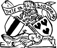
|
| JACOB JACOBZOON VAN DER MEER. |
So far as Gouda is concerned, Gheraert or Gerard Leeu and early printing are synonymous. He was a native of this place, and established himself here as a printer in 1477 and continued up to 1484, when he removed his presses to Antwerp, where he was printing until the year of his death, 1493. His “Dialogus Creaturarum,” the first edition of which appeared in 1480, had run into over a dozen editions, in Latin or Dutch, by the first year of the sixteenth century. Whilst at Gouda Leeu used several marks, of which the smaller, given on p. 39, was printed in red and black; at Antwerp he used a much more ambitious example, consisting of the arms of the Castle of Antwerp: a battlement and a turreted gate, with two smaller ones on either side; the two large flags bear the arms of the German Empire and of the Archduke Maximilian of Austria. Nicolas Leeu, who was printing at Antwerp in 1487–8, was possibly the 186 brother of the more famous typographer, and his Mark consists of the lion (a pun on his surname, which is equivalent to lion) in a Gothic window holding two shields, with the arms of Antwerp on the left and the monogram of Gheraert Leeu on the right. Like Leeu and so many of the other early Dutch printers, the first Delft typographer, Jacob Jacobzoon Van der Meer, 1477–87, employed the arms of the town in which he printed on his Mark, the right shield in the present instance carrying three water-lily leaves. In 1477 he issued an edition of the Dutch Bible, and three years later the first edition of the Psalter, “Die Duytsche Souter,” which had been omitted from the Bible. The only other Delft printer to whom we need refer is Christian Snellaert, 1495–7, the only book to which he has placed both his name and his Mark being “Theobaldus Physiologus de naturis duodecim animalium,” 1495. His most remarkable production, however, is a “Missale 188 secundum Ordinarium Trajactense,” issued about 1497; this Mark, given on p. 35, was also used by Henri Eckert van Hombergh, who was printing at Antwerp from 1500 to 1519: the shield carries the arms of Antwerp; in the arms of Snellaert this shield is blank, and this constitutes the only difference between the two Marks.
GERARD LEEU.
MATHIAS VAN DER GOES.

|

|
| R. VAN DEN DORP. | G. BACK. |
191

|
| A. CÆSARIS. |
If it could be proved that “Het boeck van Tondalus visioen” was, as has been stated, printed at Antwerp in 1472, by Mathias Van der Goes, the claim of Antwerp to be regarded as the first place in the Low Countries in which printing was introduced would be irrefutable. Unfortunately there is very little doubt but that the date is an error, although Goes is still rightly regarded as having introduced printing into Antwerp, where he was issuing books from 1482 to about 1494 in Dutch and Latin. He had two large Marks, one of which was a ship, apparently emblematical of Progress or commercial enterprise, and the other, a savage brandishing a club and bearing arms of 189 Brabant,—the latter, from “Sermones Quatuor Novissimorum,” 1487, is here given. Rolant Van den Dorp, 1494–1500, whose chief claim to fame is that he printed the “Cronyke van Brabant,” folio, Antwerp, 1497, had as his most ambitious Mark a charming picture of Roland blowing his horn; on one of the shields (suspended from the branch of a tree) is the arms of Antwerp, which he sometimes used separately as his device. Contemporaneously with Van den Dorp, 1493–1500, we have Godefroy Back, a binder who, on November 19, 1492, married the widow of Van der Goes, and continued the printing-office of his predecessor. His house was called the Vogehuis, and had for its sign the Birdcage, which he adopted as his Mark; this he modified several times, notably in 1496, when the monogram of Van der Goes was replaced by his own. In the accompanying example (apparently broken during the printing) the letter M is surmounted by the Burgundy device—a wand upholding a St. Andrew’s cross. We give also a small example of the two other Marks used by this printer. Arnoldus Cæsaris, l’Empereur, or De Keysere, according as his name happened to be spelt in Latin, French, or Flemish, is another of the early Antwerp printers whose mark is sufficiently distinct to merit insertion here. His first book is dated 1480, “Hermanni de Petra Sermones super orationem dominicam.” Michael Hellenius, 1514–36, is a printer of this city who has a special interest to Englishmen from the fact that “in 1531 he printed at Antwerp an anti-Protestant work for Henry Pepwell, who could 191 find no printer in London with sufficient courage to undertake it.” Hellenius’ Mark is emblematical of Time, in which the figure is standing on clouds, with a sickle in one hand and a serpent coiled in a circle on the left. The Mark of Jan Steels, Antwerp (p. 19), 1533–75, is regarded by some bibliographers as the emblem of an altar, but “from the entire absence of any ritual accessories, and the introduction of incongruous figures (which no mediæval artist would have thought of representing), it would appear to be merely a stone table.” Jacobus Bellaert, 1483–86, was the first Haarlem printer, one of his earliest works being “Dat liden ende die passie ons Heeren Jesu Christi,” which is dated December 10, 1483. Bellaert’s name does not 192 appear in it, but his Mark at the end permits of an easy identification, it being the same as that which appears in his Dutch edition of “Glanvilla de Proprietatibus Rerum,” 1485: the arms above the Griffin are those of the city of Haarlem. One of the most famous printing localities of the Low Countries was Leyden (Lugdunum Batavorum), where the art was practised so early as 1483, Heynricus Henrici, 1483–4, being one of the 194 earliest, his Mark carrying two shields, one of which bears the cross keys of Leyden. The Pelican is an exceedingly rare element in Dutch and Flemish Printers’ Marks, one of the very few exceptions being that of J. Destresius, Ypres, 1553, the motto on the border reading “Sine sanguinis effusione non fit remissio.”
GODEFROY BACK.
MICHAEL HILLENIUS.
J. BELLAERT.
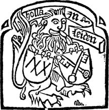
|
| H. HENRICI. |
|
| JODOCUS DESTRESIUS. |
|
| HENRI VAN DEN KEERE. |
It will be convenient to group together in this place a few of the more representative examples of the Marks of the Dutch and Flemish printers of the sixteenth century. Of Thomas Van der Noot, who was printing at Brussels from about 1508 to 1517, there is very little of general interest to state, but his large Mark is well worthy of a place here. Picturesque in another way also is the Mark of J. Grapheus, Antwerp, 1520–61; the 195 example we give is a distinct improvement on a very roughly drawn Mark which this printer sometimes used, which is identical in every respect to this, except that it has no borders. It is one of the few purely pictorial, as distinct from armorial, Marks which we find used at Antwerp in the earlier half of the sixteenth century. One of this printer’s most notable publications is “Le Nouueau Testament de nostre Sauflueur Iesu Christ trāslate selon le vray text en franchois,” 1532, a duodecimo of xviii and 354 folios, a rare impression of Le Fèvre d’Etaples’ Testament as it had been issued by L’Empereur, in 1530, who had obtained the licence of the Emperor and the Inquisition for this impression. Henri Van den Keere, a book-seller 197 and printer of Ghent, 1549–58, had four Marks, all of which resemble more or less closely the rather striking and certainly distinct example here given. Of the Bruges printers of the sixteenth century, Huber or Hubert Goltz, 1563–79, is 198 perhaps the most eminent, not so much on account of the typographical phase of his career, as because of his works as an author and artist. The “Fasti Magistratum et Triumphorum Romanorum,” is one of his books best known to scholars, whilst to students of numismatics his work on the medals from the time of Julius Cæsar to that of the Emperor Ferdinand, in Latin, of which a very rare French edition appeared at Antwerp in 1561, is well known, and the original edition of his works in this respect is still highly esteemed, although, as 200 Brunet points out, Goltz has suffered a good deal in reputation since Eckel has demonstrated that he included a number of spurious examples, whilst some others are incorrectly copied. His interesting typographical Mark is given on p. 51. J. Waesberghe, of Antwerp and Rotterdam, had at least three Marks, of which we give the largest example, and all of which are of a nautical character, the centre being occupied by a mermaid carrying a horn of plenty; in the smaller example of the accompanying Mark, the background is taken up by a serpent forming a circle. The Mark of M. De Hamont, a printer and bookseller of Brussels, 1569–77, is worth quoting as one of the very few instances in which the subject of St. George and the Dragon is utilized in this particular by a printer of the Low Countries. Rutger Velpius appears to have had all the wandering proclivities of the early printers; for 201 instance, we find him at Louvain from 1553 to 1580, at Mons from 1580 to 1585, and Brussels from 1585 to 1614: he had three Marks, of which we give the largest. Of the Liege printers, we have only space to mention J. Mathiæ Hovii, whose shop was “Ad insigne Paradisi Terrestris” 202 during the latter half of the seventeenth century, and whose Mark is of rather striking originality and boldness of design.
THOMAS VAN DER NOOT.
J. GRAPHEUS.
Full text
J. WAESBERGHE.
RUTGER VELPIUS.
J. M. HOVII.
200
|
| MICHEL DE HAMONT. |
The two most distinguished names in the annals of Dutch and Flemish
printing are unquestionably
203
Plantin and the Elzevirs. A full description of the various Marks
used by Christophe Plantin alone would fill a small volume, as the
number is not only very great, but the varieties somewhat conflicting in
their resemblance to one another; all of them, however, are distinctly
traceable to three common types. Some are engraved by Godefroid Ballain,
Pierre Huys, and other distinguished craftsmen. His first Mark appeared
in the second book which he printed, the “Flores de L. Anneo
Seneca,” 1555. His second Mark was first used in the following year, and
bears the monogram of Arnaud Nicolaï. Of each of these examples we give
reproductions, as also of the fine example designed for Plantin’s
successors either by Rubens or by Erasme Quellin, and engraved by Jean
Christophe Jegher, 1639, Plantin having died in 1589. The most famous of
all Plantin’s Marks is
205
of course that with the compass and the motto “Labor et Constantia,”
which he first used in 1557. Plantin explains in the preface to his
Polyglot Bible the signification of this Mark, and states that the
compass is a symbolical representation of his device: the point of the
compass turning round signifies work, and the stationary point
constancy. One of the most curious combinations of Printers’ Marks may
be here alluded to: in 1573, Plantin, Steels and Nutius projected an
edition of the “Decretals,” and the Mark on this is made up of the three
used by these printers, and was designed by Pierre Van der Borcht.
203

|
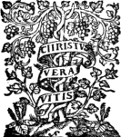
|
| C. PLANTIN. (First Mark.) |
C. PLANTIN. (Second Mark.) |
C. PLANTIN.
Nearly every volume admittedly printed by the Elzevir family possessed a Mark, of which this family, from Louis, in 1583, to Daniel, 1680, used four distinct examples. The founder of the dynasty, Louis (1583–1617), adopted as his sign or mark an Eagle on a cippus with a bundle of arrows, accompanied with the motto, “Concordia res parvæ crescunt”—the emblem of the device of the Batavian Republic—and as the year 1595 occurs on the primitive type of this Mark, it might be concluded to date from that period. But Willems points out that no book published by Louis in the years 1595 and 1596 carries this Mark, which (he says) figures for the first time on the Meursius, “Ad Theocriti idyllia Spicelegium,” 1597. In 1612 Louis Elzevir reduced this Mark, and suppressed the date above mentioned. For some time Isaac continued the use of the sign of his grandfather, and even after 1620, when he adopted a new Mark—that of the Sage or Hermit—he 206 did not completely repudiate it. Bonaventure and Abraham scarcely ever used it except for their catalogues.
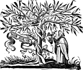
|
| THE SAGE. |
The second Mark, which Isaac (1617–25) adopted in 1620, it occurring for the first time in the “Acta Synodi Nationalis,” is known as the Solitaire and sometimes as the Hermit or Sage. It represents an elm around the trunk of which a vine, carrying bunches of grapes, is twined; the Solitaire and the motto “Non solus.” The explanation of this Mark is obvious, and may be summed up in the one word “Concord;” the solitary individual is symbolical of the preference of the wise for solitude—“Je suis seul en ce lieu être solitaire.” This Mark was the principal one of the Leyden office, and was in constant use from 1620 to 1712, long after the Elzevirs had ceased to print.
The third Elzevir Mark consists of a Palm with the motto “Assurgo pressa.” It was the Mark of Erpenius, professor of oriental languages at the University of Leyden, who had established a printing-press which he superintended himself in 207 his own house. At his death the Elzevirs acquired his material, with the Mark, which occurs on the Elmacinus, “Historia Saracenica,” and on the Syriac Psalter of 1625, on the “Meursii arboretum sacrum,” 1642, and on about seven other volumes.
| THE ELZEVIR SPHERE. | |

|

|
| THE SPURIOUS SPHERE. | THE GENUINE SPHERE. |
The fourth important Elzevir Mark is the Minerva with her attributes, the breastplate, the olive tree, and the owl, and the motto “Ne extra solus,” which is from a passage in the “Frogs” of Aristophanes. It was one of the principal Marks of the Amsterdam office, and was used for the first time by Louis Elzevir in 1642. After Daniel’s death this Mark became the property of Henry Wetstein, who used it on some of his books. It was also used by Thiboust at Paris and Theodoric van Ackersdyck at Utrecht.
In addition to the foregoing, a number of other Marks were employed by this firm of printers, the most important of the minor examples being the Sphere, which occurs for the first time on “Sphæra Johannis de Sacro-Bosco,” 1626, printed by 208 Bonaventure and Abraham; and from this time to the end of the period of the operations of the Elzevirs, the Sphere and the Minerva appear to have equally shared the honour of appearing on their title-pages. Among the other Marks which we must be content to enumerate are the following: a hand with the device of “Æqvabilitate,” an angel with a book, and a book of music opened, each of which was used occasionally by the first Elzevir; and one in which two hands are holding a cornucopia, of Isaac; the arms of the Leyden University formed also occasionally the Mark of the Elzevirs established in that city.
The Mark of Guislain Janssens, a bookseller and printer of Antwerp, at the end of the sixteenth and beginning of the seventeenth century, is both distinct and pretty, and is worth notice if only from the fact that artistic examples are by no means common with the printers of this city.
GUISLAIN JANSSENS.
PRINTERS’ MARKS IN ITALY
AND SPAIN.
1

|
| A. FRITAG. |
The incunabula of Italy offer very little interest so far as regards the Marks of their printers, and the adoption of these devices did not become at all general until the early years of the sixteenth century. Conrad Sweynheim and Arnold Pannartz, who were the first to introduce printing from Germany into Italy, first at the monastery of Subiaco, near Rome, in 1465, and to that city in 1467, appear to have had no Mark; and the same may be said of several of their successors. We give the earliest 210 Roman example with which we are acquainted, namely, that of Sixtus Riessinger, and George Herolt, a German, who printed in partnership at Rome in 1481 and 1483. One of the books produced by this partnership was the “Tractatus sollemnis et utilis,” etc., which contains “full-page figures of the Sybils, fine initials, and an interlaced border to the first page of text, all executed in wood engraving.” The next Roman typographers who used a Mark were, like Herolt, “Almanos” or Germans, for as such Johann Besicken (1484–1506) and Martens of Amsterdam describe themselves in the colophon of “Mirabilia Romæ,” a 24mo. of 63 leaves, 1500. This work contains ten woodcuts, of which that on “the 211 reverse of leaf 36 has at the bottom the words ‘Mar’ and ‘De Amstdam’ in black letters on white scrolls, and ‘Er’ immediately beneath the latter, in white letters on a black ground, showing that Martin of Amsterdam, one of the printers, was also the engraver. On the woodcut on the reverse of leaf 25 also, there is a shield with the initials of both printers, ‘I’ and ‘M’ interlaced, in both large and small letters.” Andreas Fritag de Argentina (or Strassburg), 1492–96, is another early Roman printer who used a Mark. The four foregoing Marks are given on the authority of J. J. Audiffredi, “Catalogus ... Romanorum Editionum saeculi XVI.,” 1783. Among the early sixteenth century printers of Rome, one of the most distinguished was Zacharias Kalliergos of Crete, 1509–23, who had started printing at Venice in 1499, and of whom Beloe has given an interesting account in the fifth volume of his “Anecdotes of Literature.” A miniature of his device is given at the end of this chapter.

|
![DE AMST[ER]DAM / T A M DE AMST[ER]DAM / T A M](images/pic211b.png)
|
| J. BESICKEN. | THIERRY MARTENS. |
210
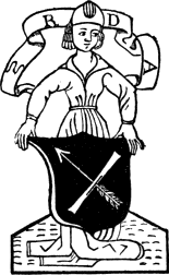
|
| SIXTUS RIESSINGER. |
Printing was introduced into Venice by Johannes de Spira in 1469, and, as showing the extent to which it was quickly carried, Panzer reckons that 212 up to the end of the fifteenth century, no fewer than 189 printers had established themselves here, and had issued close upon 3,000 works. From 1469 to 1480, over sixty master printers were 213 found within the precincts of the city. The first of the superb series of early printed books produced here is the folio edition of Cicero, “Epistolæ ad Familiares,” 1469, although the honour of being the most magnificent production appears to be equally divided between the Livy and the Virgil, 1470, executed by John of Spira’s brother and successor Vindelinus. So far as we know, neither of the two brothers, nor Nicolas Jenson, 1470–88, many of whose beautiful books rivalled the De Spiras’, used a Mark.
ERHARDUS RATDOLT.
Erhardus Ratdolt may be regarded as one of the earliest, if not actually the first Venetian printer to adopt a Mark. From 1476 to 1478 he was in partnership with Bernardus Pictor and Petrus Loslein de Langencen, but from the latter year to 1485 he was exercising the art alone. (It is not altogether foreign to our subject to mention that this firm printed the “Calendar” of John de Monteregio, 1476, which has the first ornamental title known.) In 1487, Ratdolt was at Augsburg, and perhaps his claims as a printer are German rather than Venetian, but as his best work was executed during his sojourn in Venice, it will be more convenient to include him in the present chapter. Like so many others of the early printers, he regarded his own performances with no little self-complacency, for in his colophons he describes himself, “Vir solertissimus, imprimendi arte nominatissimus, artis impressoriæ magister apprimè famosus, perpolitus opifex, vir sub orbe notus,” and so forth. To him is attributed the credit of having invented ink of a golden colour; and he 214 was the first to employ the “flourishes,” (“literæ florentes”) or initial letters formed of floral scrolls and ornaments borrowed from the Italian manuscripts, and sometimes printed in red and sometimes in black. Joannes and Gregorius de Gregoriis, 1480–1516, and Gregorius alone, 1516–28, make a very good show in the way of printed books, one of the most notable being the first quarto edition of Boccaccio, 1516, and another the 215 “Deutsch Römisch Brevier,” 1518, which is printed in black and red Gothic letter with numerous full-page woodcuts and borders. Contemporary with these two brothers and also famous as a prolific printer comes Ottaviano Scotto, “Civis Modoetiēsis,” 1480–1500, and his heirs, 1500–31, of whose Mark we give an exact reproduction. Baptista de Tortis, 1481–1514, also issued a number of interesting books, more particularly folio editions of the classics, copies of which are still frequently met with, and of whose Mark we give a reduced example on p. 25; and the same may be said of Bernardinus Stagninus, 1483–1536. The Mark, also, of Bernardinus de Vitalibus, 1494–1500, is sufficiently distinct to justify a reduced example. Bartholomeus de Zanis, 1486–1500, was not only a prolific printer on his own account, but also for Scotto, to whom reference is made above. The Marks, on a greatly reduced scale of Dionysius Bertochus, 1480; of Laurentius Rubeus de Valentia, 1482; of Nicholas de Francfordia, 1473–1500; and of Peregrino de Pasqualibus, 1483–94, who was for a short time in partnership with Dionysius de Bertochus, are all interesting as more or less distinct variations of one common type (see p. 25). Of Petrus Liechtenstein, 1497–1522, who describes himself as “Coloniensis,” and whose very fine Mark in red and black forms the frontispiece to the present volume, it will be only necessary to refer to one of his books, the “Biblij Czeska,” 1506, which is the first edition for the use of the Hussites. Of this exceedingly rare edition, only about four copies are known. It is 217 remarkable in not having been suppressed by the Church, for one example of its numerous woodcuts (which are coloured) at once betrays its character, viz., the engraving to the sixth chapter of the Apocalypse, in which the Pope appears lying in hell. As illustrative of some of the more elaborate and pictorial Marks which one finds in the books of the Venetian printers during the sixteenth century, we give a couple of very distinct examples, the first being one of the Marks of the Sessa family, whose works date from 1501 to 1588; and the second example distinguishing the books of the brothers Paulum and Antonium Meietos, who were printing books in 1570.
OTTAVIANO SCOTTO.
MELCHIOR SESSA.
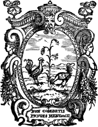
|
| P. AND A. MEIETOS. |
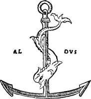
|
| THE FIRST ALDINE ANCHOR. |
The Aldine family come at the head of the Venetian printers, not only in the extreme beauty of their typographical work, but also in the matter of Marks. The first (and rarest) production of the founder of the dynasty, Aldus Manutius, 1494–1515, was “Musæi Opusculum de Herone & Leandro,” 1494, a small quarto, and his life’s work as a printer is seen in about 126 editions which are known to have been issued by him. “I have made a vow,” writes Aldus, in his preface to the “Greek Grammar” of Lascaris, “to devote my life to the public service, and God is my witness that such is my most ardent desire. To a life of ease and quiet I have preferred one of restless labour. Man is not born for pleasure, which is unworthy of the truly generous mind, but for honourable labour. Let us leave to the vile herd the existence of the brutes. Cato has compared the life 219 of man to the tool of iron: use it well, it shines, cease to use it and it rusts.” It was not until 1502 that Aldus adopted a Mark, the well-known anchor, and this appears for the first time in “Le Terze Rime di Dante” (1502), which, being a duodecimo, is the first edition of Dante in portable form. This Mark, and one or two others with very slight alterations which naturally occurred in the process of being re-engraved, was used up to the year 1546. In 1515 the original Aldus died, and as his son Paolo or Paulus was only three years of age, Andrea Torresano, a distinguished printer of Asola, into whose possession the “plant” of Jenson had passed in 1481, and whose daughter married the first Aldus, carried on the business of his deceased son-in-law, the imprint running, “In ædibus Aldi et Andreæ Asulani soceri.” In 1540 Paulus Manutius took over the entire charge of the business founded by his father. The Anchor, 220 known as the “Ancora grassa,” which he used from 1540 to 1546, is more carefully engraved but less characteristic than that of his father; whilst that which he used from 1546 to 1554 was usually but not invariably surrounded by the decorative square indicated in the accompanying reproduction; then he again modified his Mark, or more particularly its border. Paulus Manutius died in April 1574. Aldus “the younger,” 1574–98, the son of Paulus and the last representative of the house, also used the anchor, the effect of which is to a great extent destroyed by the elaborate coat-of-arms granted to the family by the Emperor Maximilian. Aldus “the younger,” was a precocious scholar, of the pedant type, and under him the traditions of the family rapidly fell. He married into the eminent Giunta family of printers, and 221 died at the age of 49. The famous Mark of the anchor had been suggested by the reverse of the beautiful silver medal of Vespasian, a specimen of which had been presented to Aldus by his friend Cardinal Bembo, the eminent printer, adding the Augustan motto, “Festina lente.” The Mark of the dolphin anchor was used by many other printers in Italy, France, Holland (Martens, Erasmus’ printer, among the number), whilst the “Britannia” of Camden, 1586, printed by Newbery, bearing this distinctive Mark, which was likewise employed by Pickering in the early part of the century; and, as will be seen from the next chapter, is still employed by more than one printer.
219
|

|
| ANDREA TORRESANO. | |
220
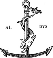
|
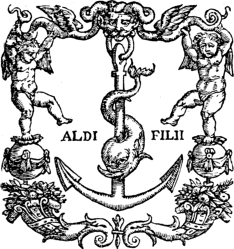
|
| THE ALDINE ANCHOR, 1502–15. | THE ALDINE ANCHOR, 1546–54. |
|
224 
|
| P. GIUNTA. |
The Giunta or Junta family, members of which were printing at Florence and Venice from 1480 to 1598, may be conveniently referred to here. One of the earliest books in which the founder of the family, Filippo, used a Mark, is “Apuleii Metamorphoseos,” Florence, 1512; our example, which is identical with that in Apuleius, is taken from Ὀππιανου Ἁλιευτικων (Oppiani de natura seu venatione piscium), Florence, 1515, which was edited by Musurus. From a typographical and artistic point of view the books of Lucantonio Junta (or Zonta) are infinitely superior to those of Filippo. He was both printer and engraver, and many of the illustrations which appear in the 223 books he printed were executed by him. His Mark appeared as early as 1495 in red at the end of an edition of Livy which he appears to have executed for Philippus Pincius, Venice, and again in red, this time on the title-page, in another edition of the same author, done for Bartholomeus de Zanis de Portesio, Venice, 1511. Each of these productions contained a large number of beautiful woodcuts. Early in the sixteenth century those “vero honesti viri” (as they modestly described themselves), Jacobi and Francisci, were printing at Florence (“et sociorum eius”), the accompanying mark being taken from a commentary on Thomas Aquinas, 1531. It will be noticed that in the three marks of different members of 224 the family the fleur-de-lys appears. Among the Venetian printers of the beginning of the sixteenth century Johannes de Sabio et Fratres may be mentioned, if only on account of their Mark which is given herewith. Its explanation is certainly not obvious; and Bigmore and Wyman’s suggestion that it is a punning device is not a correct one, whilst the statement that the cabbage is of the “Savoy” variety is also erroneous, for this variety has scarcely any stalks; for “Brasica” we should read “Brassica.” In 1534, “M. Iwan Antonio de Nicolini de Sabio” printed “Alas espesas de M. Zuan Batista Pedreçan,” a 225 rare and beautiful edition with woodcuts, and, in small folio, of “Primaleon” in Spanish; and in 1535 Stephano da Sabio issued a translation of “La Conquesta del Peru,” etc., of Francesco de Xeres.
222
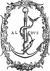
|
223
|
| THE ALDINE ANCHOR, 1555–74. | THE ALDINE ANCHOR, 1575–81. |
|
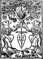
|
| L. GIUNTA. | F. DE GIUNTA. |
Although not the first printer either at Cremona, where he started in 1492, or at Brescia, where he was printing from 1492 to 1502, Bernardino de Missintis deserves mention among the typographers of the fifteenth century. So far as regards the latter place, the Mark of Giammaria Rizzardi, who was established in this city during the latter half of the last century, is one of the most distinct, and was probably designed by Turbini. Bonino de Boninis of Ragusa, was printing at Venice, 1478–1480, 226 at Verona, 1481–3, and afterwards removed to Brescia, where he was printing until about 1491. The earliest known book printed at Modena (or Mutine) is an edition of Virgil, executed by Johannes Vurster de Campidonâ, 1475; but one of the best known printers of this city is Dominico Rocociolo, or Richizola, 1481–1504, who was in partnership with Antonio Miscomini, 1487–89.
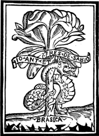
|
| THE BROTHERS SABIO. |
Printing was introduced into Milan (Mediolanum) in 1469 or in the year following, and from the numerous presses established in this city before the end of the fifteenth century very many beautiful books were issued. Gian Giacomo di Legnano 228 and his brothers, whose highly decorative Mark we reproduce, were working in this city from 1503–33; one of their most interesting books is a Latin translation of the first edition (Vicenza, 1507) of the “Paesi novamente retrovati, et Novo Mondo da Alberico Vesputio Florentino intitulato.” Bologna was also a busy printing centre from 1470 onwards; but it must suffice us to give the monograms of three of the more noteworthy, namely, Hercules Nanni, 1492–4; Giovanni Antonio de Benedetti (or Johannes Antonius Platonides de Benedictis), 1499, and Justinian de Ruberia, 1495–9 (see p. 25).
GIAN GIACOMO DI LEGNANO.
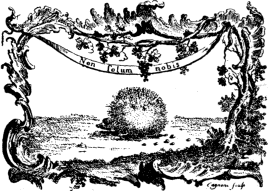
|
| GIAMMARIA RIZZARDI. |
The Printers’ Marks of Spain (including Portugal) need not detain us long. They cannot in any case be described as other than archaic, and they are for the most part striking on account of the coarseness of their design. A few examples are given in Fray Francisco Mendez’s “Tipografica 229 Española,” of which the first and only volume appeared at Madrid in 1796; and of which a second edition, corrected and enlarged by Dionisio Hidalgo, was published at the same city in 1861. As the latter writer clearly points out “los del siglo XV., y aun hasta la mitad del XVI. los mas eran estranjeros, como lo demuestran sus nombres y apellidos, y algunos lo declaran espresamente en sus notas y escudos.” These “estranjeros” were almost without exception Germans.
Valencia (or Valentia Edetanorum) was the first place in Spain into which the art of printing was introduced; the earliest printers being Alfonso Fernandez de Cordova and Lambert Palomar (or Palmart) a German, whose names however do not appear on any publication (according to Cotton) antecedent to the year 1478. Although not the earliest of the Seville printers the four “alemanes, y compañeros,” Paulo de Colonia, Juan Pegnicer de Nuremberga, Magno y Thomas, their composite Mark is one of the first which appears on books printed in Spain. It is of the cross type, with two circles, one within another, the smaller divided into four compartments, each of which encircles the initials of the four printers, “P” (the lower part of which is continued so as to form an “L”), “I M T.” Among other books which they printed is the “Vidas de los Varones ilustres de Plutarco.” In 1495, Paulo de Colonia appears to have left the partnership, for the Mark appeared with its inner circle divided into three compartments in which the initials “I M” and “T” only appear. This firm continued printing at Seville until the commencement 230 of the sixteenth century. Federico de Basilea (or, as his name appears in the imprints of his books, Fadrique Aleman de Basilea) was busy printing books at Burgos from the end of the fourteenth to the second decade of the fifteenth century; his Mark, a cross resting on a V-shaped ground, is a poor one, the motto being “sine causa nihil.” “En mushos libros de los que imprimió puso su escudo,” observes Mendez; this printer possesses an historic interest from the fact that he issued the first edition the unabridged “Chronicle of the Cid,” 1512—“Cronica del Famoso Cauallero Cid Ruy Diez Campeador,” 231 a book of the greatest rarity. One of the early printers of Barcelona, Pedro Miguel, had a Mark, also of the cross type, the circle surrounding the bottom of which is divided into three compartments, in two of which occur his initials “P M.”
JUAN ROSEMBACH.
V. FERNANDEZ.
One of the most noteworthy names in the early annals of Spanish printing is that of Juan de Rosembach de Haydellerich, who printed books in Barcelona, 1493–8, and again at the beginning 232 of the sixteenth century; in Perpignan, 1500; in Tarragona, 1490, and in Montserrat. In 1499 he printed at Tarragona the famous “Missal de aquel Arzobispado,” which Mendez declares to be “muy recomendable por varias circumstancias.” At Barcelona he printed in 1526 an edition of the “Oficias de Cicero.” The Marks of this printer vary considerably, but the example here reproduced may be regarded as a representative one. Of the early Lisbon printers, Valentin Fernandez “de la Provincia de Moravia” was probably the first to use a Mark (here reproduced), one of his publications being the “Glosa sobre las Coplas” of Jorge Manrique, 1501.
1 The reader will find on page 25 a series of thirty reduced reproductions of Marks used for the most part by the Italian printers. These are given after Orlandi (“Origine e Progressi della Stampa,” 1722) and Horne (“Introduction to the Study of Bibliography,” 1814), but several of the names are open to question from the fact that the former author has given no account either of the places at which they worked, or of the books which they printed.

|
|
|
|
| ZACHARIAS KALLIERGOS. |
J. A. DE LEGNANO. |
J. DE VINGLE, OF PICARDY. |
M. HUGUNT.C |
SOME MODERN EXAMPLES.

|
| THE STATIONERS’ COMPANY. |
During the past few years there has been a very evident revival in the Printer’s Mark as a modern device, but the interest has much more largely obtained among publishers than among printers. We propose, therefore, to include in this chapter a few of the more interesting examples of each class. On the score of antiquity the Stationers’ Company may be first mentioned. Founded in 1403—nearly three-quarters of a century before the introduction of printing—its first charter was not received until May 4th, 1557, during the reign of Mary. The number of “seditious and heretical books, both in prose and verse,” that were daily issued for the propagation of “very great and detestable heresies against the faith and sound Catholic doctrine of Holy Mother the Church,” became so numerous, that the government were 234 only too glad to “recognize” the Company, and to intrust it with the most absolute power. The charter was to “provide a proper remedy,” or, in other words, to check the fast-increasing number of publications so bitter in their opposition to the Court religion. But, stringent and emphatic as was this proclamation, its effect was almost nil. On June 6th, 1558, another rigorous act was published from “our manor of St. James,” and will be found in Strype’s “Ecclesiastical Memorials” (ed. 1822, iii. part 2, pp. 130, 131). It had specific reference to the illegality of seditious books imported, and others “covertly printed within this realm,” whereby “not only God is dishonoured, but also encouragement is given to disobey lawful princes and governors.” This proclamation declared that not only those who possessed such 235 books, but also those who, on finding them, do not forthwith report the same, should be dealt with as rebels. It will be seen, therefore, how easy it was, in the absence of any fine definition, for books of whatever character to be proscribed. There was no appeal against the decision of the Stationers’ Hall representatives, who had the power entirely in their own hands. A few months after Mary’s futile attempt at checking the freedom of the press, a diametrically objective change occurred, and with Elizabeth’s accession to the throne in November, 1558, the licensed stationers conveniently veered around and were as industrious in suppressing Catholic books as they had been a few weeks previously in endeavouring to stamp out those of the new religion. The history of the Stationers’ Company however has been so frequently told that it need not be further entered upon here, and it must suffice us to say that, after many vicissitudes, all the privileges and monopolies had become neutralized by the end of the last century, till it 236 had nothing left but the right to publish a common Latin primer and almanacks, and the right to the latter monopoly was annulled after a memorable speech of Erksine. The Company still continues to publish almanacks, and uses the two Marks or Arms here reproduced. The larger example is the older, and is used on the County almanacks; whilst the smaller one is used on circulars and notices.
234
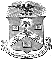
|
235

|
| THE STATIONERS’ COMPANY. | THE RIVINGTONS. |
Of the existing firms of publishers and printers, that of Messrs. Longmans is the most memorable; vice the firm of Messrs. Rivingtons, which has now become joined to that of the Longmans. This gives us the opportunity to consider briefly the Marks of the two firms together. In the year 1711, Richard Chiswell, the printer of much of Dryden’s poetry, died, and his business passed into the hands of Charles Rivington, a native of Chesterfield, Derbyshire. Thoughtful and pious himself, Charles Rivington threw himself with ardour into the trade for religious manuals, and not only succeeding in persuading John Wesley to translate “à Kempis” for him, but also in publishing the saintly Bishop Thomas Wilson’s “Short and Plain Introduction to the Sacrament of the Lord’s Supper,” the first edition of which bears Charles Rivington’s name on the imprint, and which is still popular. To the novelist Richardson, he suggested “Pamela.” Dying in 1742, he left Samuel Richardson as one of the executors of his six children, but his sons, John and James, continued to conduct the business. A few years later, it was deemed advisable for the 237 brothers to separate, and while John remained at the “Bible and Crown,” St. Paul’s Churchyard, James joined a Mr. Fletcher in the same locality, and started afresh. One especially fortunate venture was the publication of Smollett’s continuation of Hume, which brought its lucky publishers upwards of £10,000, a larger profit than had previously been made on any one book. However, Newmarket had attractions for James, and eventually disaster set in; he died in New York in 1802 or 1803. His brother, meanwhile, had plodded on steadily at home, and admitting his two sons, Francis and Charles, into partnership. About this time there were numerous editions of the classics, the common property of a syndicate of publishers, and it says much for Mr. John Rivington 238 that he was appointed managing partner. About 1760 he obtained the appointment of publisher to the Society for Promoting Christian Knowledge, a lucrative post, held by the firm for upwards of two generations. By the year 1889, the two representatives of this ancient firm were Messrs. Francis Hansard Rivington and Septimus Rivington; in this year the partnership was dissolved, and the goodwill and stock were acquired by Messrs. Longmans. They used at various periods no less than eight Marks, the design of which was in most cases based upon the ancient sign of their shop, “The Bible and Sun.”
LONGMAN AND CO.

|
| THE CLARENDON PRESS. |
The history of Messrs. Longmans may be said to commence with the birth of Thomas Longman in 1699. The son of a Bristol gentleman, he lost his father in 1708, and, eight years later, was apprenticed, on June 9, 1716, to Mr. John Osborn of Lombard Street, London. His apprenticeship expiring (he had come into the possession of his property two years earlier), we find him, in 1724, purchasing from his master, John Osborn (acting with William Innys as executors), the stock in trade of William Taylor, of the Ship and Black Swan in Paternoster Row. Readers of Longman’s 239 Magazine turn to Mr. Andrew Lang’s genial gossip, “At the Sign of the Ship,” without recalling the origin of the title. Henceforward the Ship carried the Longman fortunes as cargo, and 240 the prosperity of the vessel is not yet ended. Messrs. Longmans have used nearly a dozen Marks, all of which have been suggested, like those of the Rivingtons, by the sign of their shop, which has now grown into a very imposing pile of buildings. Of these Marks we give two of the most artistic and interesting. As taking us back into a comparatively remote period in the history of printing and publishing in England, the Mark of the Clarendon Press, or, in other words, the arms of the University of Oxford, may be here cited.
239
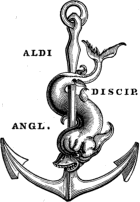
|
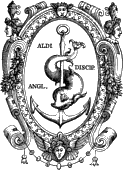
|
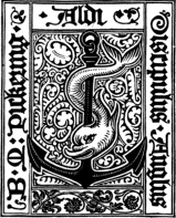
|
| WILLIAM PICKERING. | BASIL MONTAGU PICKERING. | |
THE CHISWICK PRESS.
241
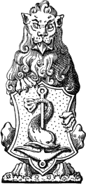
|
| THE CHISWICK PRESS. |
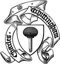
|
| THE CHISWICK PRESS. |
The “Chiswick Press” of Messrs. Whittingham and Co., is in several respects a link with the long past, and, having been in existence for more than a century, is one of the oldest offices in London. It 242 has attained a world-wide celebrity for the excellence of its work, the careful reading and correction of proofs, and the appropriate application of its varied collection of ornaments and initial letters. The Chiswick Press was the first to revive the use of antique type in 1843, for the printing of “Lady Willoughby’s Diary,” published by Messrs. Longmans. Since that time its use has become universal. The founder, Charles Whittingham, was born on June 16th, 1767, at Calledon, in Warwick, and was apprenticed at Coventry in 1779, working subsequently at Birmingham, and then in London. He commenced business on his own account in Fetter Lane in 1790; and in 1810 he had removed to Chiswick, and since that period the firm has always been known as “The Chiswick Press.” In 1828 he began to execute work for William Pickering, the publisher, and his press quickly acquired an unrivalled reputation for its collection of ornamental borders, head and tail pieces. The publisher Pickering, and the printer Whittingham, had employed about two dozen marks in their various books: the former justly calling himself a disciple of Aldus, and using a large number of variations on the original Anchor and Dolphin Mark of the great Venetian printer. Of these we give two examples, one with, and one without a cartouche; and also the mark of Basil Montagu Pickering, the son and successor of William Pickering. We also reproduce three of the more striking Marks of the Chiswick Press, the shield on one of which, it will be observed, carries the Aldine Anchor and Dolphin.
243

|
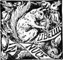
|
| CHATTO AND WINDUS. | DAVID NUTT. |
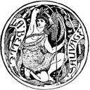
|

|
| CASSELL AND CO. | |
|
|
|
| MACMILLAN AND CO. | T. FISHER UNWIN. |

|

|
| LAWRENCE AND BULLEN. | KEGAN PAUL AND CO. |
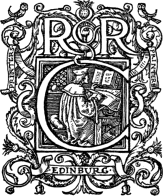
|
| R. AND R. CLARK. |
The name of Cassell takes us back to the era of Charles Knight and John Cassell, and the inauguration of the noble results which these two pioneers achieved on behalf of cheap and healthy literature. The name of the former is no longer associated with either printing or publishing; but that of the latter is still one of the most prolific firms of printers and publishers. Its Mark is founded on the name of “La Belle Sauvage” Yard, Ludgate Hill, in which the business has been located for a long series of years.
Two Edinburgh printers may be here conveniently referred to. Messrs. R. and R. Clark, whose business was started in Hanover Street, Edinburgh, in 1846, and removed to Brandon Street, in that city, in 1883, are well known for the excellence of their printing. Mr. Austin Dobson thus sings, in Mr. Andrew Lang’s Book on “The Library:”
245“‘Of making many books,’ ’twas said,
‘There is no end;’ and who thereon
The ever-running ink doth shed
But proves the words of Solomon:
Wherefore we now, for Colophon,
From London’s City drear and dark,
In the year Eighteen-eighty-one,
Reprint them at the press of Clark.”
The accompanying Mark was designed by Mr. 247 Walter Crane, and first used by Messrs. Clark in 1881. It is used in several sizes. Of the very handsome Mark of Messrs. T. and A. Constable, the Queen’s Printers, at the University Press, we may mention that the legend is a hexameter; it was written by Professor Strong, and contains two puns; the ship is an old Constable device. The Marks of both Messrs. Chatto and Windus (who succeeded to the business, started and carried on with such energy by the late John Camden Hotten) and Messrs. Macmillan and Co. (whose firm dates from the year 1843) are characterized by the extremest possible simplicity.
T. FISHER UNWIN.
T. AND A. CONSTABLE.
WILLIAM MORRIS
The finest of the several Marks used by Messrs. George Bell and Sons is given in two colours on 249 the title-page of the present volume, and is a play on the surname, the Aldine device being added to the bell. Another example will be found on page 261.
WILLIAM MORRIS.
Messrs. Kegan Paul, Trench, Trübner and Co., Limited, originally a branch of the extensive Anglo-Indian firm of H. S. King and Co., first used the accompanying device in the autumn of 1877; the drawing was executed by Mrs. Orrinsmith in accordance with Mr. Kegan Paul’s suggestions. Messrs. Lawrence and Bullen, like Messrs. Clark, called in the aid of Mr. Walter Crane in designing their charming little Mark.
We give two of the several Marks used by one of the most prolific of the younger publishers, Mr. T. Fisher Unwin, the one is simply his initials, and the more elaborate example is a copy of a type not infrequently met with among the marks of the sixteenth century printers. Mr. David Nutt’s device is a quaint and effective play on his surname. Through the courtesy of Mr. William Morris, we are enabled to give examples of both of the Kelmscott Press Marks, each of which was designed by Mr. Morris.
As indicating the position of the printer’s Mark in America, we group together seven of the most interesting examples of the leading printers and publishers in the United States. The eighth example is that of Mr. Martinus Nijhoff, of the Hague; the device, “Alles komt te regt,” signifies “All turns right,” or something to that effect.
250

|

|
| D. APPLETON AND CO. | J. S. CUSHING AND CO. |

|
|
| HARPER BROTHERS. Full text |
H. LOCKWOOD AND CO. |

|
|
| BERWICK AND SMITH. | THEODORE L. DE VINNE AND CO. Full text |
|
|
| J. B. LIPPINCOTT CO. | M. NIJHOFF. |
BIBLIOGRAPHY.
The following books will be found helpful to those who wish to prosecute their studies further into the subject of the Printer’s Mark. Special information respecting the devices of the more eminent typographers, such as Plantin, Elzevir, and others, will be found in the monographs and bibliographies which have been compiled concerning these men and their works.
Havre, G. van. Marques typographiques des imprimeurs et libraires anversois, 2 vols. Avec plus de 1000 reproductions. Anv., 1884.
Heitz (P.) and Barack (K. A.). Die Büchermarken oder Buchdrucker und Verlegerzeichen. Elsässische Büchermarken bis Anfang des 18. Jahrhdts. Nebst Vorbemerkungen u. Nachrichten üb. d. Drucker. Mit 76 Holzschn. Tafeln. 4o. Strassburg, 1892.
Holtrop, J. W. Monuments Typographiques des Pays Bas au quinzième siècle. Fol. La Haye, 1868.
Horne, Rev. T. H. Introduction to the Study of Bibliography. 8vo. London, 1814.
Humphreys, H. N. Masterpieces of the Early Printers. Fol. London, 1870.
Inventaire des marques d’imprimeurs et de libraires de la France. 4o. Paris, 1886–87.
Johnson, J. Typographia, 2 vols. London, 1824.
254Ledeboer, Adrian Mar. Alfabetische lijst der Boekdrukkers, Boekverkoopers en Uitgevers in Nord-Nederland. With 4 plates of Printers’ Marks. 4to. Utrecht, 1876.
Lempertz, Heinrich. Bilder Hefte zur Geschichte des Bücherhandels und der mit demselben verwandten Künste und Gewerbe. 11 Hefte mit 65 Taf., enthalt. Facs. Reprod. von Portraits berühmter Buchhändler, auf den Buchhandel bezügl. Schriftstücke, Initialen, Ex-libris, Abbilden kunstvoller Einbände. Fol. Köln, 1853–65.
Linde, A. v. d. Geschichte der Erfindung der Buchdruckerkunst. 3 Bde. 4o. 1886–87.
Meermann, Gerard. Origines typographicæ, 2 vols. With 10 pl. Printers’ Marks. 4o. Hag. Com., 1765.
Mendez, Fray Francisco. Tipographia española ó historia de la introduccion, propagacion y progesos del arte de la imprenta en España. Second edition revised by D. Hidalgo. Madrid, 1861.
Orlandi, P. A. Origin e Progressi della Stampa. 4o. Bolog. 1722.
Roth-Scholtz, F. Thesaurus Symbolarum ac Emblematum, etc. Fol. Nüremberg, 1730 (with reproductions of several hundred Marks).
Silvestre, L. C. Marques typographiques ou recueil des monogrammes, chiffres, enseignes, etc., des libraires et imprimeurs qui ont exercé en France depuis 1470, jusqu’à la fin du 16e siècle. Avec plus de 1300 fig. s. bois. Paris, 1853–67.
Thierry-Poux, O. Premier Monuments, etc., de l’imprimeur en France au XVe siècle. Fol. Paris, 1890.
Weigel (T. O.) and Zestermann (A. C. A.). Die Anfänge der Druckerkunst in Bild und Schrift. An deren frühesten Erzeugnissen in der Weige’schen Sammlung erlaütert. Mit 145 Facs. u. viel. Holzschn. im Text. Folio. Leipz., 1866. 2 vols.
INDEX.
|
Abiegnus, J., 26. Aldine family, The, 218–223. Allen, John, 92. Angelier, J., 27. Apiarius, Mathias, 7. Appleton and Co., 250. Auvray, G., 27. Auzolt, R., 26. Back, G., 188–190. Bade, C., 91. Baland, E., 22. Barack, Dr. K. A., 140. Barbon, H., 8. Barker, C. and R., 90. Bartholomæus, D., 47. Bartholomeus de Zanis, 25. Bassandyne, T., 99. Baumgarten, C., 171. Bell (Geo.), and Sons, 247. Benedetto d’Effore, 25. Bentley, R., 19. Berger, Thiebold, 150–151. Bernardino de Misintis, 25, 225. Bernardinus de Vitalibus, 25. Berrichelli, D., 25. Berthelet, T., 71. Bertramus, A., 29. Berwick and Smith, 251. Besicken, J., 210–211. Besson, J., 21. Bichon, G., 7. Bien-Né, J., 20. Bignon, J., 14. Birckmann, A., 162–163. Blades, W., 55. Blount, E., 87. Bocard, A., 20. Bonino de Boninis, 25, 225–256. Boucher, N., 27. Bouchet, G., 21. —— J., 21. Bouchets Brothers, 12. Boulle, G., 34. Bounyn, B., 14. 256Bourgeat, G., 27. Bouyer, J., 21. Bradshaw, Henry, 53. Brothers of Common Life, 181. Brylinger, N., 176. Bumgart, Herman, 158–159. Burges, J., 22. Byddell, J., 72. Cæsar, N., 161. Caillaut, A., 3. Caligula de Bacileriis, 25. Calvarin, P., 14. Calvin, J., 174. Cartander, see Cratander. Cassell and Co., 243–4. Caxton, W., 53–57. Cervicornis, Eucharius, 159. César, P., 12. Charteris, H., 99. —— R. and G., 126. Chevallon, G., 22. Chiswick Press, The, 240–2. Chouet, J., 31. Christopher de Canibus, 25. Clarendon Press, The, 238, 240. Clark, R. and R., 244. Cleray, G., 32. Clopejau, M., 27. Cloquemin, L., 12. Colines, see De Colines, S. Colomies, J., 137. Colophon, The, 49. Constable, T. and A., 246–7. —— W., 68. Corrozet, G., 32. Cox, T., 92. Cramoisy, S., 127. Cranach, L., 170. Cratander, 44–45. Crespin, J., 20. Cushing and Co., 250. Cyaneus, L, 125. Dallier, J., 32. Davidson, T., 98. Day, John, 78–80. De Bordeaux, J., 32. De Campis, J., 51. De Codeca, M., 25. De Colines, S., 14, 27, 118–119, 120, 126. De Francfordia, W., 25. De Gourmont, G., 13, 118, 124. —— J., 21. —— R., 27. De la Barre, N., 26. De Laet, 30. Delalain, Paul, 24. De la Noue, D., 8. De la Porte, A. S. and H., 133–135. —— H. and A., 66. De la Rivière, G., 8. De Marnef Brothers, The, 26, 106–107. Denidel, A., 21. 257Denis, J., 38. De Pfortzheim, Jacobus, 163, 165. De Saincte-Lucie, P., 14. De Salenson, G., 17. De Sartières, P., 14. Destresius, J., 194. —— S., 25 De Vinne, Th., 251. Dewes, R., 89. Dorp, R. van den, 188–189. Duff, E. Gordon, 62. Dulssecker, J. R., 47, 50, 153–154. Du Mont, A., 8. Du Moulin, J., 6. Du Pré, Galliot, 5. —— P., 22. Eckert de Hombergh, H., 34. Eggestern, H., 139. Endter’s (W. E.) Daughter, 167. Erpenius, T., 49. Estienne, Family, The, 100, 118–123. Eve, N., 8. Fawkes, R., 63. Federico de Basilea, 230. Fernandez, A., 229. Feyrabendt, J., 172. Fézandat, M, 14. Fouet, R., 32. Fradin, C., 36. —— F., 26. Francfordia, N. de, 215. Frellon, J., 22. Fritag, A., 209–211. Froben, J., 42–44, 48, 58, 164–166. Furter, M., 166. Fust and Schoeffer, 40–42. Gerla or Gerlis, L., 25. Gibier, Eloy, 12. Girard, J., 173–174. Giunta Family, The, 222–225. Goes, M. van der, 187–188. Gourmont, see De Gourmont. Grandin, L., 18. Granjon, R., 14. Gregorius, J. and G. de, 214. Grosii, The, 22. Groulleau, E., 32. Grüninger, J., 140. —— The, 36. Guarinus, 73. Gueffier, J., 8. Guerbin, L., 172–173. Guillemot, M., 32. Harper Bros., 250. Harrison, R., 89. 258Hauth, David, 152. Heitz, P., 140. Henricpetri, 166. Herembert, J., 131, Herolt, G., 210. Hesker, H., 34. Hillenius, M., 57. Hombergh, H. Eckert van, 188. Hovii, J. M., 201–202. Huby, F., 34. Huguetan, The Brothers, 17, 49. —— J., 26. Hugunt, M., 232. Husz, M., 26. “Inventaire des Marques d’Imprimeurs,” 24. Jacobi, P., 29. Jaggard, Isaac and William, 87, 88. Janssens, G., 208. Jenson, N., 213. Johannes de Spira, 211. Jove, M., 8. Jucundus, J., 29. Julian, G., 8. Junta, see Giunta. Justinian de Ruberia, 25, 228. Keysere, see Cæsaris. Kingston or Kyngston, Felix, 88, 89. Koberger, Anthony, 167. Kobian, Valentin, 156. Koelhoeff, J., 159–160. |
Lagache, J. and A., 29. Lamparter, N., 166. L’Angelier, A., 10. Laurens, Le Petit, 34. Lawrence and Bullen, 243. Le Bret, G., 36. Leeu, G., 184–186. —— N., 184. Le Forestier, J., 21. Legnano, G. G., 226–228. —— J. A., 232. Le Jeune, M., 20. Le Preux, F., 177. —— J., 12. —— Poncet, 36. Le Rouge, P., 109. Le Talleur, G., 26. Liechtenstein, P., 215. Lippincott and Co., 251. Lockwood and Co., 250. Longis, J., 14. Longman and Co., 233, 237, 240. 259Macé, B., 36. —— R., 13. —— Family, The, 108. Macmillan and Co., 243. Madden, J. P. A., “Lettres,” 57. Magno, 229. Maillet, J. and E., 5. Mainyal, G., 101. Mallard, O., 14. Manilius, G., 32. Mansion, Colard, 181. Marnef, see De Marnef. Martin d’Alost, T., 180, 210, 211. Martin, L., 34. Meer, J. J. van der, 186. Meietos, P. and A., 217. Mentelin, J., 139. Middleton, W., 76–77. —— H., 252. Miscomini, A., 226. Mittelhus, G., 26. Morin, M., 137. Morris, William, 247–91. Moulin, J., 97. Nani, H., 25. Neobar, C., 20. Nijhoff, M., 251. Nivelle, S., 14, 126, 128, 129, 130. Noir, see Le Noir. Notary, J., 61–62. Nourry, C., 14. Nutt, David, 243. Oglin, Erhart, 163–164. Olivier, J., 23. Orwin, T., 30. Paffraej, Albertus, 183–184. —— Richard, 184. Palomar, L., 229. Pannartz, A., 209. Paulo de Colonia, 229. Paul (Kegan) and Co., 243, 249. Pegnicer, J., 229. Peregrino de Pasqualibus, 25, 215. Périer, T., 27. Pfortzheim, see De Pfortzheim. Picart, B., 46. Pincius, P., 223. Pine, J., 46. Pinzi, P., 25. Plantin, C., 203–205. Pollard, A. W., 48. Portunaris, V., 22. Prevosteau, E., 17. Printers’ Marks: mottoes from sacred history, 8; printing press, 12; mottoes, 13; Hebrew and Greek mottoes, 17; the Brazen Serpent, 20; Balaam’s Ass, 22; Christ on the Cross, 22; St. Christopher, 22; Saints and 260Priests, 23; The Cross, 23–26; St. George and the Dragon, 26; Time and Peace, 27; musical notes, 29; rustic subjects, 29; the Cornucopia, 30; the Unicorn, 32–34; the Griffin, 35; the Mermaid, 36; the Anchor, 37; Angels, 37; Arion, 37; Bellerophon, 37; astrological signs, 37; Cat, 38; Eagle, 38; Fountain, 38; Heart, 38; Hercules, 38; Lion, 38; Magpie, 38; Mercury, 38; Pelican, 38; Phœnix, 39; Salamander, 39; Swan, 39. Psalter, The Mentz, 41. Pynson, R., 59–61. Rastell, J., 36. —— P., 105. Rembolt, B., 17, 26, 101, 102. Reynes, J., 16. Ricci, B., 25. Richard, J., 34. —— T., 29. Rigaud, B., 14. Rihel, Wendelin, 150. Rivery, J., 174. Rivingtons, The, 235–8. Rodt, Berthold, 163. —— Family, The, 125. Rose, Germain, 4. Rosembach, J., 26, 230, 231–2. Roth-Scholtz’s “Thesaurus,” 24. Rubeus de Valentia, L., 25, 215. Ryverd, G., 22. Sabio Brothers, The, 224–226. Sacer, J., 25. Schäffeler of Bodensee, 22. Scher, Conrad, 152. Schomberg, W., 25. Schott, M. and J., 141. Schultis, E., 32. Schumann, V., 170–171. Scott, or Skott, J., 66. Sergent, P., 18. Sessa, M., 217–218. Silvius, G., 22. Sixtus Riessinger, 210. Somaschi, The, 25. Soter, Johann, 161–162. St. Albans Press, The, 54–56. Stadelberger, J., 172–173. Stationers’ Company, The, 233–6. Steinschawer, Adam, 173. Suardo, L., 25. Sweynheim, C., 209. Tardif, A., 8. 261Ther Hoernen, A., 24, 157, 159, 183. Thomas, 229. Title-page, The First, 48. Tonson, J., 94. Topie, M., 131. Torresano, A., 219. Tottell, R., 85. Tournes, see De Tournes. Trepperel, J., 21. —— The Brothers, 17. Treveris, P., 64. Van Hombergh, H. E., 188. Veldener, J., 178. Velpius, Rutger, 200. Vindelinus de Spira, 213. Vitalibus, B. de, 215. Vostre, S., 102, 103, 111, 112. Vurster de Campidonâ, J., 226. Waesberghe, J., 199. Walthoe, J., 92. Wéchel, A. and C., 31, 125–127. Weissenburger, J., 167–169. Whitchurche, E., 75. Whittingham, Messrs., 240–2. Windet, J., 82. Wyer, R., 68. Wynkyn de Worde, 51, 57–59, 67. Zanis, Bartholomeus, 215. |
CHISWICK PRESS:—CHARLES WHITTINGHAM AND CO.,
TOOKS COURT, CHANCERY LANE.
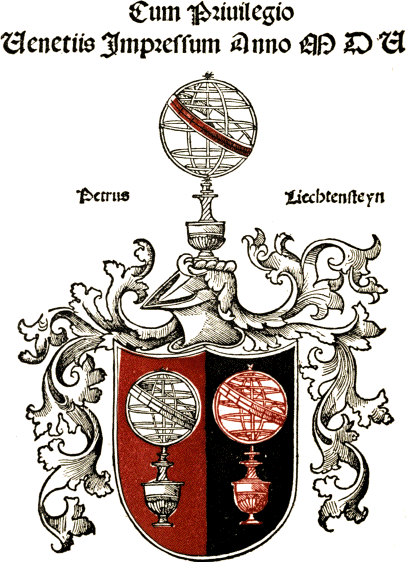


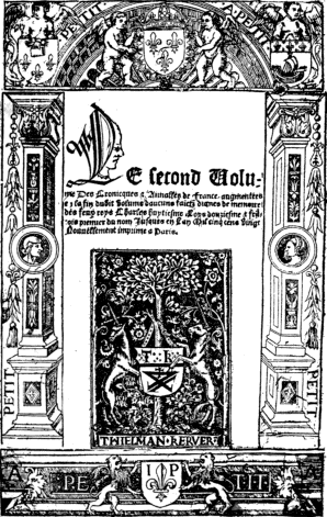
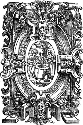
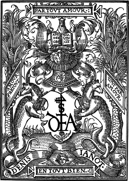
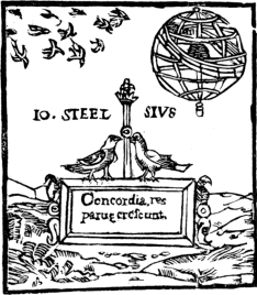
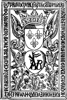
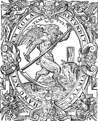
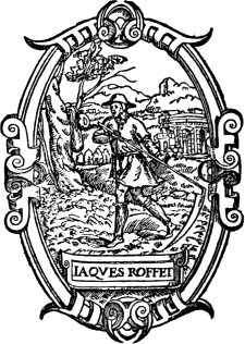
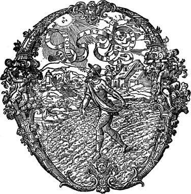
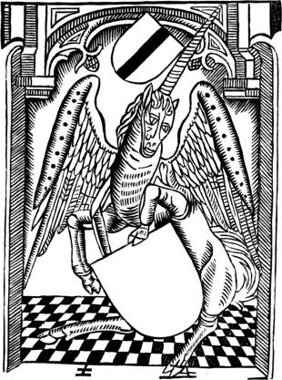


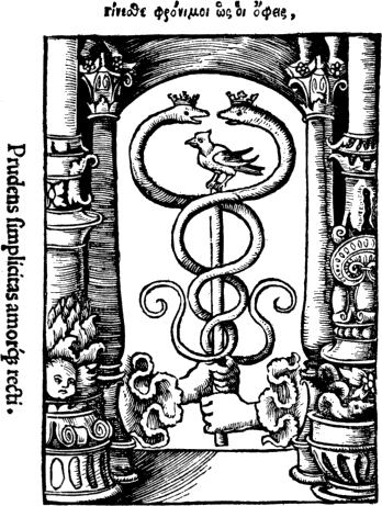
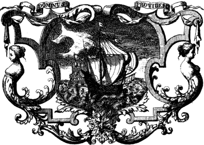
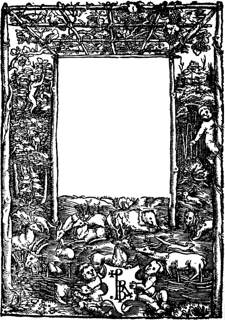

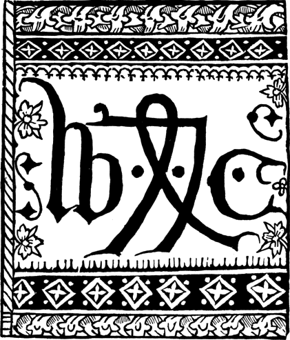
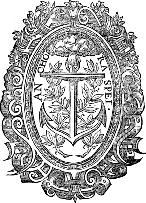
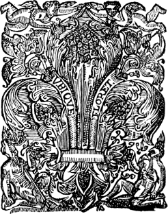
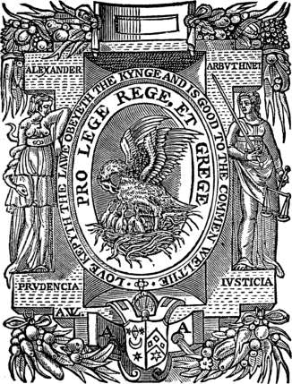
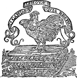
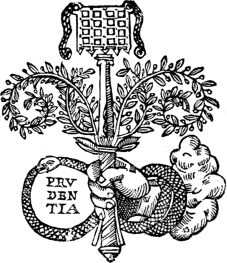
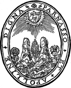
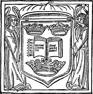
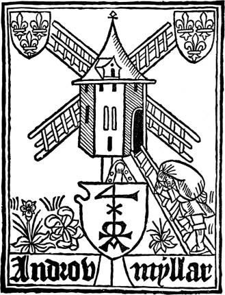
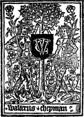
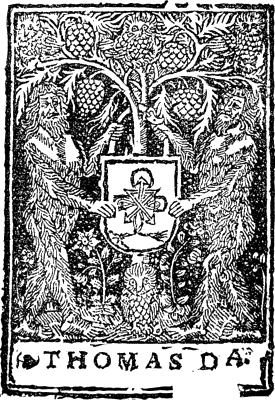
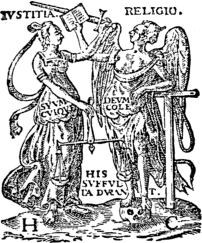

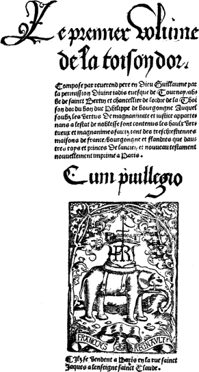
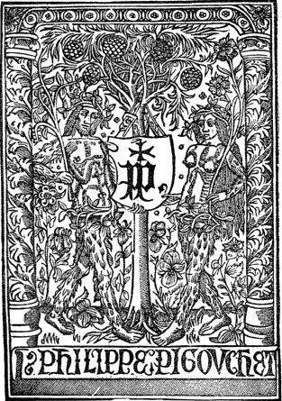
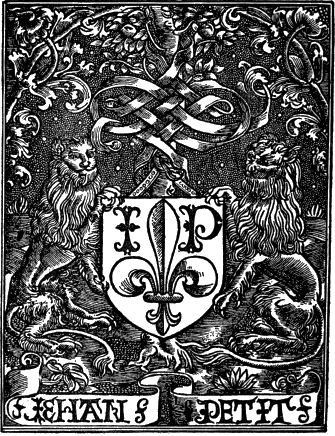
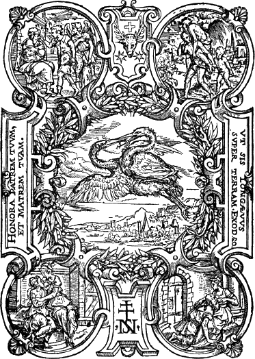
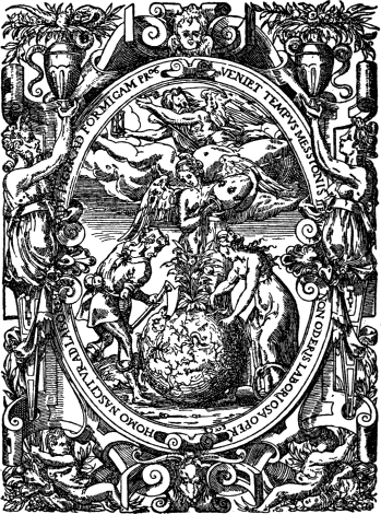
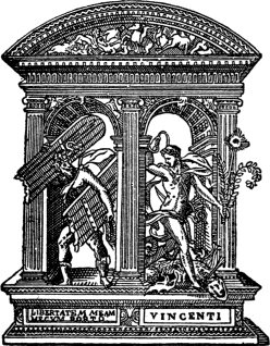
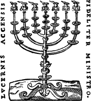

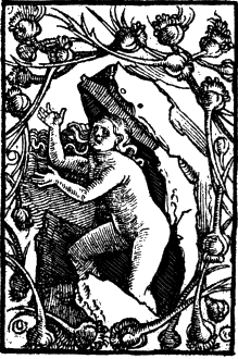
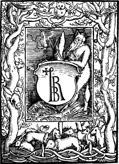
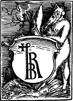
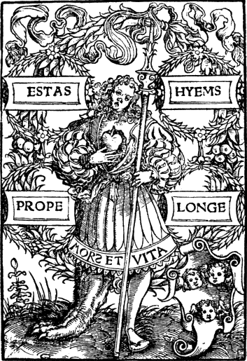
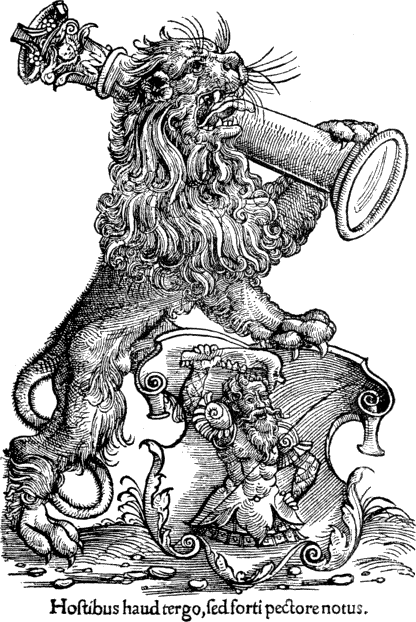
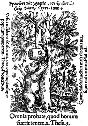
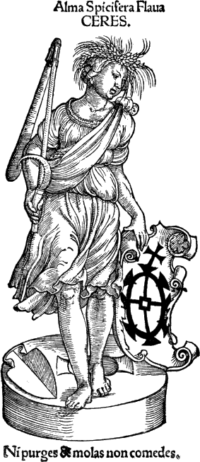
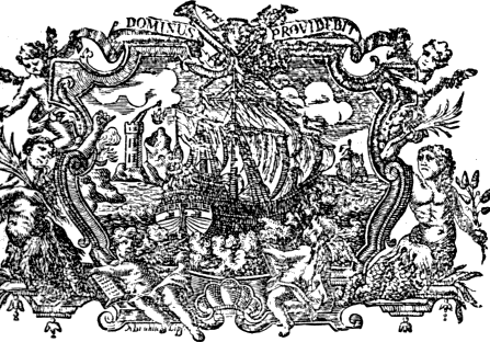
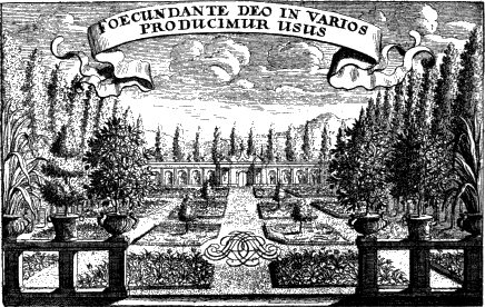
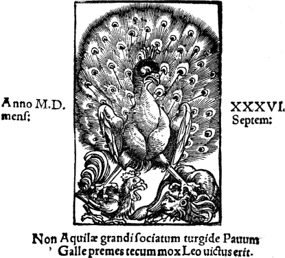
![Impressu[m] Colonie sup[er] antiquū for[um] in Siluestri viro. Impressu[m] Colonie sup[er] antiquū for[um] in Siluestri viro.](images/pic158.png)
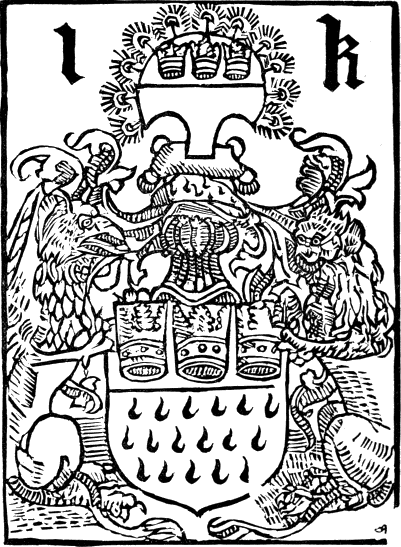
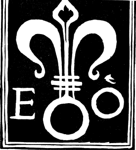
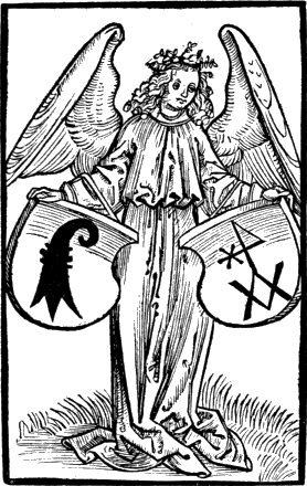
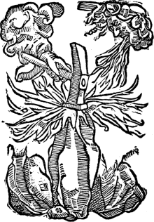
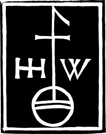
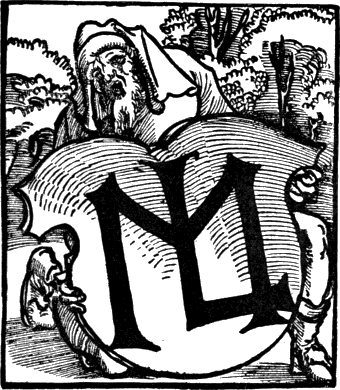
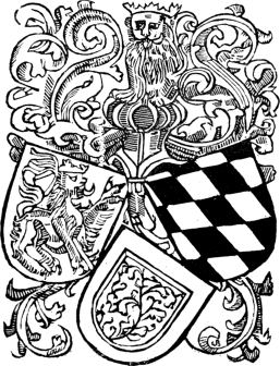
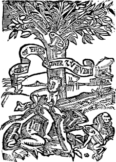
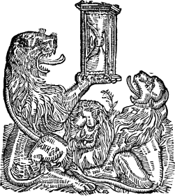

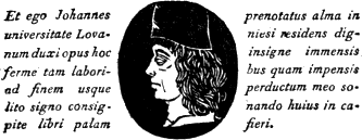
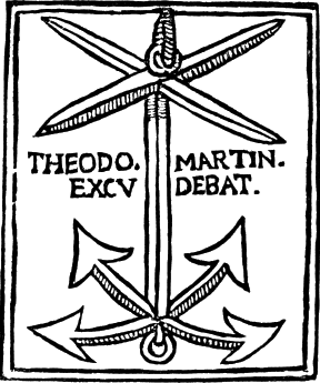
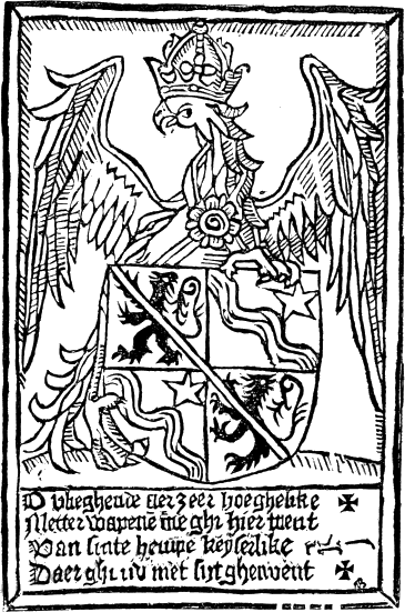
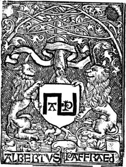
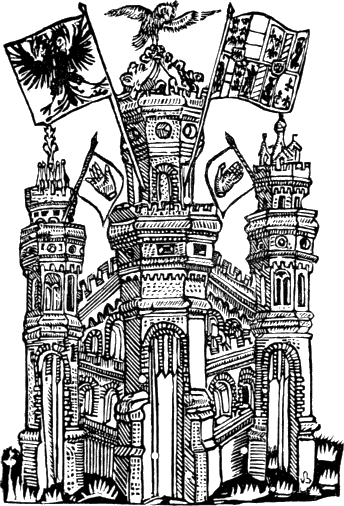
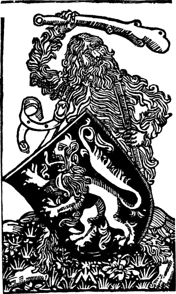
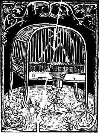
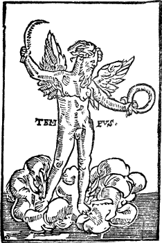
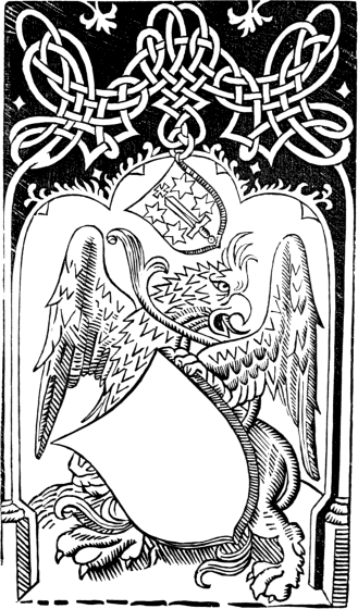
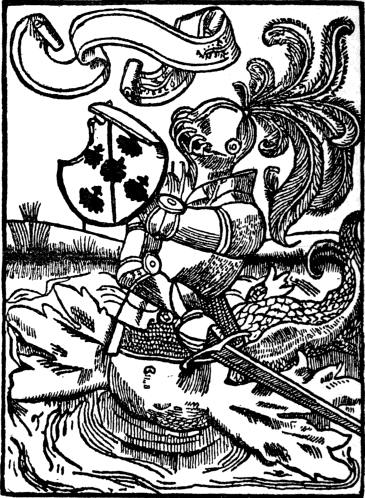
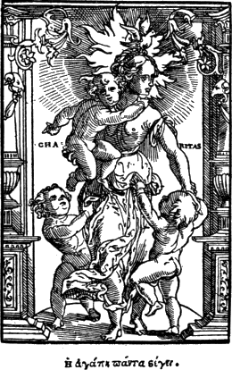
![LITERÆ IMMORTALITATE[M] PARIV[N]T LITERÆ IMMORTALITATE[M] PARIV[N]T](images/pic199.png)
